Showing posts with label are. Show all posts
Showing posts with label are. Show all posts
Adjustment layers are special layers in Photoshop that will apply an "adjustment" onto its own layer. There are many adjustments you can make to a layer, such as: color balance, levels, hue/saturation, etc. You create an adjustment when you feel an image needs a deliberate change or modification to your choosing. Adjustments can quickly and easily enhance your digital or scanned-in photographs and are used all of the time in creating great, layer-based graphic design.
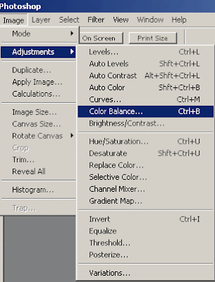
There are basically two ways to do things. Adjustments and adjustment layers.
1. You can create an adjustment on an actual layer itself (by going under Image: Adjustments: and then choosing an adjustment). Note: adjustments will not work on shape layers (vectors). In this case youll want to make duplicate the original layer before you make any adjustments or changes.
2. You can create an adjustment layer on top of an original layer. This preserves the original layer, as you can easily discard the adjustment layer.
If you are a beginner, youll want to be careful. Always make sure that if you are making an adjustment on a layer itself that you are certain you want to keep that adjustment. To play it safe you should always duplicate the original layer if you are going to make adjustments or try out some filters. But you can easily just create an adjustment layer instead by clicking on the adjustment layer icon on the bottom of the layers palette.
When you create an adjustment layer, it will apply to all of the layers beneath it. For example if you had 20 layers of a complex design and wanted to change the color balance of all of the layers (the entire document) you would select the top layer in the layers palette and then create an adjustment layer: color balance and then it will apply to all of your image. You can move that adjustment layer down and layers on top of it in the palette wont be affected. Remember that it applies to all of the layers beneath it.
What I have just talked about is creating an adjustment layer that will spread across the entire space of the document. Because you have not made a selection, an adjustment layer will spread across the document on its own special layer. If you make an adjustment ON a specific layer, it will just apply to that layer.
Now..if you want an adjustment layer to apply specifically to a certain layer (instead of the entire document) for the same effect as creating an adjustment on the layer itself; what you have to do is simply Ctrl or Cmd click on the layer icon and get the layer selected so you see the marching ants. Then what you do is simply create an adjustment layer of your choice (from the icon) and it will only apply to the selected areas of the layer immediately beneath it (because no other layers are in between it).
This is the same effect as creating an adjustment on the layer itself except more flexible because you can easily adjust the adjustment layer attributes (by double clicking on the adj. layer) or simply throw it away or hide it if you dont like it. You may want to consider trying different adjustment layers on a layer but remember you have to select the layer itself first otherwise the adjustment layer will apply across the entire document.
You may also have to do some layer masking as certain adjustments will create harsh and distinct differences from the rest of the document. Remember there are these two ways to do the same thing but if you can get comfortable with creating and using adjustment layers, they are going to save you some time. Consider putting several layers of adjustments in a layer set for better organization. I personally use adjustment layers all of the time and they are used religiously in designs such as movie posters and flyers.
Read more »
There are basically two ways to do things. Adjustments and adjustment layers.
1. You can create an adjustment on an actual layer itself (by going under Image: Adjustments: and then choosing an adjustment). Note: adjustments will not work on shape layers (vectors). In this case youll want to make duplicate the original layer before you make any adjustments or changes.
2. You can create an adjustment layer on top of an original layer. This preserves the original layer, as you can easily discard the adjustment layer.
If you are a beginner, youll want to be careful. Always make sure that if you are making an adjustment on a layer itself that you are certain you want to keep that adjustment. To play it safe you should always duplicate the original layer if you are going to make adjustments or try out some filters. But you can easily just create an adjustment layer instead by clicking on the adjustment layer icon on the bottom of the layers palette.
When you create an adjustment layer, it will apply to all of the layers beneath it. For example if you had 20 layers of a complex design and wanted to change the color balance of all of the layers (the entire document) you would select the top layer in the layers palette and then create an adjustment layer: color balance and then it will apply to all of your image. You can move that adjustment layer down and layers on top of it in the palette wont be affected. Remember that it applies to all of the layers beneath it.
What I have just talked about is creating an adjustment layer that will spread across the entire space of the document. Because you have not made a selection, an adjustment layer will spread across the document on its own special layer. If you make an adjustment ON a specific layer, it will just apply to that layer.
Now..if you want an adjustment layer to apply specifically to a certain layer (instead of the entire document) for the same effect as creating an adjustment on the layer itself; what you have to do is simply Ctrl or Cmd click on the layer icon and get the layer selected so you see the marching ants. Then what you do is simply create an adjustment layer of your choice (from the icon) and it will only apply to the selected areas of the layer immediately beneath it (because no other layers are in between it).
This is the same effect as creating an adjustment on the layer itself except more flexible because you can easily adjust the adjustment layer attributes (by double clicking on the adj. layer) or simply throw it away or hide it if you dont like it. You may want to consider trying different adjustment layers on a layer but remember you have to select the layer itself first otherwise the adjustment layer will apply across the entire document.
You may also have to do some layer masking as certain adjustments will create harsh and distinct differences from the rest of the document. Remember there are these two ways to do the same thing but if you can get comfortable with creating and using adjustment layers, they are going to save you some time. Consider putting several layers of adjustments in a layer set for better organization. I personally use adjustment layers all of the time and they are used religiously in designs such as movie posters and flyers.

Monday, March 16, 2015
are,
color,
colors,
king,
theory,
why
0
comments
Why Colors are King Color Theory
Author: Brian McGregor
 You may not realize it, but many of your website visitors form an immediate opinion about you and your website. The opinion that is formed in this instantaneous way is done so subconsciously. You might wonder why this happens. It has absolutely nothing to do with the text on your website. And yet your visitor will still form their instant opinion without even reading a single word of your costly copy.
It doesnt matter either, whether the quality of the images on your website are of the highest. Nor does your offer matter. You could be promoting a sensational deal, like selling dollars for dimes. But this too, will be overlooked by the site visitor. This is because the instant opinion is made when your web page is displayed to your visitor. You may have guessed there is something subliminal at work here. In a way, that is right. Immediate opinions are formed by visitors to every single website. This may surprise you, but the answer is colors. Your visitors instant opinion of your website is primarily due to the color scheme which you have used.
This is because colors are psychological. They engender an intuitive reaction which we cant control. We cant help ourselves. Colors bring us these emotions and feelings whether we want them or not! As you will know, millions are spent by big companies in deciding the correct colors of new products and in their marketing campaigns. Big companies realize that colors are a psychological feature, and they can influence our reception of their marketing. In their business propositions, the big companies understand that the use of appropriate colors is a key element. What webmasters have to realize, and this can be very important, is that the same color psychology applies to our web pages.
By the psychological power you could encourage your website visitors to leave your page the instant they see it. No matter what your website is about, it may simply be unsuccessful due to the colors youre using. Forget the text, it might never be read! The good news, however, is that you can use colors to engender a really positive reaction. This color psychology is nothing new. In fact, its been with us for years and years. Whatever our role in life, colors convey emotions to our subconscious mind.
For example, a particular color scheme could convey a good feeling in each of us. However, a different color scheme might convey not so good feelings. In essence, you might send a sense trust, warmth and belonging. Conversely, the feeling sent may be one of distrust, coolness and rejection. The following list gives an idea of the emotions associated with their respective colors:
Red Excitement, energy, danger, love, leadership, sense of power, strength etc
Orange Comfort, steadfastness, cheerfulness, courage, confidence, playfulness, friendliness etc
Yellow Curiosity, brightness, organization, intelligence, joy, amusement, caution etc
Green Harmony, nature, money, healing, health, life, food etc
Blue Trustworthiness, stability, peace, tranquility, love, acceptance, patience etc
Purple Nobility, dignity, independence, royalty, luxury, ambition, wisdom etc
Brown Reliability, nature, comfort, tribal, earthiness, durability, primitive etc
Black Sophistication, dramatic, power, formality, style, health, elegance etc
White Innocence, cleanliness, fresh, goodness, easy, simplicity, purity etc
When designing your web pages, you ideally need to ensure that the color scheme you use is consistent with your offering. The reason is that your visitors subconscious minds will look to reconcile the color with the message. If they are irreconcilable, you will find your visitors click away from your page very quickly. Which means, your visitor will be lost. The important issue therefore is that it is essential the right color scheme is used on your website. If you do this, your website will produce the results youre looking for. In summary, the difference between the right and wrong color scheme on your website can be the difference between profit and loss.
Read more »
You may not realize it, but many of your website visitors form an immediate opinion about you and your website. The opinion that is formed in this instantaneous way is done so subconsciously. You might wonder why this happens. It has absolutely nothing to do with the text on your website. And yet your visitor will still form their instant opinion without even reading a single word of your costly copy.It doesnt matter either, whether the quality of the images on your website are of the highest. Nor does your offer matter. You could be promoting a sensational deal, like selling dollars for dimes. But this too, will be overlooked by the site visitor. This is because the instant opinion is made when your web page is displayed to your visitor. You may have guessed there is something subliminal at work here. In a way, that is right. Immediate opinions are formed by visitors to every single website. This may surprise you, but the answer is colors. Your visitors instant opinion of your website is primarily due to the color scheme which you have used.
This is because colors are psychological. They engender an intuitive reaction which we cant control. We cant help ourselves. Colors bring us these emotions and feelings whether we want them or not! As you will know, millions are spent by big companies in deciding the correct colors of new products and in their marketing campaigns. Big companies realize that colors are a psychological feature, and they can influence our reception of their marketing. In their business propositions, the big companies understand that the use of appropriate colors is a key element. What webmasters have to realize, and this can be very important, is that the same color psychology applies to our web pages.
By the psychological power you could encourage your website visitors to leave your page the instant they see it. No matter what your website is about, it may simply be unsuccessful due to the colors youre using. Forget the text, it might never be read! The good news, however, is that you can use colors to engender a really positive reaction. This color psychology is nothing new. In fact, its been with us for years and years. Whatever our role in life, colors convey emotions to our subconscious mind.
For example, a particular color scheme could convey a good feeling in each of us. However, a different color scheme might convey not so good feelings. In essence, you might send a sense trust, warmth and belonging. Conversely, the feeling sent may be one of distrust, coolness and rejection. The following list gives an idea of the emotions associated with their respective colors:
Red Excitement, energy, danger, love, leadership, sense of power, strength etc
Orange Comfort, steadfastness, cheerfulness, courage, confidence, playfulness, friendliness etc
Yellow Curiosity, brightness, organization, intelligence, joy, amusement, caution etc
Green Harmony, nature, money, healing, health, life, food etc
Blue Trustworthiness, stability, peace, tranquility, love, acceptance, patience etc
Purple Nobility, dignity, independence, royalty, luxury, ambition, wisdom etc
Brown Reliability, nature, comfort, tribal, earthiness, durability, primitive etc
Black Sophistication, dramatic, power, formality, style, health, elegance etc
White Innocence, cleanliness, fresh, goodness, easy, simplicity, purity etc
When designing your web pages, you ideally need to ensure that the color scheme you use is consistent with your offering. The reason is that your visitors subconscious minds will look to reconcile the color with the message. If they are irreconcilable, you will find your visitors click away from your page very quickly. Which means, your visitor will be lost. The important issue therefore is that it is essential the right color scheme is used on your website. If you do this, your website will produce the results youre looking for. In summary, the difference between the right and wrong color scheme on your website can be the difference between profit and loss.
Subscribe to:
Posts (Atom)


- Follow Us on Twitter!
- "Join Us on Facebook!
- RSS
Contact