Showing posts with label art. Show all posts
Showing posts with label art. Show all posts
Photoshop Tutorials
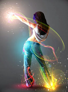
Step 1
Open the girl model in photoshop and using the Pen Tool (P), trace the contour but make sure you have the paths selected. I suggest using the pen tool technique because it’s a lot more accurate. Also, when you’re dealing with high resolution images like this, try to subtract the subject from the background before scaling down the original image because you will be more accurate.
After you traced the contour, with the pen tool active, right click and choose “Make Selection”. Delete the background.
After you traced the contour, with the pen tool active, right click and choose “Make Selection”. Delete the background.
Create a new document 1500×2026 pixels and paste the girl, name this layer model. Create a new layer below the model layer, use a radial Gradient (G) and draw from the top left corner of the canvas to the bottom right. Use a light gray 66686b as foreground color and 474b4e for the background. See the image below.

Step 2
Now we are going to make some adjustments to the color and the contrast and add some shadows.
Make some color adjustments and increase the contrast of the girl. I used Adjustments Layers because they are non destructive, in other words, you can eliminate the adjustment layer or modify it without affecting the original image.
Levels settings to increase contrast.

Saturation settings to increase color

After making this adjustments, make some shadows on the ground to give a more realistic look, otherwise it looks like the girl is hanging in the air.
To add the shadows like I did in the image below, use different size brushes and hardnesses on different layers. For the contact shadows use a 35% hardness brush and diameter 30 pixels. Set Flow and Opacity of the brush to 40-50% and make several passes along the inner edge of both feet.
To make the big ground shadow use a bigger soft brush. Try to get something like the image below. The next tutorial will be all about shading techniques so don’t worry now if you don’t get it right.

Step 3
This is where the fun and the creative stuff starts. I will give the links to the images that we will use next but if you want to make this with different images, download the Colors in Motion pack and the Cosmic Lights PNG images pack .
The first image that I used was from the Cosmic Lights pack. Open the image “18-star-radiation” and paste it on a new layer below the girl’s layer but above the shadow layers, change it’s Blending Mode to Screen and if you see that is not visible enough duplicate the layer or increase the saturation to make the colors more visible.

Now open the image “11-cosmic-rays” from the same pack, flip it vertically and paste it above the girl’s layer and change the blending mode to Screen, just like you did with the previous one. You should get something like in the image below.

Use a soft edge Brush and 75-85% Opacity and on a new layer under the two previous lights click just one time with the brush and change the Blending Mode to Color Dodge. I used the color bc7a39.

Now you have to do the same but using a bigger brush, a different Blending Mode and this time the layer must be above the girl layer. For the color I used e2a02d and the blending mode Screen. The way to do this next light is by making 2 strokes. The first one using a 650px brush and 50% opacity and the second one on the same layer on the center of the first stroke using a 350px brush and 100% Opacity.

Open the “stock 4” image in photoshop and paste it above the previous light that you just made but flip it first, like in the image below. After that, change the blending mode to Screen.

Open “red_light.jpg” and paste it over the left foot and change the Blending Mode to Screen. As you can see we will use this technique for all stock images that have black background.

Step 4
All the lights that we just added on step 3 look great but we can make them look a bit better by adding some lights on the floor and on the girl’s body. We will do that manually and we will start with the left leg where you just added the red_light.jpg
Locate the model layer on the palette and click it’s thumbnail while you hold down the CTRL key in order to select it’s edges. Once you have the edges selected, create a new layer above the model layer (the layer of the girl) and create a layer mask on it. I named this layer ambient lights. This is necessary because we want to paint the lights only on the body.

Change the Blending Mode of the ambient lights layer to Color Dodge. Select a soft edge brush about 90px in diameter and set the Opacity of the brush to 20%. As I said, we will start with the left leg so the light that we need should match the red color of the stock image that we used on step 3. But because the blending mode of the layer is set to Color Dodge, we must use a lighter and less saturated color, I used e0446c. With the soft brush selected paint along the edges of the left leg.
You must create a stronger light at the bottom of the leg making multiple passes with the brush and fade out the effect with less brush strokes as you go up because the light is fading away. Do the same thing on the right leg but use green and yellow desaturated colors and paint on the same ambient lights layer.

Create a new layer above the model layer and set the blending mode to Color Dodge. Paint the floor with a soft brush and color 8c0548. Reduce the opacity of the layer if the effect is too strong. See image below.

Now we will move to the upper parts of the body and using more stock images from the packs mentioned earlier, add more lights.
On the hand I used the image Color_gradient (15) located in the “smoother gradients” folder from the Colors in Motion pack. Again change the Blending Mode to Screen and duplicate the layer for a stronger effect.
On the hand I used the image Color_gradient (15) located in the “smoother gradients” folder from the Colors in Motion pack. Again change the Blending Mode to Screen and duplicate the layer for a stronger effect.

Add another light to the hand from the same textures pack. I used the image Color (13) and I changed the Hue from Image>Adjustments>Hue/Saturation to match the colors of the first image added on the hand on the previous step. This time I didn’t duplicate the layer.

Use the same technique and add the image Color_gradient (18) like in the image below.

Step 5
Now things will get even brighter with some soft spotlights that we will add on this step. You can paint this spotlights above all the other layers on the palette.
From now on you will need a big soft brush to make this lights. We are going to start from the bottom part.
Se the brush color to 534906 and using a 600-750 pixels brush size and Opacity 65%, stroke once over the bottom right leg where we added the first lights at the beginning of this tutorial and set the layer Blending Mode to Color Dodge. That will make the light even brighter. See image below.

Change the brush size to 800px, create a new layer and set the foreground color to 064953. Make another light on the girl’s back and change the layer’s blending mode to Color Dodge (Add).

Do the same on the hand but this time using two different colors and different opacities. For the first stroke, use a 500px brush and the color 5a4f34. Set the brush Opacity to 100% and hardness to 0%. Create a new layer and click once over the fingers of the girl’s hand. Decrease the layer’s Opacity to 65% and change the Blending Mode to Color Dodge.
Make a new layer above the previous one and increase the brush size to about 960px. Change the color to 574739 and click once over the same spot as before. Leave the layers opacity to 100% and change the Blending mode to Color Dodge (Add). You should get something like in the image below.

Download the Media Militia particles pack and open two images that look like an explosion and paste them on the base of the right leg and over the light that you made on the previous step. Change the Blending Mode for both images to Color Dodge (add). Depending on the images you choose you might need to use another blending mode that fits better.

Step 6 – post editing
We are almost there. What we are going to do in this final step is shift the general lights of the image using the Lighting Effects filter.That’s something that I recommend you do always because you will always end up with a much better result. We are also going to reduce the size of the image. If you remember, on the first step we set the image resolution to 1500×2026 pixels but now we will make it smaller. Is always better to work with a high resolution image and then make it smaller. That way, you have more control for example when you cut out the image from its background.
Save your work because we are going to work on a new document. To create a copy of the final result you have two options. The first one is to select the top most layer on your layers palette and press Ctrl+Alt+Shift+E to create a stamp of the image and then copy and paste it into a new document. The second option is to select the entire canvas with Ctrl+A and then go to Edit>Copy Merged.
Now create a new document by pressing Ctrl+N or go to File>New and the new document should be the exact size as the image you have on your clipboard (as long as you copied the image). Paste the image on the new document and resize it (Ctrl+Alt+i) to 1000×1351. I added a default Lens Flare to the hand but that’s up to you. Go to Filter>Render>Light Effects and apply the settings that you see on the image below.

Now make the image sharper. Go to Filter>Sharpen>Unsharp Mask and apply the settings from the image below TWICE.

And that’s how you make a cool digital art manipulation. I hope you enjoyed this tutorial and that you learned something. If you like this technique feel free to spread the word and submit this tutorial to as many social sites as possible, I would really appreciate that.

Tuesday, March 31, 2015
art,
cityscape,
concept,
create,
how,
to
0
comments
How to Create Cityscape Concept Art

Editor’s note: This tutorial was originally published on Psdtuts in December 2009.
The Brief
The brief, in my case, was to create a historical street scene from anywhere in the world before 1914. It wasn’t to be a particular street, but the concept had to serve the purpose of seeming as though it could be a real street in the time and place I chose, to have a sense of architecture and light, and overall atmosphere.Obviously you can do anything you want for your projects, but for the sake of the tutorial let’s roll with my choice, which was Glasgow (Scotland) in 1900.
Step 1
The first thing to do is to gather lots of visual reference. Just because you’re doing Glasgow in 1900 doesn’t mean you should only be searching for photos or paintings of Glasgow in 1900.You should be looking at the work of traditional painting masters, contemporary painters and concept artists, photographers, sculptors, arch-vis studios, etc. This will get you thinking about color, composition, lighting, and so on. All of this can be found online, in books, television, newspapers & magazines, and generally just about anywhere. If something inspires you, retain it somehow! I could sit here boring you with lists of incredible work you should look at, but that would take up a whole article in itself…
I can’t emphasize enough how important reference material is, because without it, you’re working blindly. And more often than not, the work you make up in your head will be ten times weaker than work produced with well used reference. Just about any successful concept artist will tell you this.
Another great way to gather visual reference, is of course to capture it yourself! Below for example, are a couple of photographs from a batch I took in London.

Step 2
Beyond the general inspirational type of reference, it’s a good idea to gather the more practical and useful type of reference material. By this, I mean actually photos of Glasgow in 1900 we can use to help build our scene in the later stages.In my case, I found an incredible resource through the AMICA Library, which is a free service for searching all sorts of arts from all sorts of periods, but you have to pay a premium to access the full resolution images.
Here, you’ll see that I came across images from a fantastic book by photographer Thomas Annan called "The Old Streets and Closes of Glasgow," from 1900. It is these images precisely that we’ll eventually cut up and manipulate in order to add texture to our scene. You can find the images here.

Step 3
Once you have all your reference images and are roughly sure what sort of image you’d like to create, it’s a good idea to do lots of thumbnail sketches. You can use a pencil or paint directly into Photoshop. These thumbnails were painted using some of Photoshop’s default brushes set to pen opacity, but I’ll go into brushes a little later on.For this you should work quite small, and spend the smallest amount of time on each one. Speed is key! If I can remember correctly, these were drawn in between 30 seconds and two minutes. This way you really have to figure out the composition and main idea of the image rather than getting caught up in the details.
Don’t be scared to do this step. I’m not a great painter, but you can see in some of the thumbnails below that they are simple yet complex enough to convey the idea for a scene.

Step 4
Now we’ll actually start working on our final piece. Open up Maya (or the program of your choice), then create a polygon Plane. Make it quite large, so it can act as our floor.
Step 5
Next, create a cube on top of your plane, this will be the template for our other buildings.Once it’s created, press the Insert key. This will turn your manipulator into a slightly different icon, and will allow you to move just the pivot point of your object. In a side view, move the pivot point to the bottom of your cube (you can change viewports by pressing the spacebar whilst hovering the mouse over a viewport to maximize it or zoom out to 4-panel view). This will mean when you scale it, that it won’t really scale below the floor, but instead it will grow outwards from the bottom.
Once that’s done, press the Insert key again to get out of pivot point edit mode.

Step 6
Once you have your basic cube setup, you’ll need to start placing duplicates around the scene to create the street.To do this, select the cube and press Command + D to duplicate it, the W key to move it, and the R key to scale it. Do this enough times until you have something like the image below.
Don’t try and align things perfectly, the charm of these kinds of streets is the chaotic asymmetry and variation.

Step 7
Now that we have a basic street setup, we’ll create a simple daylight system. Open up the render settings and under the Render Using drop-down, choose Mental Ray. Then, under the Quality tab, choose the Quality Preset called "Preview: Final Gather."
Step 8
Still in the Render Settings window, go to the Indirect Lighting tab, and next to Physical Sun and Sky, press the Create button.
Step 9
The daylight system actually created a Directional light to act as the sun. This light may be hard to find by eye, so go to Window > Outliner. In there, you can see a list of all the elements in your scene. Scroll down until you see something called “sunDirection,” then use the move and scale tools to place it somewhere a little easier to see and manipulate.Note that these types of lights don’t change according to their size or position, only the rotation will affect the appearance of light.
So, to manipulate the light, press the number 7 on your keyboard, which activates the light preview mode in your viewport, and rotate the sun light until you are happy with it. Don’t be scared to experiment with this and produce a few test renders. I wanted my sky to be coming almost against the camera, so I positioned it similar to what you can see below.

Step 10
We’re going to make our camera slightly more interesting by giving it a wide-angle view. In your viewport, click on View > Select Camera.If your Attribute Editor isn’t already up, press Command + A. Then, under Camera Attributes, type 18 in the Focal Length parameter.

Step 11
When you’re happy with your angle, go to the Render Settings once again, and under the Common tab you can change the size of your render output. In my case, I was working with A4 size, so I put those dimensions in, but feel free to choose your own.Then under the Render menu, press Render Current Frame. You should end up with something similar to the image below!
In the Render View, press File > Save Image. Save it as a nice, high-quality Targa file.
Then, create a new Photoshop document (again, A4 size in my case) and paste your rendered image in it.

Step 12
This is where it gets fun!Start by opening up your reference photos, and thinking about which pieces of the photos can go where. You can then start by using the Polygonal Lasso tool to make selections around rectangular patches of your reference images that vaguely resemble the angle at which you want to paste them over your render. Once a selection is made, Command + C to copy and Command + V to paste on your document with the rendered image.
At this point, don’t worry too much about scaling up small reference images, it will hardly be noticeable in your final result. Once you have a patch of buildings pasted in to your scene, press Command + T to Free Transform, and use Command+click & drag on the corners of your sample images to manipulate their perspective roughly into place. Set the blending mode to Overlay, Multiply or whatever else works best. You can also play around with opacity.
Again, don’t feel the need to be very precise. It doesn’t matter all that much if some of the perspective appears to be wrong, it’s a very loose concept, and the images are only there to establish an idea of architecture and surface texture. These mistakes will be covered up in the later stages anyhow.
One thing you should be very cautious about is scale! Try and picture a human standing in the street (paste one in, if it helps!) and work out if there is anything too unrealistic compared to the person in scale.
This is a very organic process, I can’t tell you exactly where to paste each image, but I hope you get the idea of the process!

Step 13
The next step is where a graphics tablet really comes in handy. That’s because we’ll be doing some actual painting! The custom brushes I use 99% of the time are the "MyBroosh" and "Oil Pastel Large 3," which are included in the free brush pack kindly provided by artist Daarken on his website. You can find the brushes in his fantastic Tutorials section.
Step 14
Don’t be put off if you haven’t had any previous digital painting experience. We’re not painting a whole scene, but rather just adding bits of detail and tone to blend the photo elements together.Make sure you work in new layers when doing things like painting, so that you can always delete all your brush strokes without damaging the material underneath.
As you can see below, you just need to add random tone and detail all over your scene, without being too precise. Just remember to consider the light source, so that you add highlights and shadows in the right places. On the second image below, you can see just the painting layer pasted over red, so that you can see the black and white strokes. I hope you can see just how messy you can be with this!


Step 15
A good, cheap way to add color information without painting it, is to use existing photographs or paintings. For example, I really liked the color and light in this photograph by Leo Rubinfien, so I just pasted it over my document, stretched it to fill my whole canvas vertically and set it to Overlay, at about 67% opacity. Then, I just erased the top part of the image so that it didn’t go into the sky.Feel free to experiment! A lot of times these experiments will go wrong, but the mistakes are worth it just for the few times when they work.

Step 16
You should then start to establish the light and shadow areas a bit further, to tighten up the scene. Once again you can see just the new painted layer pasted over red. I set the opacity of this layer to around 84%.

Step 17
If you feel the need to, go ahead and keep adding more bits of texture and architecture to your scene. In this case, I’ve placed a few more windows and some chimneys around the scene, since it was looking a bit too box-like.Then, start to add more tone by creating a Gradient Map adjustment layer, setting it to Soft Light and about 11-15% opacity. I used the gradient "Yellow, Violet, Orange, Blue." I also added a yellow/orange grunge texture found at designshard.com and set it to Soft Light, at about 22%.
These steps are by all means not absolute. Again, they aren’t exact values and resources that will work with every image, so by all means experiment until something works for you. I’m just hoping to share the method of creating this particular image, and that will hopefully give you ideas when creating your own.

Step 18
Create a new layer and start painting a few brush strokes in orange-ish and red tones, with the layer set to color, and about 40% opacity. Since the image was leaning mostly to cooler tones, I thought this could add some of color balance and variation.Then, I add a new Curves adjustment layer, and create a slight S curve on it, to darken the shadows and brighten the highlights.

Step 19
To accentuate the shadow and sun-lit tones further, create a new layer and fill it with a gradient going from an orange to a blue tone, as you can see in the image below. Then, set this layer to Overlay at around 10% opacity.You can then add another yellow/orange grunge texture, much like the one previously mentioned, and set it to Soft Light at around 34% opacity.
I also thought I should mention that even at this stage, I kept adding architecture reference photos in where I thought they were needed to add more detail.


Step 20
We’re nearly there! Just add any last minute subtle Gradient Maps or any other adjustment layers. Then, create a new layer and fill it with Mid-Gray, and go to Filter > Noise > Add Noise. Depending on your image size, adjust the percentage so that it’s just a very subtle effect, and tick the Monochromatic box. Set this layer to Overlay at around 60-70% opacity, or until it looks right to you.Then, flatten your image and apply an Unsharp Mask filter to taste!

Conclusion
You can now do whatever you want to it, I just added a white border over a black background, and a bit of text, but the presentation is up to you.Thank you so much for taking the time to read this. I hope this tutorial has been insightful and inspirational.
As you can see, you don’t have to be a great painter with years of experience to create successful pieces of concept art. Can’t wait to see what you guys come up with. Good luck in your future creations!
 Author : Miguel Santana da Silva
"Miguel is a UK-based digital artist currently finishing off an Art and Design Foundation course before starting a degree in "Digital Animation: Visual Effects" at the University of Hertfordshire. He is of Portuguese nationality and currently 19 years old. Hes been meddling with digital arts since he was 13, taking a special interest in CGI and animation. You can see his online portfolio by visiting miguelsantana.net.
Monday, March 16, 2015
art,
illustration,
photo,
quick,
to,
vector
0
comments
Photo to Illustration Quick Vector Art
I am going to show you that is quick and easy way to convert a picture in illustration vector effect. Here we go!
Step 1: First I will start with an image.
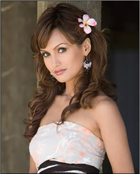
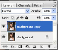
Step 2: Duplicate the Background layer.
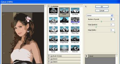
Step 3: Now apply the Cutout filter (Filter => Artistic => Cutout). On the left side the amount of detail in the vector can be controlled by adjusting the Number of Levels, Edge Simplicity and Edge Fidelity sliders. For this example I am using 5 levels, with the Edge Simplicity set to 3 and Edge Fidelity set to 3. Click OK.
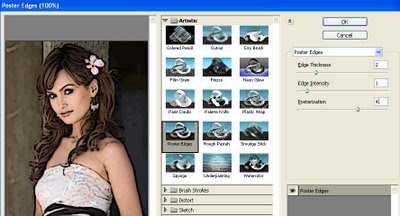
Step 4: You can trace the areas of color divided by the Cutout filter with the Poster Edges Filter. For this example the Edge Thickness is set to 2, Edge Intensity to 1 and Posterization to 4. Click OK.
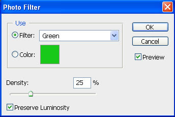
Step 5: The color can be changed subtly with a Photo Filter adjustment layer.
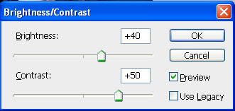
Step 6: And finally, to add to the colored effect, a Brightness/Contrast adjustment layer will help take away the natural highlights/shadows even more.
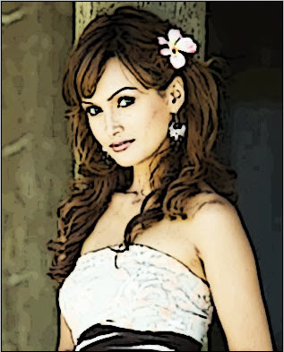
Step 7: Here is my final vector image:
Read more »
Step 1: First I will start with an image.
Step 2: Duplicate the Background layer.
Step 3: Now apply the Cutout filter (Filter => Artistic => Cutout). On the left side the amount of detail in the vector can be controlled by adjusting the Number of Levels, Edge Simplicity and Edge Fidelity sliders. For this example I am using 5 levels, with the Edge Simplicity set to 3 and Edge Fidelity set to 3. Click OK.
Step 4: You can trace the areas of color divided by the Cutout filter with the Poster Edges Filter. For this example the Edge Thickness is set to 2, Edge Intensity to 1 and Posterization to 4. Click OK.
Step 5: The color can be changed subtly with a Photo Filter adjustment layer.
Step 6: And finally, to add to the colored effect, a Brightness/Contrast adjustment layer will help take away the natural highlights/shadows even more.
Step 7: Here is my final vector image:
Subscribe to:
Posts (Atom)


- Follow Us on Twitter!
- "Join Us on Facebook!
- RSS
Contact