Showing posts with label tutorial. Show all posts
Showing posts with label tutorial. Show all posts
Corel Draw Tutorial PDF
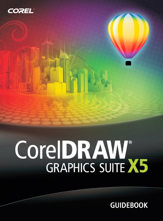
1. Corel Draw X5 Guidebook
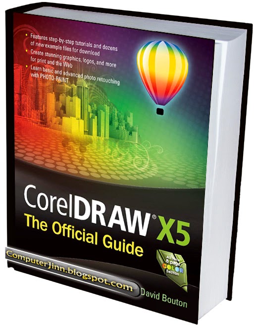
2. Corel Draw X5 The Official Guide eBook

Photoshop Tutorial PDF
1. Photoshop Tips, Tricks and Fixes - Vol.6, 2014

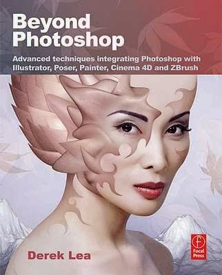
2. Beyond Photoshop Advanced Techniques

3. Photoshop For Photographers Book
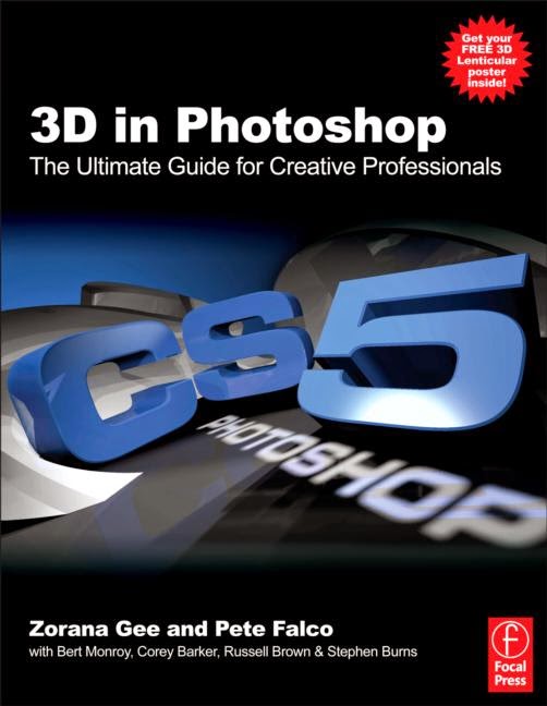
4. 3D in Photoshop The Ultimate Guide for Creative Professionals
5. Photoshop CS3 Restoration and Retouching Bible

6. Photoshop Creative - 125
Saturday, June 13, 2015
–,
corel,
on,
road,
text,
the,
tutorial,
x3
0
comments
Text on the Road – Corel X3 Tutorial
Text on the Road – Corel X3 Tutorial
In this tutorial we will show you how to place text on a street in Corel Draw X3.
Start a new drawing.
Then import a street photo:


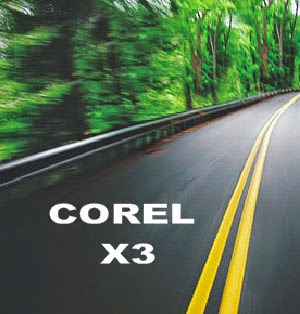



Then import a street photo:
Now type the text you want to add to the road:
Then place it over the picture:
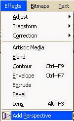
As soon as you finish, add some perspective:
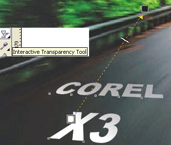
Then, add the Interactive Transparency tool to the text:
Look how cool it is looking now:
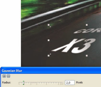
As this is an image in motion, we need to add the same motion to our text.
So lets add some Gaussian Blur:
So lets add some Gaussian Blur:
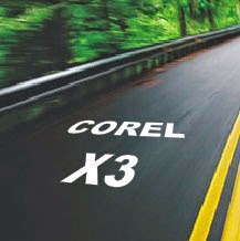
This is the result:
You can do it ...
Download the original source files from this tutorial in Zip format Here
Friday, May 1, 2015
cs6,
design,
drop,
illustrator,
shadow,
tutorial,
vector,
with
0
comments
Design Vector Drop Shadow with Illustrator CS6 Tutorial
In today’s quick tip tutorial, I’m going to show you how to use one of the great new features of Adobe Illustrator CS6, gradient on stroke, to create a 100% vector Drop Shadow and Inner Glow.
So let’s get to it straight away.

So you’ve drawn a random object, in this case I’ve used the Star Tool and you want a drop shadow on it. To get this go to Effect > Stylize > Drop Shadow and you’ll get the blow dialogue box to modify your drop shadow as you wish.
 However if you were to apply this effect and then Object > Expand it and drill down into the group it produces, you’d notice that it contains a raster element. This is the object labeled "Image" which you can see below.
 In fact if you hide the "Image" you’ll just be left with the original shape. So what actually happens?
 What actually happens when you apply the effect is Adobe Illustrator duplicates the shape and then changes the fill color to say black in this case. It then rasterizes the object, blurs it and offsets it. Then the shape is combined with the original to produce Live Effect Drop Shadow. This means you can go back into the options of the Drop Shadow via the Appearance panel to modify anything from the drop shadow fill color, blur and so on. The same is true when you create an Inner Glow effect.
 You can apply a similar process to create an inner glow effect, just by using "Align Stroke Inside".

There are a couple things you need to keep in mind. You can’t "Align Stroke Outside" with a gradient. To get around this you’ll need to ensure your Drop Shadow color, in this case black, is the most central Gradient Slider and at 100% Opacity. Other than that, you’ll find you can increase the Drop Shadow "blur" by playing with the Stroke Weight and even the Gradient Sliders along the top.
 Let’s just look at this a little more closer and Object > Expand our Gradient on Stroke. When you do this, you’ll notice the Gradient on Stroke is just a Gradient Mesh! So not a raster element as the Live Effect Drop Shadow uses. This makes it a vector Drop Shadow.
 To prove furthermore it’s a Gradient Mesh and one you can actually edit, I’ve used the Direct Selection Tool (A) to select all the points in the corner of our mesh and changed the color to blue.

 Use the duplicate of the original shape to then create a Clipping Mask (Command + 7) and there you’ll have your Inner Glow.

Read more »
Introduction Design Vector Drop Shadow with Illustrator CS6 Tutorial
In today’s quick tip tutorial, I’m going to show you how to use one of the great new features of Adobe Illustrator CS6, gradient on stroke, to create a 100% vector Drop Shadow and Inner Glow.So let’s get to it straight away.
Taking Apart the Drop Shadow
Before we get into how to achieve this drop shadow, we need to understand what actually happens when we use a Drop Shadow effect in Adobe Illustrator at present and why it isn’t completely vector.So you’ve drawn a random object, in this case I’ve used the Star Tool and you want a drop shadow on it. To get this go to Effect > Stylize > Drop Shadow and you’ll get the blow dialogue box to modify your drop shadow as you wish.
100% Vector Drop Shadow – CS5 Style
If you’re a regular reader of VectorTuts+, you may have seen a similar tutorial title a couple of years back. In fact I did a video quick tip tutorial on how to create a 100% vector drop shadow in Adobe Illustrator CS5. This is done by making use of "Align Stroke Outside" in the Appearance panel.100% Vector Drop Shadow – CS6 Style
So how can we achieve a Drop Shadow in CS6? Simple, by duplicating your shape and giving it say a black fill and then a black transparent linear gradient stroke set to "Apply gradient across stroke".There are a couple things you need to keep in mind. You can’t "Align Stroke Outside" with a gradient. To get around this you’ll need to ensure your Drop Shadow color, in this case black, is the most central Gradient Slider and at 100% Opacity. Other than that, you’ll find you can increase the Drop Shadow "blur" by playing with the Stroke Weight and even the Gradient Sliders along the top.
100% Vector Inner Glow – CS6 Style
If only you could use "Align Stroke Inside" with Gradient on Stroke, because creating an Inner Glow would be a lot easier. However as you can see from the below, the option is greyed/nulled out. So to create an Inner Glow first duplicate your original shape. Then put your fill on as normal and then "Apply gradient across stroke" with the previously used transparent linear gradient. Give the stroke only a Blending Mode and Opacity.Conclusion
Why would you want to do this? Well if you’re a vector freak like me, the thought of having any raster elements in your work makes your skin crawl and you’d like to go that extra mile to ensure every part of your work is vector. Maybe I’ve just confessed to some bizarre vector OCD. Anyway other than that, it’s just a bit of an exercise for those who like to exercise their scalable brains. I hope you’ve enjoyed this tip!
adobe,
bridge,
cs2,
cs6,
icon,
illustrator,
tutorial
0
comments
Adobe Bridge CS2 Icon Illustrator CS6 Tutorial
Adobe Bridge CS2 Icon
This tutorial will show you how to replicate the Adobe Bridge icon in Illustrator CS6 using the same techniques as the Photoshop Splash Page tutorial. You will be surprised how easy it is to create such as complicated icon with gradient & blending mode.Download Source File
Required: Illustrator CS2+
1. Place Images
First, place in the original Adobe Bridge icon image in Layer 1 for reference. Double click on Layer 1 and change the following Layer Options: check Lock and Dim Images to 50%.
2. Start Tracing
Make a new layer. Hold down Ctrl key and click on the Visibility icon of Layer 2 to view that layer in Outline Mode. Now use the Pen tool and start tracing the basic shapes of the sea shell.

3. Gradient
Select the top layer and apply a 2 colors radial gradient (color 1 = m5, color 2 = c26, m86, y44). Use the Gradient Tool (G) and drag from the lower center to top corner. This will re-position the gradient.
4. Multiply Blending Mode
Now in the Transparency palette, select Multiply Blending Mode. Notice this will create the see through effect.
5. Back Layer
Select the back sea shell layer, fill it with another radial gradient (color 1 = c21, color 2 = c26, m86, y44). Again, you need to use the Gradient Tool to position the gradient. Then, select Multiply Blending Mode.
6. Top Layer
Select the top layer and fill it with different color gradient (color 1 = m5, color 2 = c33, m95, y62). Again, select Multiply Blending Mode.
7. Eyedropper
Select the rest of the unfilled paths, use the Eyedropper tool and click on the top layer to copy the gradient fill. To get the best result, you might need to use the Gradient Tool to adjust the gradient position of each shape.
8. Icon Base
Make a rectangle box and then apply 25pt round corner (Effect > Stylize > Round Corners).
9. Drop Shadow
Now go to Effect > Stylize > Drop Shadow and apply the following setting:
10. Gradient
Use the Gradient Tool and apply a 3 colors gradient as shown (color 1 = k0, color 2 = k16, color 3 = k13).
11. Add New Stroke
To make an inner glow effect, we need to add a new stroke. in the Appearance palette (top right corner dropdown menu), select Add New Stroke.
Align Stroke Inside
In the Appearance palette, selct the new added stroke, fill it with 4pt white stroke color. Then open the Stroke palette, and click on Align Stroke to Inside.
12. White Background
Notice when you place the sea shell on top of the icon base, the sea shell is see-through because the blending mode has been set to multiply? We can get rid of that by adding a white background to the sea shell. First copy the entire sea shell to clipboard, then merge the current sea shell by Alt-click on Add to shape area (Pathfinder palette).

Final
The image on the left is my version and the image on the right is the original version.
iTune Icon Illustrator CS6 Tutorial
The challenge of this tutorial is to use various Blending modes and blending techniques to replicate the iTune icon. This tutorial is a good exercise to master your Blend techniques.Download Source File
Required: Illustrator 9+
1. Basic Shapes
Start making the basic shapes of the iTune icon. If you need help on how to trace from an image, visit my Tracing Photo tutorial.
2. Music Note
Make a glossy orb by using my Glossy Button technique. First, make 3 shapes from light color to dark color. Go to Object > Blend > Blend Options, select Specified Steps = 128. Then select all 3 shapes and press Ctrl + Alt + B or go to Object > Blend > Make.
Reflection
Make an oval shape and fill with black-white gradient. Make sure the black color is full black (C,M,Y,K=100). Drag it on top of the orb and select Screen Blending Mode.
Highlights
Make a tall vertical rectangle and an elongate circle; then Blend it. Duplicate it by Alt-drag to the right.


3. CD
Use the Gradient tool and fill the CD shapes with white-grey gradient.
Rainbow Gradient
Make some multi-color line strokes as shown below. Make sure the first and last stroke is white because it will be transparent. Use the Blend Tool (W), click on the edge of each stroke starting from left to right.
Mask
Use the CD shape and mask the rainbow gradient by Ctrl+7 or Object > Clipping Mask > Make. Then select Multiply Blending Mode and adjust the Opacity to 26%.

4. Music Note Refection
Make 3 oval paths, make sure the outer path is white color(this will make a glow effect). Select all 3 paths, go to Object > Blend > Make (Ctl+Alt+B).

5. Drop Shadow
The last step is to apply a Drop Shadow effect to the CD. Select the outer CD path, go to Effect > Stylize > Drop Shadow and apply the following setting:
Final
Here is the final iTune icon!
Subscribe to:
Posts (Atom)


- Follow Us on Twitter!
- "Join Us on Facebook!
- RSS
Contact