Showing posts with label typography. Show all posts
Showing posts with label typography. Show all posts
Friday, April 3, 2015
create,
how,
in,
photoshop,
to,
typography,
wallpaper
0
comments
How To Create Typography Wallpaper in Photoshop
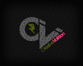
Step 1
Create a new document at 1200 x 800 pixels with a resolution of 72dpi. Start off by importing all of your vector designs separately into a Photoshop canvas. In this case we divided our vectors into 3 separate smart objects and dragged them into the Photoshop canvas.
Step 2
Hide all vectors and create a new text box. In this case I typed out the name of our company, "Creative Volition Inc.". The font we chose was "ITC Avant Garde Gothic". Keep your font in full caps, especially if your using this one! Continue to copy/paste your text across the text box.
Step 3
Text settings: 16pt font, Regular, 16pt height spacing, Color #404040.
Step 4
Continue to copy/paste the text until it fills the entire canvas. Stretch the box out using the text tool until it expands beyond the canvas size.
Step 5
Once the text box is filled completely with the copy begin to rotate the box clockwise in about a 45 degree angle.
Step 6
Make one of the smart objects visible. Command/Apple click the preview box on the layer panel to create marching ants around your object.
Step 7
Once the marching ants appear, hide your smart object so you can see the selection.
Step 8
Rasterize the type layer and with the marching ants active on your rasterized layer click Edit > Cut.
Step 9
Then click Edit > Paste and align your new layer so all the words connect. Open the Layer Style box and change the "Color Overlay" to white.
Step 10
Continue to do the same procedure with your other smart object layers but make sure to always cut from the rasterized layer.
Step 11
Lastly create a new layer and fill it with any color. Place this layer on top of all other layers. Drop the fill down to 0%. Open the Layer Styles box and change the inner glow to the following settings and click OK.

Conclusion
Thats it! You should now have a beautiful design in front of you.
Source : Abduzeedo
 About The Writer
Hello! My name is Tommy. Im a blogger, I love graphics design and now i went to Architechture Technical Senior High School. | Facebook |

Typography Text Effect
Final View
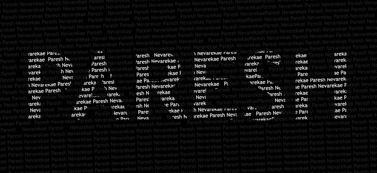
Step 1 :-
Create new file..
Paint background with Black color (Shft+f5 or Fill Color)

Step 3 :-
Select a Horizontal Type text tool from tool box and type the word for giving effect..
bold the font you use for better effect.
I use the text "PARESH" for same..

Now rasterize this layer by right clicking on the text layer.
and make this layer invisible by clicking on eye .
Step 4 :-
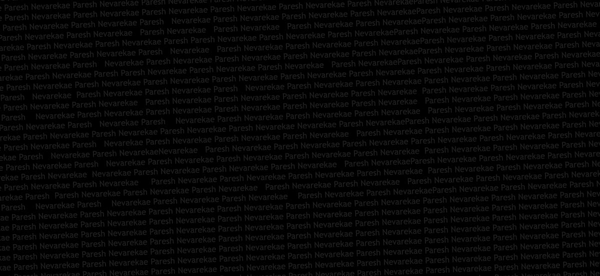
Select a Horizontal Type text tool from tool box and type words/characters for background..
copy paste it again and again so that it will cover full size of image.
use font 12-15 px max.. set color of font to "#1b1b1b".
Step 6 :-
Now make the layer "paresh" visible.. and select the ants/borders of the layers..
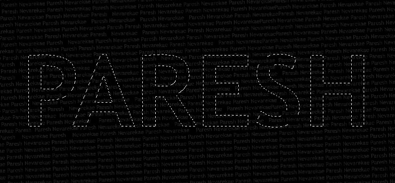
Again make this layer invisible.. Now you will get the selected area of the text..
Step 7 :-
Select the Text background layer and capy selected atea and paste it..
adjust the new layer to the backgrounds text or match it with background.
go to layer properties and change color Overlay to white..

Done...!! :-)

Step 1
Open Adobe Illustrator and go to View>Show Grid. Then select the Rectangle Tool (M) and create 2 squares and 2 rectangels like the image below.
Step 2
To create the M select the Pen Tool (P) and add 2 points 2 blocks away from the center.
Step 3
Add 2 more points and the move then nudge them up 2 blocks.
Step 4
Now add another point in the very middle of the line and then nudge that point down 1 block. Use the image below for reference.
Step 5
To finish the M, again with the Pen Tool (P) add 3 new points but move only the middle one down.
Step 6
For the other letters its pretty much the same, use the Pen Tool (P) and use the same technique we used for the M. Use the image below for reference.


Step 7
Open Photoshop and create a new document, I used 1920x1200 pixels for the size. Then copy the letters from Illustrator and paste them in Photoshop. Each font has to be in one layer. The Background will be black white the word will be white.
Step 8
To create the milk splashes I used some stock photos. You can download the first image at http://www.shutterstock.com/pic-27264406-splash-in-a-milk-glass.html.
Step 9
Copy the image and paste in the document. Go to Edit>Transform>Scale and resize it so it fits the width of the M. With the Eraser Tool (E) delete some areas at the bottom of the photos. Also with the Stamp Tool (S) paint the parts where you can see the glass, the idea is to hide the glass and leave just the milk parts.
Step 10
With the Eraser Tool (E) erase the part of character M on the top right corner where the effect wasnt looking really nice with the milk spalsh.
Step 11
For each character we will use a different photo, that way the effect will look more convincing. You can use only one and just tweak it with the warp tool as well. The photo I used for the "I" can be downloaded at http://www.shutterstock.com/pic-12058783-splash-in-a-milk-glass.html
Step 12
Paste the image in the photoshop document then with the Magic Wand Tool (W) select the black area of the image and delete it. Go to Edit>Transform>Rotate. Also resize it so it fit with the width of the "I"
Step 13
With the Rectangular Marquee Tool (M) delete the bottom part of the image where you could see the glass, then select an area that is uniform and go to Edit>Transfor>Scale. Make the area much higher like the image below and then with the Eraser Tool (E) use a very soft brush and delete the bottom of the milk splahs until you have a very smooth transition. You can move down the whole splash a little bit as well.
Step 14
Try to look for different images for each characters, for the L I used another photo from Shutterstock, you can download it at http://www.shutterstock.com/pic-10532656-milk-splash-against-dark-background.html. Then repeat the same thing we did for the other letters to match the image with the text.
Step 15
For the K I used another image that you can find at http://www.shutterstock.com/pic-15459070-milk-splash-on-a-blue-background.html.The first thing to do is convert it to greyscale. Go to Image>Adjustment>Desaturate. After that go to Image>Adjustment>Levels. Increase the Black Input until you have almost a black background, then with the Magic Wand Tool (W) select and delete the background of the splash image. Go to Edit>Transform>Scale and move it and resized it to match the width of the K, then with the Eraser Tool (E) delete some areas of the splash like the image below. Tip: use the [ and ] to increase or reduce the Eraser size, its very important to delete the right areas to make the effect more realistic. Try to follow the flow of the milk.

Step 16
Select the K and with the Eraser Tool (E) delete the top right corner of the letter.
Step 17
As we used different images and some of them had some color variations, such as the images over the M and L. So to make them look more uniform go to Layer>New Adjustment Layer>Gradient Map. Select the Reverse option and that will be enough to make the splashes look the same.
Step 18
To create the Depth of Field effect, just copy a part of one of those images that have quite a few drops and paste in the document, in my case I used the top right corner of the image used in the step 15. Copy and paste it in the document and again, go to Image>Adjustments>Desaturate, and Image>Adjustments>Levels increasing the Black Input to make the background turn to black. After that go to Edit>Transform>Scale and make it much bigger and go to Filter>Blur>Gaussian Blur. Use 15 for the amount.
Conclusion
Click on Control/Command + Alt + Shift + E to create a new layer with all the layers merged. Then go again to Filter>Blur>Gaussian Blur. Use 10 pixels for the amount. After that change the Blend Mode to Screen and the Opacity to 50%.Also place your logo and the effect is practicaly done. You can add more splashes or try different colors. The idea is basicaly to learn how to mix the milk splashes with the vector text and make them look real. I hope you enjoyed the tutorial and let me know if you have suggestions for this or other tutorials.

Source : Abduzeedo
About The WriterHello! My name is Tommy. Im a blogger, I love graphics design and now i went to Architechture Technical Senior High School. | Facebook |
Subscribe to:
Posts (Atom)


- Follow Us on Twitter!
- "Join Us on Facebook!
- RSS
Contact