Showing posts with label in. Show all posts
Showing posts with label in. Show all posts
Friday, June 12, 2015
9,
for,
how,
in,
layer,
masks,
precise,
pse,
selections,
to,
use
0
comments
How to use Layer Masks for precise selections in PSE 9
There is a wonderful addition amongst the rich set of features in PSE 9 - Layer masks. This was something which was missing in PSE 8. It is a wonderful tool which helps in achieving a lot of good results in different editing operations. This tool is specially helpful for people like me who arent that precise in selection tools like lasso,quick selection etc. However, are more comfortable with the paint brush and eraser.
 In this tutorial, I will be using Layer Masks to move one object from one image and place it on other precisely without using any of the other selection tools in PSE like Lasso, quick selection etc.
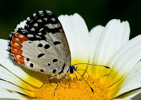
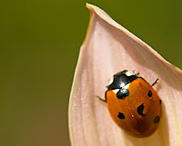
I have the following two pictures : one is butterfly on a white flower and other is a lady bug on a pink leaf. Now I want to place the lady bug from the second picture on the flower leaf of the first picture, next to the butterfly.
1. I opened both the images in PSE 9 Editor.
2. Now I keep the image of butterfly in display in the editing workspace.
Select the Move tool from the tools bar and drag the ladybug image from the project bin below over to the butterfly image in the workspace.
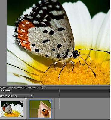
3. Now as you see in the image below, the lady bug image comes over the butterfly image occupying a lot of space. Also you would notice that there is a new layer formed in the layers palette which is that of the lady bug image.
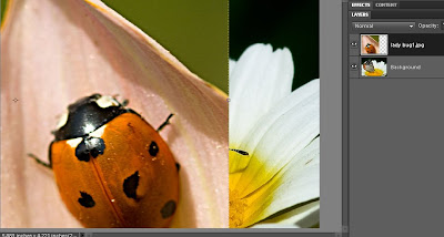
Just drag one of the corners of the lady bug image inwards to reduce its size.
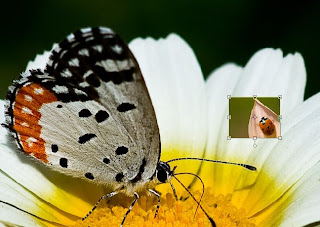
Now one can rotate the image of the lady bug by dragging the corner of the image keeping Control key pressed and revolving it through the corners like this.
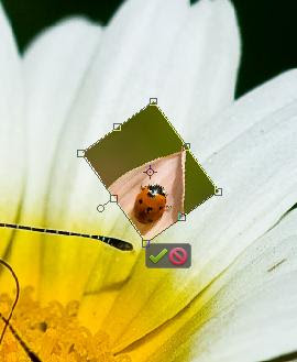
Click the commit green button when you think that the orientation is correct.
4. Now select the lady bug layer in the layers palette and go to Layer> Layer Mask> Reveal All.
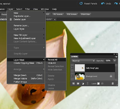
As you do this you would see that there is one white mask that got created in layers palette.
5. Now select the Brush tool from the tools bar and black color selected as foreground color in the color swatch (as shown below). Now brush over the rest of the area of the lady bug layer leaving just the lady bug. This will remove the pink and green background of the ladybug in the layer.
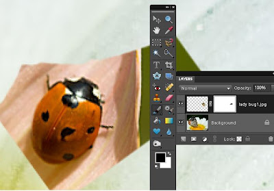
As you click and drag the mouse with the paint brush you would notice that some black color gets painted in the white mask in the layers palette. And you would see the pink leaf disappearing.
In case you mistakingly paint any unwanted area or some extra area, you can correct it by changing the foreground color in the color swatch to white and paint over that area again. So you can keep switching between black and white foreground colors in the color swatch to correct your selection.
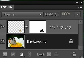
Also for best results, zoom the image to 200-300% and reduce the brush size when you brushing around the corners of the lady bug to get precision.
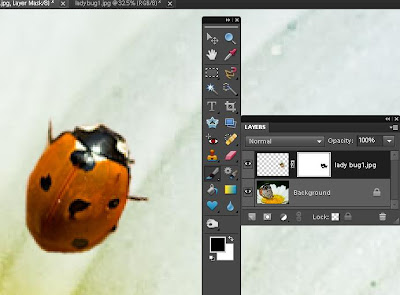
Once you are done, select zoom tool and right click -Fit to screen.
6. Now select the move tool again and move the lady bug over the white flower and change its orientation as per your needs. You may transform it using Control+Shift+Alt and dragging the corners.
Here is my final result ;
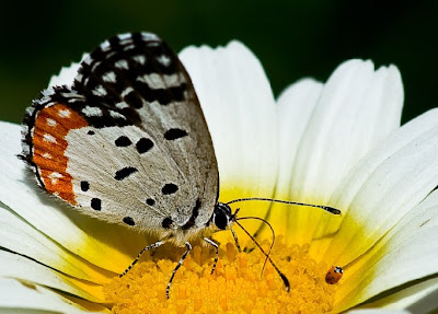
Layer Masks can be used in several other workflows like selective editing in a picture or applying filters to some part of the image etc.
Hope you would find it useful too.
Read more »
In this tutorial, I will be using Layer Masks to move one object from one image and place it on other precisely without using any of the other selection tools in PSE like Lasso, quick selection etc.I have the following two pictures : one is butterfly on a white flower and other is a lady bug on a pink leaf. Now I want to place the lady bug from the second picture on the flower leaf of the first picture, next to the butterfly.
1. I opened both the images in PSE 9 Editor.
2. Now I keep the image of butterfly in display in the editing workspace.
Select the Move tool
from the tools bar and drag the ladybug image from the project bin below over to the butterfly image in the workspace.3. Now as you see in the image below, the lady bug image comes over the butterfly image occupying a lot of space. Also you would notice that there is a new layer formed in the layers palette which is that of the lady bug image.
Just drag one of the corners of the lady bug image inwards to reduce its size.
Click the commit green button when you think that the orientation is correct.
4. Now select the lady bug layer in the layers palette and go to Layer> Layer Mask> Reveal All.
As you do this you would see that there is one white mask that got created in layers palette.
5. Now select the Brush tool from the tools bar and black color selected as foreground color in the color swatch (as shown below). Now brush over the rest of the area of the lady bug layer leaving just the lady bug. This will remove the pink and green background of the ladybug in the layer.
As you click and drag the mouse with the paint brush you would notice that some black color gets painted in the white mask in the layers palette. And you would see the pink leaf disappearing.
In case you mistakingly paint any unwanted area or some extra area, you can correct it by changing the foreground color in the color swatch to white and paint over that area again. So you can keep switching between black and white foreground colors in the color swatch to correct your selection.
Once you are done, select zoom tool and right click -Fit to screen.
6. Now select the move tool again and move the lady bug over the white flower and change its orientation as per your needs. You may transform it using Control+Shift+Alt and dragging the corners.
Here is my final result ;
Layer Masks can be used in several other workflows like selective editing in a picture or applying filters to some part of the image etc.
Hope you would find it useful too.

Saturday, May 23, 2015
a,
bring,
eyes,
focus,
how,
in,
more,
on,
potrait,
pse,
to,
using
1 comments
How to bring more focus on eyes in a potrait using PSE
1. Select Background layer in layers palette
2. Select the complete eye area ( including the white part ) using any selection tool (i used quick selection tool). Right click over the selected portion and say Layer via Copy. Name this layer in layers palette as Eyes by double clicking the layer in the palette.
3. Now select the background layer again and make a selection for the eye ball regions only. And right click and select Layer via Copy and name this layer as Eye ball.
4. Now Conrol+Click on the layer Eyes to show the eyes selected in the image. Click on Background layer and Select Inverse from right click on image area followed by Layer via Copy. Name this new layer as Blur. This constitutes the whole image except the eye region.
5. Now select the layer Blur and Filter>Blur>Gaussian Blur. Modify the blur to something like 2.5 or lesser. This is done to rest of the image leaving eyes so that eyes are prominent in the image. Click Ok. You can later on modify the opacity of the layer making it more transparent if you want to decrease the blur effect. You can do that by selecting this layer in the layer palette and moving the opacity slider on right top of layers palette.
6. Now select the layer Eyes. Go to Enhance>Adjust Sharpness. Now make changes to the amount and radius. Click Ok. You can vary the sliders as per your needs and preview it side by side in image area or preview area in the dialog. Do not oversharpen as it makes the eyes look artificial.
7. Now select only the layer Eye ball and select Enhance >Unsharp mask.
I changed the amount to near 50% and radius to near 16. This details out the pattern inside the eye ball and brings more focus to the eye region.
8. You can now also increase the saturation of this layer by Enhance>Adjust color>Adjust Hue/Saturation. You can select the Grrens from the combo box if you obly want to saturate the Green of the eyes using the Saturation slider.
Click Ok.
Here are the initial and the final images :
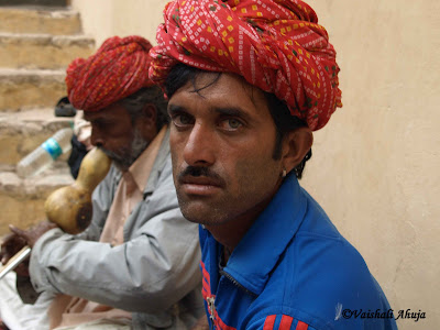
(Click to have larger views to see differences)
Friday, May 22, 2015
awesomeness,
elements,
folders,
in,
of,
organizer,
photoshop,
watch
0
comments
Awesomeness of Watch Folders in Photoshop Elements Organizer
Watch Folders : This functionality is a little hidden in Elements Organizer (File>Watch Folders) and not many know about it usefulness. It is one quick way to get media into your Organizer catalog without bothering about manually importing into it.
To use it, just make the parent folder (of all your photo folders) as the watch folder and it auto imports the media into your Organizer catalog. As soon as any new picture is added to your watch folder in windows explore or to any child of your watch folder, it would be auto-imported to your Organizer catalog.
For example, mostly all my pictures are dumped to one of following three folders (shown in screenshot). So i have made all three as my watch folders. Hence I never need to import any media to my Organizer catalog.
Awesomeness is added if you say exchange photos or receive photos through dropbox. You can add dropbox as your watch folder. Hence all media comes to your Organizer catalog automatically.

I find this feature very useful as it saves a lot of my time. The dropbox idea was shared by one of the Elements user(Thanks Mellissa) and I really found it useful. So just thought to share this tip with everyone!
Thursday, May 21, 2015
bring,
effect,
how,
ice,
in,
text,
to
1 comments
How to bring Ice effect in text
I looked at few tutorials on this for Photoshop and tried the same in PSE. Its simple and cool effect.
1. Open a blank document with black background. Write some text with Black color on it.
2. Now Control click on the text layer so that the text gets selected as shown.

3. Go to Filter>Artistic>Plastic Wrap. Now repeat this filter 10 times by pressing Control+F 10 times. The result may look something as shown below.

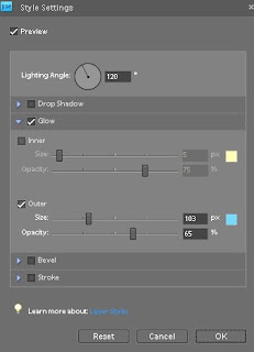
4. Now go to Layer>Layer Style>Style settings. Select Glow>Outer glow and select the color from color swatch to be "79d9f9". The output may look like as shown below :
5. Now rotate the image by 90 Right from Image>Rotate>90 Right. Now from Filter menu>Stylize>Wind. Click Ok. The output text would appear like this :
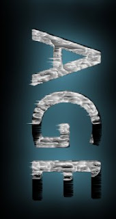
Now rotate Left 90 to bring it back.
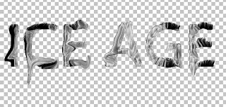
6. Now go to Filter >Distort>Liquify. Use the Warp tool at some of the places to warp some areas of the text to given more frozen ice effect. The output may appear like this :
7. You may add a little Bevel from Layer Setting dialog.
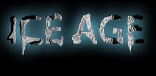
8. Now go to Enhance>Adjust Color>Adjust Hue/Saturation. And change the color of the text to some less saturated bluish grey.
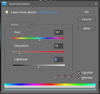
Check the checkbox "Colorize". Here is how it will look after that :
Check the checkbox "Colorize". Here is how it will look after that :

One may add Wind effect again by rotating as we did in step 5. Here is my final output after applying the effect again :

Tuesday, May 19, 2015
better,
for,
how,
in,
making,
pse,
quick,
selection,
selections,
the,
to,
tool,
train
0
comments
How to train the quick selection tool for making better selections in PSE
Quick selection is a great tool for selecting objects in any image. It intelligently selects the object distinctly from the background by detecting the brightness, contrast and tonal changes along the objects and their backgrounds. It takes just a little mouse drag with in an object to select an background.
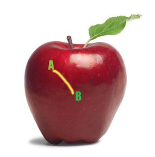
For example : for the image below I just dragged my mouse from point A to point B for selecting the whole apple instead of moving my mouse along the edges of the whole apple which we would require for other selection tools.
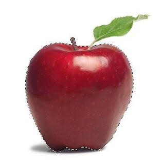
This is how my object was selected moving my mouse from point A to B (Please note I increased the brush size to 35 px from options bar after selecting the quick selection tool for making this selection) :
However in the above image, there is good contrast between the object to be selected and its background. So we did not need to train our quick selection tool. But for getting better results in minimum time when there is not much great color difference or contrast between our object and background, it is recommended that you train your quick selection tool.
So in an image like below, where there is not that great color contrast between yellow flower and its background, we would train our tool.
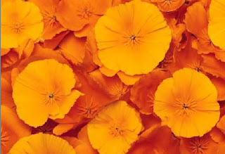
So if I move my quick selection tool from point A to B to select the yellow flower, here is what
I get as selected :
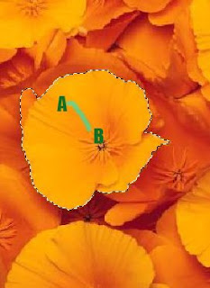
However I did not need this extra highlighted(green) part in my selection(as shown below) which was selected when I moved my mouse from point A to point B. But since there is a low contrast between the orange and the yellow here, this area too got selected.
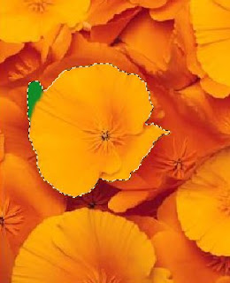
So instead of selecting my flower in one go as shown above, I follow the steps below to get my needed selection :
1. Select a very small part of the yellow flower as shown after selecting Quick selection tool.
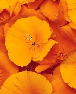
2. Now I will press Alt key and keeping it pressed, I click and drag my mouse over the area I did not want in the selection. So I brush my mouse over the green highlighted region shown in the second last image.
I also notice that as soon as I click Alt key my mouse cursor changes from "+" to "-" as it tell what area not to select.
Once I am done with that I leave the Alt key back and again move my mouse from point A to B as I did earlier and here is how I get my desired selection :
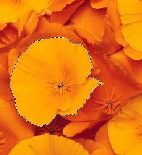
So here I have trained my quick selection tool not to select what areas of contrast. So if I had the similar background around the whole flower, then I would just drag my mouse once along the boundaries of the flower to tell my tool about the low contrast areas which I do not want to select.
Also keep in mind that if you have a large and random objects to be selected then you should keep subtracting the wrong selections you make as you sweep and not to defer the subtraction task in the end. This trains my tool at every step of selection and tell it what "not" to selection as it goes ahead.
I hope you find this tutorial helpful!
Read more »
For example : for the image below I just dragged my mouse from point A to point B for selecting the whole apple instead of moving my mouse along the edges of the whole apple which we would require for other selection tools.
This is how my object was selected moving my mouse from point A to B (Please note I increased the brush size to 35 px from options bar after selecting the quick selection tool for making this selection) :
However in the above image, there is good contrast between the object to be selected and its background. So we did not need to train our quick selection tool. But for getting better results in minimum time when there is not much great color difference or contrast between our object and background, it is recommended that you train your quick selection tool.
So in an image like below, where there is not that great color contrast between yellow flower and its background, we would train our tool.
So if I move my quick selection tool from point A to B to select the yellow flower, here is what
I get as selected :
However I did not need this extra highlighted(green) part in my selection(as shown below) which was selected when I moved my mouse from point A to point B. But since there is a low contrast between the orange and the yellow here, this area too got selected.
So instead of selecting my flower in one go as shown above, I follow the steps below to get my needed selection :
1. Select a very small part of the yellow flower as shown after selecting Quick selection tool.
2. Now I will press Alt key and keeping it pressed, I click and drag my mouse over the area I did not want in the selection. So I brush my mouse over the green highlighted region shown in the second last image.
I also notice that as soon as I click Alt key my mouse cursor changes from "+" to "-" as it tell what area not to select.
Once I am done with that I leave the Alt key back and again move my mouse from point A to B as I did earlier and here is how I get my desired selection :
So here I have trained my quick selection tool not to select what areas of contrast. So if I had the similar background around the whole flower, then I would just drag my mouse once along the boundaries of the flower to tell my tool about the low contrast areas which I do not want to select.
Also keep in mind that if you have a large and random objects to be selected then you should keep subtracting the wrong selections you make as you sweep and not to defer the subtraction task in the end. This trains my tool at every step of selection and tell it what "not" to selection as it goes ahead.
I hope you find this tutorial helpful!
Sunday, May 17, 2015
create,
customized,
easily,
how,
in,
pse,
to,
watermarks
0
comments
How to easily create customized watermarks in PSE
Here are the quick steps :
- First open a new file with transparent background.
- Create a text layer with the text you want on watermark.
- Customize it as you want. You may use bevels effect on the text layer from effects pallette. Add glow, strike etc by clicking on the icon one right side in the text layer in the layers pallete. You may add gradient if you want and customize it as you like.
- Then just add this as a brush from Edit menu >Define brush. Now this will be added to your brushes in preset manager.
- Whenever you want to watermark any picture, just click on Brush tool and choose the brush you created from top toolbar. You may also select different patterns from patterns dropdown and then just stamp them on your pictures. I am not sure if people use this or not. It was just a workaround which I got for myself.
Wednesday, May 13, 2015
and,
content,
create,
have,
how,
in,
own,
panels,
pse,
templates,
them,
theme,
to,
using,
your
0
comments
How to create your own theme templates using PSE and have them in your content panels
You can create your own custom themes for the different creations like Greeting card, Photo book, CD/DVD jacket etc and have them placed in your content panel of Photoshop Elements Editor.
Here are the steps with which I created my own theme "Mothers Day" for Mothers day and had it placed in my content panel.
1. Create a blank file from File>New>Blank File. Select default size of the file.
2. Now paint it with the color you like. I painted pink and used gradient tool to give non monotonous effect of the background.
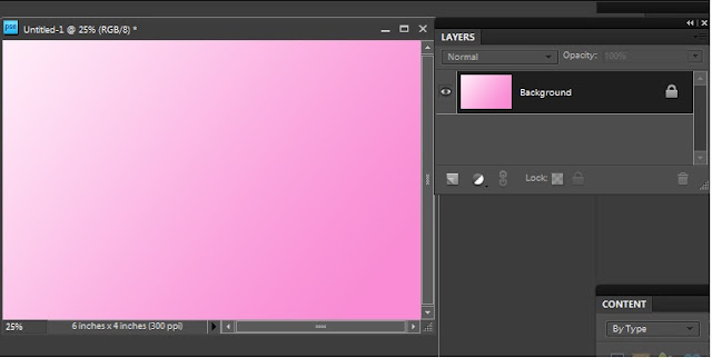
3. Save this as a jpeg on your hard drive. This step is workaround for PSE8 where there is no way of creating a smart object from a leyer as we had in PSE7. Once you have saved the jpeg, click on close widget of the file you were previously working with. It will ask you to save the untitled file. Say No. This will bring back the file you were working till step 2.
4. Now select the background layer from layers pallette and File>Place and select the jpeg saved at step 3. Click on the green checkmark shown shown over the image.
As soon as you do this, you would notice that there is a layer created as a smart object with a tiny icon on the layer thumbnail as shown below. And this layer is exactly as your background layer.
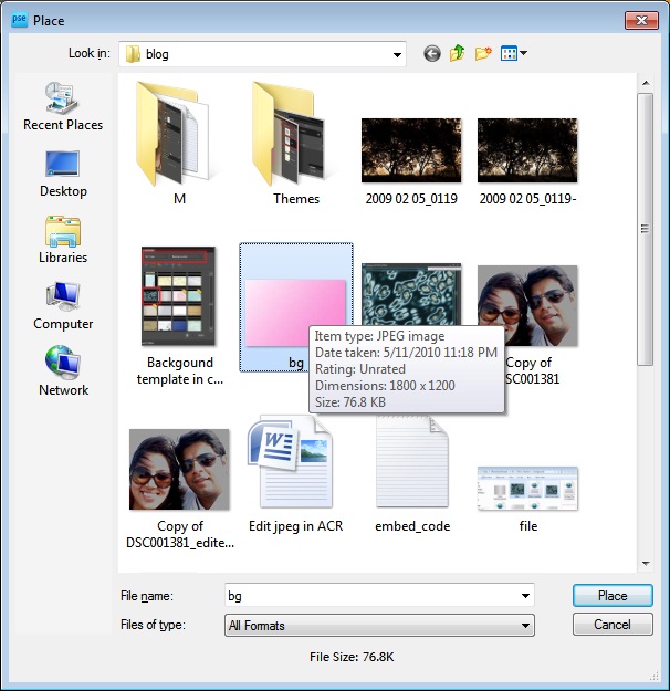
So by now, you would have understood why we saved the background as a separate jpeg in step3. The reason is, in PSE8, we can create smart objects using File>Place. In PSE 7, we do not need the step 3 as we can directly create the background layer as a smart object. This is a workaround in PSE8.
5. Now you can create a duplicate of this smart object layer by pressing Control+J and delete the original background layer.
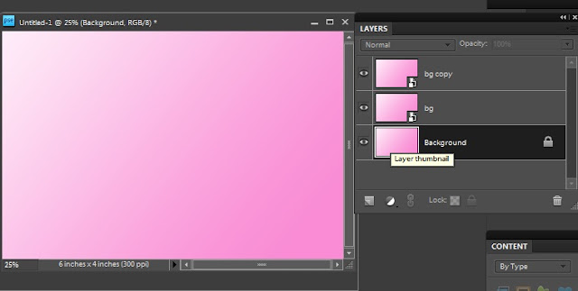
6. From Window meniu, select Content. This will result in Content pane appear in right hand panel.
7. Select "By Type" from Category and "Frames" in sub category.
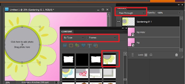
8. Drag a frame from the frames shown in the content bin to the image. Once you do this, you will notice that the blending mode for the frame dropped is "Pass through".
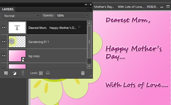
9. Add text layer and put some text to your theme. I am creating a Mothers day greeting card template in this example. So I added the text as shown below.
11. Save this file as a psd. I saved it as "Mothers day.psd"
12. Create a template file with name "<filename>.metadata.xml". I created "Mothers day.metadata.xml"
13. Copy the following into your xml file :
**************************************************************************
Also note that you can edit the categories and sub categories as per your needs. For example my above theme will appear under category Event and sub category Celebration. Similarly in category Color and sub category Pink.
You can customize these as per your needs.
14. Now place your jpeg and your metadata xml file at location :
On XP : C:Documents and SettingsAll UsersApplication DataAdobePhotoshop Elements8.0Photo Creations hemes
On Win 7 : C:ProgramDataAdobePhotoshop Elements8.0Photo Creations hemes
Please make sure that your Editor is closed and you relaunch it to see the background created in your content pane.
If you still do not find it in the content pane in Background category, close Editor and rename the file : "C:Documents and SettingsAll UsersApplication DataAdobePhotoshop Elements8.0Localeen_USMediaDatabase.db3" followed by application relaunch. The launch may take sometime as application creates thumbnails for your background at the location where you have created your jpeg.
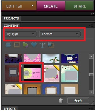
After relaunch, here is where I see my Mothers day theme in Content Panel from Create Pane>Photo Book or Greeting Card :
I hope you find this tutorial useful!
Read more »
Here are the steps with which I created my own theme "Mothers Day" for Mothers day and had it placed in my content panel.
1. Create a blank file from File>New>Blank File. Select default size of the file.
2. Now paint it with the color you like. I painted pink and used gradient tool to give non monotonous effect of the background.
3. Save this as a jpeg on your hard drive. This step is workaround for PSE8 where there is no way of creating a smart object from a leyer as we had in PSE7. Once you have saved the jpeg, click on close widget of the file you were previously working with. It will ask you to save the untitled file. Say No. This will bring back the file you were working till step 2.
4. Now select the background layer from layers pallette and File>Place and select the jpeg saved at step 3. Click on the green checkmark shown shown over the image.
As soon as you do this, you would notice that there is a layer created as a smart object with a tiny icon on the layer thumbnail as shown below. And this layer is exactly as your background layer.
So by now, you would have understood why we saved the background as a separate jpeg in step3. The reason is, in PSE8, we can create smart objects using File>Place. In PSE 7, we do not need the step 3 as we can directly create the background layer as a smart object. This is a workaround in PSE8.
5. Now you can create a duplicate of this smart object layer by pressing Control+J and delete the original background layer.
6. From Window meniu, select Content. This will result in Content pane appear in right hand panel.
7. Select "By Type" from Category and "Frames" in sub category.
8. Drag a frame from the frames shown in the content bin to the image. Once you do this, you will notice that the blending mode for the frame dropped is "Pass through".
9. Add text layer and put some text to your theme. I am creating a Mothers day greeting card template in this example. So I added the text as shown below.
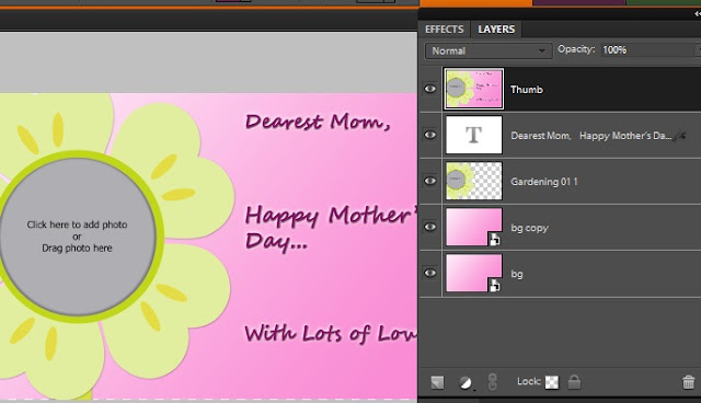
10. Now select all the layers in the palette and right click>Duplicate. This will create duplicate of all layers. Right click again and Merge. name this layer as thumb.
12. Create a template file with name "<filename>.metadata.xml". I created "Mothers day.metadata.xml"
13. Copy the following into your xml file :
**************************************************************************
<?xml version="1.0" encoding="UTF-8"?><PSEContent xmlns="http://ns.adobe.com/PSEContent/2.0/"><name value="$$$/content/themes/Mothers Day=Mothers Day" /><type value="theme" /><creation value="1x1" /><creation value="2x3" /><creation value="3x4" /><creation value="cddvdlabel" /><creation value="cdjacket" /><creation value="dvdjacket" /><creation value="photobook" /><creation value="1x1photobook" /><creation value="3x4photobook" /><category value="$$$/content/category/Event=Event"><subcategory value="$$$/content/category/Event/Celebration=Celebration" /></category><category value="$$$/content/category/Color=Color"><subcategory value="$$$/content/category/Color/Pink=Pink" /></category><category value="$$$/content/category/Style=Style"><subcategory value="$$$/content/category/Style/Cute=Cute" /></category><category value="$$$/content/category/Object=Object" /><category value="$$$/content/category/Mood=Mood"><subcategory value="$$$/content/category/Mood/Fun=Fun" /></category><keyword value="$$$/content/keyword/Toys=Toys" /></PSEContent>
**************************************************************************
Replace the text in the tag with your filename : <name value="$$$/content/themes/<filename>=<filename>" />Also note that you can edit the categories and sub categories as per your needs. For example my above theme will appear under category Event and sub category Celebration. Similarly in category Color and sub category Pink.
You can customize these as per your needs.
14. Now place your jpeg and your metadata xml file at location :
On XP : C:Documents and SettingsAll UsersApplication DataAdobePhotoshop Elements8.0Photo Creations hemes
On Win 7 : C:ProgramDataAdobePhotoshop Elements8.0Photo Creations hemes
Please make sure that your Editor is closed and you relaunch it to see the background created in your content pane.
If you still do not find it in the content pane in Background category, close Editor and rename the file : "C:Documents and SettingsAll UsersApplication DataAdobePhotoshop Elements8.0Localeen_USMediaDatabase.db3" followed by application relaunch. The launch may take sometime as application creates thumbnails for your background at the location where you have created your jpeg.
After relaunch, here is where I see my Mothers day theme in Content Panel from Create Pane>Photo Book or Greeting Card :
I hope you find this tutorial useful!
Sunday, May 10, 2015
animated,
create,
gifs,
how,
in,
pse8,
to
0
comments
How to create animated gifs in PSE8
To give an example of animated gif, i have tried an example of an animation between a cloudy day and a sunny day. You can create anything while you try this out :
1. Take any background as shown in the image :

2. Draw a boatsman like as shown below in a new layer or same layer :

3. Now draw some clouds in a new layer a shown below:
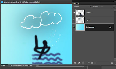
4. Now draw a sun in a separate layer a shown below. If you hide the clouds layer created in step above, you would see the following :
 5. Now merge the layer background and the boatsman by right clicking them and create a duplicate of merged copy. Now merge one of these duplicates with layer Sun and the other duplicate with layer clouds such that you have your layers palette as shown below :

6. Now go to File menu>Save for Web and select the format as Gif, check the checkbox "animate". Check the "loop" checkbox and specify the delay timing. I have mentioned the delay time as 1 second. So this means, my two layers shown above will appear alternatively after a delay of 1 second.
 7. Click Ok and you can check out your animated gif playing in IE or Windows Fax Viewer.

Read more »
1. Take any background as shown in the image :
2. Draw a boatsman like as shown below in a new layer or same layer :
PS : If animation is not visible in the image above , click on the image to open it in the new browser.
Friday, May 8, 2015
3d,
create,
elements,
how,
in,
photoshop,
text,
to
0
comments
How to create 3D text in Photoshop Elements
1. Open a new file in PSE Editor.
2. Now make the default colors in color swatch in the tool bar.
3. Select the text tool from left tools bar.

4. Write some text and simplify the text layer by right clicking the text layer in layers panel and choose "Simplify Layer".
5. Image >Free Transform.
6. Skew the layer to give 3 effect. Press Control and skew the text by extending the left top of the layer towards top left and right top toward a little down left(or some other orientation you may choose). Similar with bottom left and bottom rights.
7. Press Control selecting the text layer.
8. Select a gradient tool and choose colors and stroke from left to right or vice versa.

9. Now from Effects palette, select simple bevel and double click to give bevel effect. Click on the layer effect button on right and change the bevel level to 1 pixel.
10. Now create duplicates of this text layer say 15-20 duplicates. This will create a 3 D effect. Right click last duplicated layer and choose Clear layer style.
Its that easy !
Friday, May 1, 2015
arranging,
artboards,
auto,
cs6,
illustrator,
in
0
comments
Auto arranging artboards in Illustrator cs6
 In this movie Ill how you how to delete and organize art boards from the Artboards panel.
they are in regular alignment once again.Ive saved my progress as 10-page jumble.ai.
Again, its found inside the 02_artboards folder.
The reason I saved these progress files, by the way, is just in case youre dropping in
on a single movie, and you dont have a progress file of your own.
Im going to start by getting my Artboards panel out of the way by clicking on this little
double-arrow icon there. Now switch back to the Artboard tool, and notice that Artboard 10 is selected in my case.Illustrator CS6
I want to show you couple of other options that are available to you.
If you go up to the Object menu, and you choose Artboards, youll get the submenu of commands,
including this one here Fit to Artwork Bounds.
And thats going to go ahead and expand the Artboard so it encompasses every bit of artwork
inside your document. And thats not the effect I want but I wanted to show you that the document is there. Ill go ahead and press Ctrl+Z, or Command+Z on the Mac, to undo that change.
Illustrator CS6 Tutorial Video
Here is another option thats available to you.If you want to scale an artboard so it exactly encompasses the stuff inside of it, you double-click
on it, like so, Now you may ask me well, how is that artboard exactly encompassing that zero.
When youre working with Type inside of Illustrator cs6, the program is always consulting essentially
all the characters in that font.
A lowercase G, for example, would have a descender that comes farther down, and there might be
other characters that have ascenders that go higher up.
And the way you can confirm this is to switch back to the Black Arrow tool here, and then
Id just go ahead and click on the baseline of the zero, and notice that I get this big
bounding box and that bounding box shows me exactly how big Illustrator cs6 thinks that character is.
Im going to press Shift+0 in order to switch back to the Artboard tool, and Im going to
press Ctrl+Z, or Command+Z on the Mac, to undo that change.
Here is what I really want to do.
I want to go ahead and automatically arrange all of these artboards, and I can do that
Illustrator CS6 Tutorial Video
by once again going up to the Object menu choosing the Artboards command, and then choosingRearrange, and Ill get this dialog box here that features those same options that we saw
inside the New Document dialog box, so I can change the arrangement of my artboards if
I want to, but Im happy with the existing layout.
What I want is to have five columns instead of four so that Ill have five columns in two rows of course. Illustrator CS6
And then Im just going to go ahead and increase the Spacing value as well to 1/2 inch like that.
So 1/2" meaning that you have the press Shift along with the quote key.
I do want to move the artwork along with the artboards so Ill leave this check box on,
and then Ill go ahead and click OK, and that takes care of my problems automatically.
And just so that you know, if I bring back up the Artboards panel which I can get by clicking on what is by default, this lowest icon here in this column of panels, and then
I click on whats known as the flyout menu icon in the upper-right corner of the panel.
Illustrator CS6 Tutorial Video
I also have access to the Rearrange Artboards command here, so a little more convenient many times and that brings up that same dialog box that we saw just a moment ago. All right, Im going to cancel out because I dont want to mess things up now that Ive gotten everything perfect. That is how you take advantage of automatic artboardmodifications here inside Illustrator CS6.
Illustrator CS6
adobe,
cs6,
how,
illustrator,
image,
in,
new,
the,
to,
trace,
use
0
comments
How to Use the New Image Trace in Adobe Illustrator CS6
Today we will learn the new features of the tracing engine in Adobe Illustrator CS6 and talk about its new functions. We will trace a photo, a sketch and a texture; then we will compare the results between Adobe Illustrator CS5 and CS6. Let’s get started!
In this tutorial I’ll use a photo a strawberry (credit to deviantART user StockProject1) ; the sketch was kindly provided by Victoria Vasilyeva and the texture (credit to deviantART user ~kingkool6).
 This allows us to use other panels and tools while tracing. Such features did not exist in Adobe Illustrator CS5 as well as in earlier releases; the setting of the tracing was made in the Tracing Options dialog box, and then it was impossible to access the other objects and interfaces.

 The new preset, "Silhouettes" allows quick creation of vector silhouettes.
 After the Expand command we get the vector object with the optimal amount of points.


 Note, in Adobe Illustrator CS6 you can set several of the Palette values. This parameter sets while the vector image is been made in color or in greyscale. As you can see, the new tracing engine in Adobe Illustrator CS6 shows better results.
 There is a new feature in Adobe Illustrator according to which you can instantly check out your original image. To do so, press and hold the eye icon near the View option.


 The overlapping method creates stacked paths, the contours of neighbor objects overlay.

The Minimum Area option corresponds to the Noise option in Adobe Illustrator CS6. This option specifies the size of the smallest areas of the initial image, which will be taken into account while tracing.
The Corner Angle option in Abode Illustrator CS5 corresponds with the Corners option in Adobe Illustrator CS6 and is been set in percentage. The higher value we set, the bigger amount of angles the final image will have.
 In Adobe Illustrator CS6 there are no such function of the tracing as the Blur and the Resample. In Adobe Illustrator CS5 the Blur function is for the reducing the number of small artifacts and smoothing the jagged edges in the final image. The Resample option allows speeding up the process of tracing for big size images, losing the quality of the output image.
 When we use the same preset in Adobe Illustrator CS6 the majority of small details disappear.
 Unfortunately, you need to change the parameters of the tracing manually in order to get the same results in Adobe Illustrator CS6.

 I’ve used different presets and operated the parameters manually, but I still couldn’t get the result which would correspond to the result that can be made in Adobe Illustrator CS5.
Read more »
In this tutorial I’ll use a photo a strawberry (credit to deviantART user StockProject1) ; the sketch was kindly provided by Victoria Vasilyeva and the texture (credit to deviantART user ~kingkool6).
Step 1
In Adobe Illustrator CS6 the settings of the tracing is in the new Image Trace panel (Window > Image Trace).Step 2
The presets have also changed between Adobe Illustrator CS5 and CS6Step 3
Let us evaluate the quality of the tracing using the same preset High Fidelity Photo in Adobe Illustrator CS5 and Adobe Illustrator CS6.Step 4
There were some changes in the Colors parameter. This parameter specifies the number of colors which the final vector image will consist of. In Adobe Illustrator CS5 the Max Colors options can be set in the number values, in Adobe Illustrator CS6 the Colors option can be set accurately in percentage.Step 5
You can get access to additional options of the settings if you press the Advanced key in the Image Trace panel. Now we have an opportunity to choose a tracing method. The Abutting method creates cutout paths. The contours of neighbor objects match.Step 6
The Path Fitting option defines the accuracy of the tracing of the initial raster image. In Adobe Illustrator CS5 the smaller value allows to create a more accurate contour, the bigger- the rough contour. In Adobe Illustrator CS6 it is vice versa, the bigger the value is the more accurate contour we get.The Minimum Area option corresponds to the Noise option in Adobe Illustrator CS6. This option specifies the size of the smallest areas of the initial image, which will be taken into account while tracing.
The Corner Angle option in Abode Illustrator CS5 corresponds with the Corners option in Adobe Illustrator CS6 and is been set in percentage. The higher value we set, the bigger amount of angles the final image will have.
Step 7
Let’s see how the new tracing engine works with sketches. Apply the preset Black & White Logo. The tracing of the sketch in Adobe Illustrator CS5 shows good results.Step 8
Let’s try to make the tracing of the texture. We will use the same Black&White Logo preset. As we can see, the result of the tracing in Adobe Illustrator CS5 looks better than in Adobe Illustrator CS6Conclusion
The new tracing engine really works good with the photos and allows quick and accurate vector silhouettes. But when you use it for tracing sketches and textures you will need to operate all the tracing processes manually, and that will not always show good result. If you work with the sketches and textures, the Live Trace feature in Adobe Illustrator CS5 shows good results when you use the presets. Have you used the trace features in Adobe CS6 yet? If so, what do you think?
Subscribe to:
Posts (Atom)


- Follow Us on Twitter!
- "Join Us on Facebook!
- RSS
Contact