Showing posts with label text. Show all posts
Showing posts with label text. Show all posts
Saturday, June 13, 2015
–,
corel,
on,
road,
text,
the,
tutorial,
x3
0
comments
Text on the Road – Corel X3 Tutorial
Text on the Road – Corel X3 Tutorial
In this tutorial we will show you how to place text on a street in Corel Draw X3.
Start a new drawing.
Then import a street photo:


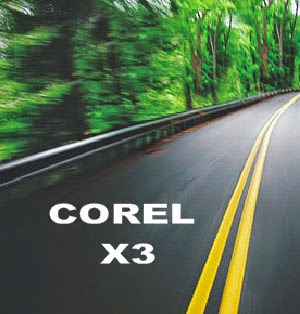
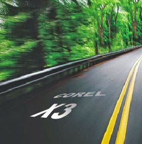
Then import a street photo:
Now type the text you want to add to the road:
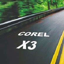
Then place it over the picture:
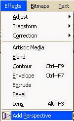
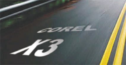
As soon as you finish, add some perspective:
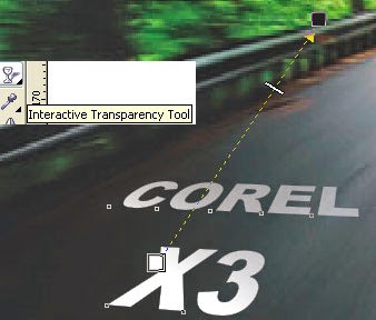
Then, add the Interactive Transparency tool to the text:
Look how cool it is looking now:
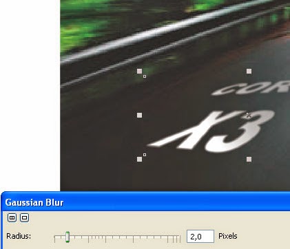
As this is an image in motion, we need to add the same motion to our text.
So lets add some Gaussian Blur:
So lets add some Gaussian Blur:
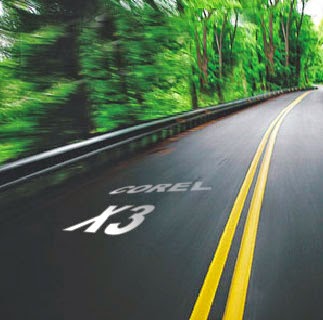
This is the result:
You can do it ...
Download the original source files from this tutorial in Zip format Here

Thursday, May 21, 2015
bring,
effect,
how,
ice,
in,
text,
to
1 comments
How to bring Ice effect in text
I looked at few tutorials on this for Photoshop and tried the same in PSE. Its simple and cool effect.
1. Open a blank document with black background. Write some text with Black color on it.
2. Now Control click on the text layer so that the text gets selected as shown.

3. Go to Filter>Artistic>Plastic Wrap. Now repeat this filter 10 times by pressing Control+F 10 times. The result may look something as shown below.

4. Now go to Layer>Layer Style>Style settings. Select Glow>Outer glow and select the color from color swatch to be "79d9f9". The output may look like as shown below :
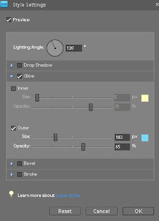
5. Now rotate the image by 90 Right from Image>Rotate>90 Right. Now from Filter menu>Stylize>Wind. Click Ok. The output text would appear like this :

Now rotate Left 90 to bring it back.
6. Now go to Filter >Distort>Liquify. Use the Warp tool at some of the places to warp some areas of the text to given more frozen ice effect. The output may appear like this :
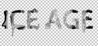
7. You may add a little Bevel from Layer Setting dialog.

8. Now go to Enhance>Adjust Color>Adjust Hue/Saturation. And change the color of the text to some less saturated bluish grey.
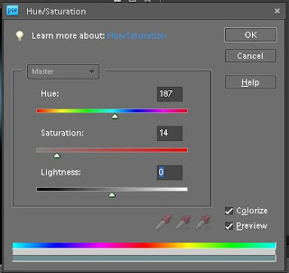
Check the checkbox "Colorize". Here is how it will look after that :
Check the checkbox "Colorize". Here is how it will look after that :

One may add Wind effect again by rotating as we did in step 5. Here is my final output after applying the effect again :

Friday, May 8, 2015
3d,
create,
elements,
how,
in,
photoshop,
text,
to
0
comments
How to create 3D text in Photoshop Elements
1. Open a new file in PSE Editor.
2. Now make the default colors in color swatch in the tool bar.
3. Select the text tool from left tools bar.

4. Write some text and simplify the text layer by right clicking the text layer in layers panel and choose "Simplify Layer".
5. Image >Free Transform.
6. Skew the layer to give 3 effect. Press Control and skew the text by extending the left top of the layer towards top left and right top toward a little down left(or some other orientation you may choose). Similar with bottom left and bottom rights.
7. Press Control selecting the text layer.
8. Select a gradient tool and choose colors and stroke from left to right or vice versa.

9. Now from Effects palette, select simple bevel and double click to give bevel effect. Click on the layer effect button on right and change the bevel level to 1 pixel.
10. Now create duplicates of this text layer say 15-20 duplicates. This will create a 3 D effect. Right click last duplicated layer and choose Clear layer style.
Its that easy !
Friday, April 3, 2015
a,
create,
effect,
glowing,
in,
liquid,
photoshop,
splash,
text,
water,
with
1 comments
Create a Glowing Liquid Text with Water Splash Effect in Photoshop

Ground texture
Water pattern image
Water splash brush
Step 1
Create a new document sized 1280px * 800px with black background. Load the Ground Texture stock image into Photoshop, and select a piece of the ground as shown below:

Copy and paste the selection onto our document, use a soft eraser to remove the edges and some parts of the ground as shown below:

Add the following 3 adjustm
ent layers on top of the ground texture layer:
Black and White

Levels

Curves

Create a new layer on top and add some cloud effect over the ground with either a cloud brush or the cloud filter – this adds some dramatic effect into it:

Step 2
We will now add some text onto the document – I used the “Freestyle Script” font (should come with Photoshop):
Apply the following layer blending options to this text layer:
Bevel and Emboss

Color Overlay

Outer Glow

and you will have the following effect:

Step 3
We add some water pattern over the text – download the water pattern pack and choose one of the images, select a portion of it with any selection tool:
Copy and paste the selection over the text and set it as a clipping mask to the text layer:

We will go back to the water images and select a piece again, then copy and paste the selection and put it below the text layer, use the liquify filter’s forward warping tool to make it into a pattern as shown below:

This step can be a bit and you will probably need to have a few tries before getting it right. The effect below is the one you’re aiming to achieve:

Step 4
Load the water splash brush into Photoshop and paint some splash around the text, use a soft eraser to fade the edges of the splash for depth:
We will fine tune the colour effect a bit with the following image adjustment layer on top:
Selective Color
Cyans

Whites

Neutrals

Layer mask on the selective colour adjustment layer:

Curves

Layer mask on this curves adjustment layer:

Color Balance


and you will have the following final image: (click to enlarge)

That’s it for this tutorial! Hope you enjoy it and find it useful! Till next time, have a great day!
 Writer : Tommy Kurniawan
Hello! My name is Tommy. Im a blogger, I love graphics design and now i went to Architechture Technical Senior High School. | Facebook |
Source : PSDVault

Tutorial Assets
The following assets were used during the production of this tutorial.- Rothenburg Decorative Free Font
- Subtle Grunge Brushes
Step 1
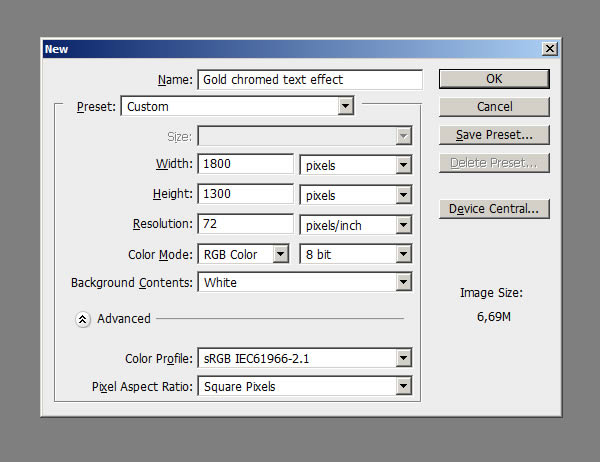
Before opening Photoshop, install the font Rothenburg Decorative and these grunge brushes.Open Photoshop and Create a New Document, 1800 x 1300 pixels in RGB mode, 72 DPI and finally then Fill the background with this dark grey color #1f1f1f.
Step 2
Create a New Layer, name it ‘texture’ and using these Grunge Brushes click a couple of times in the center of the document using a white color. Use different brushes, try to cover the center of the document, varying the textures.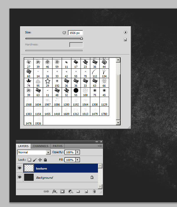
Step 3
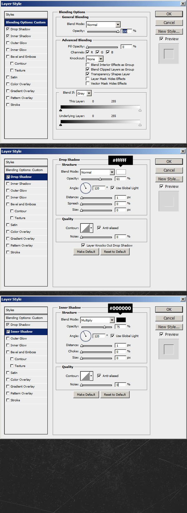
Double-click on the thumbnail of the Layer ‘texture’ to open the Layer Style panel. Into the ‘Blending Options’Reduce the ‘Fill’ to 0, then apply a ‘Drop Shadow’ and an ‘Inner Shadow’ using these settings. This will give the texture a realistic embossed look.
Step 4
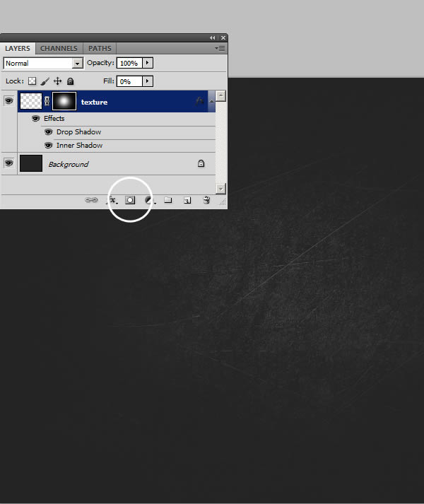
Click on the ‘Add Layer Mask’ icon, then click Command/Ctrl + (I) to invert it.Pick a big soft Brush (hardness: 0% – size: 950px) and click in the center of the document. This way the ‘texture’ Layer will be shown only in the center, fading on the edges of the document.
Step 5
Using the ‘Type Tool’ (T) and these settings, type the word ‘Othello’ or whatever you want. If you can’t see the ‘Character Window" go to Window > Character.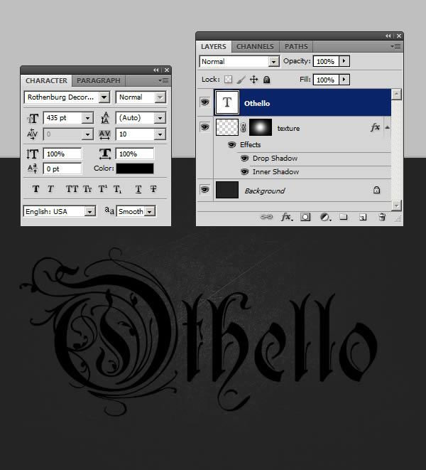
Step 6
Open the ‘Layer Style’ of the ‘Othello’ Text Layer and apply these settings. Below each step you can find a preview for the effect just added.
Step 7
Once you’ve modified the Style, click Ok. Now select the word ‘Othello’, using the Type Tool (T). Select everything beside the first capital letter and reduce the kerning to -5 as in the image below. You can find the Character Window under Window > Character.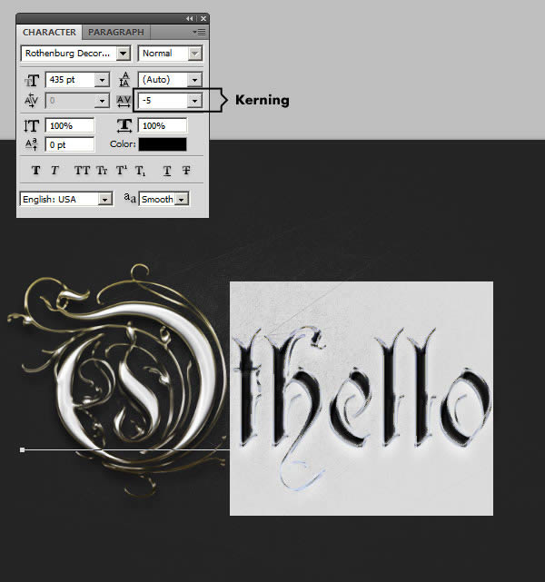
Step 8
Duplicate this Layer with Command/Ctrl + (J), right-click on the Layer’s thumbnail and choose ‘Clear Layer Style’. This way the text below matches exactly the one above, and now we can add more effects. My favorite way to work with 2 Layer Styles, is to create a solid base as we did to the first Text Layer, and then add lightings and reflections on the second Layer above. This way you can blend easier the lights and colors with the textures of the Layer below.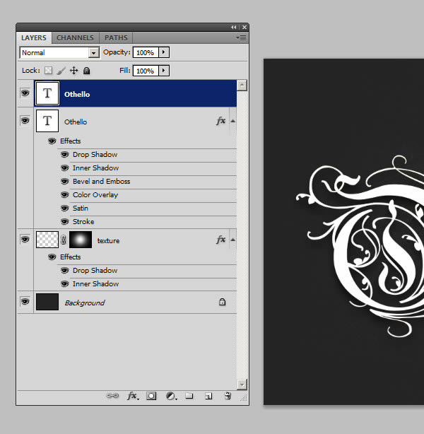
Step 9
Let’s go on, adding a Layer Style to this second ‘Othello’ Text Layer. Double click on its thumbnail to open the Layer Style panel. Set fill opacity to 0 in blending options.
Step 10
The effect is pretty much done, but we need to make it look crisp and realistic, in this final step. Take a look at the trick with the ‘Stroke’: dropping down it’s Opacity to ’0′ it works almost as a layer mask, hiding the Layer on its edges. A Stroke of 3px ‘Inside’, for example, will hide the Text for 3 px along the edges, revealing what’s below in that 3px range. Once you’ve finished with these settings, click Ok to apply the effect.
Conclusion
Remember that when you Save the final effect, as a jpg image for example, it may look different, sharper, and more defined overall.Author : Gianluca Giacoppo
About The WriterHello! My name is Tommy. Im a blogger, I love graphics design and now i went to Architechture Technical Senior High School. | Facebook |
Subscribe to:
Posts (Atom)


- Follow Us on Twitter!
- "Join Us on Facebook!
- RSS
Contact