Showing posts with label work. Show all posts
Showing posts with label work. Show all posts
Thursday, April 30, 2015
and,
coloring,
cs6,
illustrator,
in,
line,
work
0
comments
Coloring and Line Work in Illustrator CS6
Final Product What Youll Be Creating

Unlike Photoshop, however, Illustrator gives you the flexibility to edit individual paths. Since Illustrator’s brush strokes are vector, you can change the shape, width, color and blending mode to achieve exactly the look you want. You can even delete a brush stroke you don’t want. Try that, Photoshop! This tutorial will use another feature introduced in CS5, Draw Inside. Let’s get started!
Step 1
You can use this technique with any line art or illustration. I am going to quickly create my line art by tracing a source photo from Wikimedia Commons, photo by Guillaume Piolle.

Step 2
To create the line art, use the “Tapered Strokes” brush from the default set. You can adjust the brush settings by double-clicking the Brush Tool to bring up its options. This is a matter of personal preference; experiment until you find a setting that works for you. I prefer to set the brush so that the paths confirm fairly closely to my strokes, but don’t end up with too many points.


Step 3
Now you’ll do the modeling with the Bristle Brush. Lock the line work layer and create a new one below it.In order to get the most out of the Bristle Brush, it’s best to understand its settings. I’ll add a detailed explanation of each setting at the end of this tutorial for reference.
It’s also important to note that to get the full benefit of the Bristle Brush, you must use a Wacom Intuous 3 or higher tablet and a 6D Art pen. The tablet and pen combination will respond to tilt, bearing, rotation, and pressure. A mouse alone will only respond to movement, but will still work fine for this tutorial.
To create a new bristle brush click the new brush icon on the brushes panel. Choose Bristle Brush, which will bring up its options. There are tons of possibilities with a Bristle Brush, but to start, choose Flat Angle as the shape, and increase the size to 5mm. Leave the other settings as they are, with the exception of the Opacity. Set it low, to about 30%.


Step 4
Using the Pen Tool, outline a flat area of shadow on the artwork. Here, I’ve drawn around the top lip. Select the shape and then choose Draw Inside at the bottom of the tool panel. Dotted-line brackets will appear around the shape, letting you know that you’re in Draw Inside mode. You can deselect the shape, but the brackets will remain.

Step 5
Choose a warm gray for the stroke color. I’ve used some swatches from the “Neutral” library, which can be accessed by clicking the Swatch Libraries Menu icon on the bottom left of the Swatches panel.If you didn’t deselect the lip shape in the previous step, it may frustrate you to see that it now has the stroke color you just picked. This can be really annoying, but you just have to remember to deselect the shape. The dotted-line brackets indicate that the shape is still in Draw Inside mode.

Step 6
You may wish to turn off the photo layer, or move the photo to the side so you can use it as a reference. Now just start drawing strokes inside the lip shape. Depending on your Opacity setting, it may be hard to see a single stroke. You may also want to increase the brush size in the Strokes panel for wider swaths of color.Keep painting and building up color and texture. Note that different brush strokes will interact in this way, but if you just use one brush and scrub back and forth, it won’t build up. In other words, a single brush stroke does not interact with itself, so deselect the existing strokes and paint new ones to layer the color.
Step 7
Do the same for the other shadow areas. First choose Draw Normal mode, then select the new shape and choose Draw Inside again. Make sure you’re finished with one before proceeding to the next. Once you exit Draw Inside Mode for a shape, you can’t access it again.TIPS: If you want a darker stroke, you can change the opacity on the fly by using the numeric keys: 1 for 10%, 2 for 20% and so on.
You can double-click any Bristle Brush in the Brushes panel to edit it. If the brush you are changing is already in use in your file, you’ll get this warning. Unless you want every brush stoke to update with your changes, click “Leave Strokes” to leave the existing brush strokes unchanged.

Step 8
Once all the shadow shapes have been drawn and painted, your image should look something like the one below. “Draw Inside” simply creates a Clipping Mask before you draw. So if you want to edit some of the paths or start over, you can go to Object > Clipping Mask > Edit Contents.


Step 9
If you haven’t saved your work, now’s a good time to do that. You’ll most likely get a warning when you save, telling you that your document contains Bristle Brush paths and transparency. Well, duh. Actually, this is an important warning to heed, because Bristle Brushes can make the document very complex and the file size quite large. You can turn off the warning so it doesn’t appear again during this work session.
Step 10
Now we’re going to add some more color, texture and modeling. Create a new Bristle Brush if you want to experiment — a Flat Fan will work nicely.As before, set the Opacity fairly low, then begin painting along the contours of the face and neck. It’s kind of a sculptural process, with the advantage of being able to edit the paths or start over if you want. If you paint a stroke you like, you can copy it and move it to another part of the illustration. You can change the stroke width, the opacity and the blending mode, just as you can with any vector path.
If you’re using a graphics tablet and pen, you’ll get visual feedback as to the direction, tilt and bearing of your brush. Still, it can be a rather random process, but that’s part of the fun, and can lend itself to some happy accidents.


Step 11
I can’t tell you exactly where and how to paint the rest of the strokes, you’ll just have to play around until it looks right. The beauty of using Illustrator instead of Photoshop (or real paint, for that matter), is that if it gets too muddy, you can just delete some strokes or change their opacity. The final image is below.Conclusion
Due to their transparency and fluidity, Bristle Brushes can be used for a wide variety of coloring applications. And because they’re vector paths, you get the best of both worlds: The painterly effects of Photoshop brushes with the control and flexibility of Illustrator.Keys to the Bristle Brush Options:
- Name: Self-explanatory.
- Shape: There are 10 styles. Each one attempts to mimic a real-life brush.
- Size: This is the diameter of the brush. When you buy brushes in an art supply store, their size is measured at the point where the bristles meet the handle, so this measurement refers to that. Use the slider to change, or enter numerals from 1mm to 10mm.
- Bristle Length: Measured from the bristle tip to the point where the bristles meet the handle.
- Bristle Density: Has to do with the number of bristles in a brush. 1% is basically one bristle, but unlike a real-life brush, that one bristle will be the diameter of the brush as it is set in the Size field.
- Bristle Thickness: Use the slider or enter numbers in the field.
- Paint Opacity: 1% is translucent and 100% is opaque.
- Stiffness: I like to think of Stiffness as the “squirly-ness” of the brush. That is, the lower the stiffness, the less the stroke will conform to the path you actually draw. This can be good for random strokes and surprises.

Monday, March 30, 2015
add,
brilliant,
effects,
light,
photoshop,
to,
with,
work,
your
0
comments
Add Brilliant Light Effects To Your Work With Photoshop
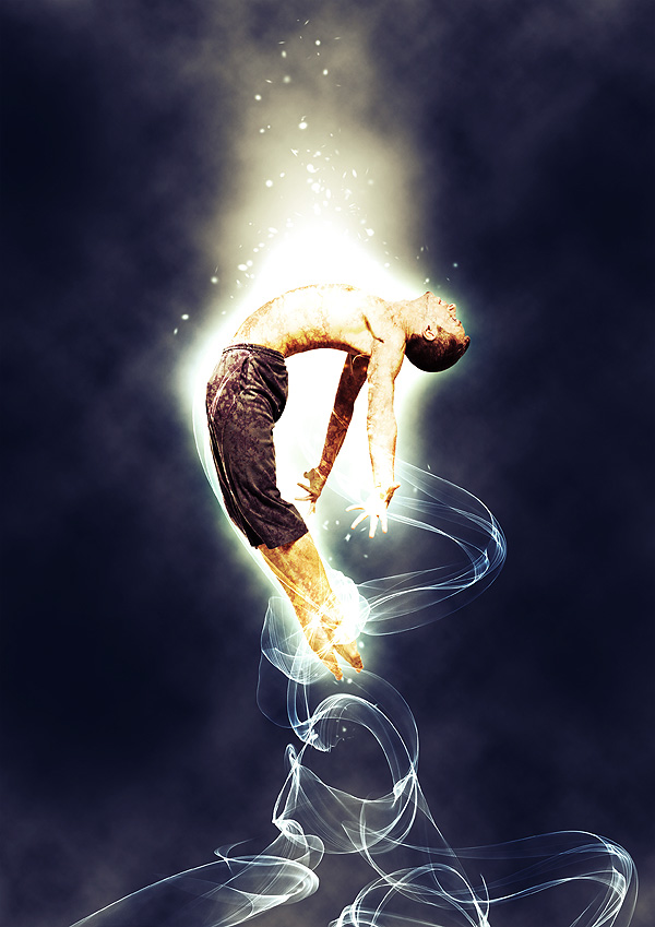
Tutorial Resources
- Blanched Paper Textures from WeGraphics
- Dancer from Shutterstock
- light_effects_custombrushes (ZIP, 26.1 MB)
Step 1: Set up the background
Let’s start the tutorial by creating a new document (Ctrl/Cmd + N) in Photoshop. Since I like printing my work, I will typically choose a large standard document size (like A4) and set the Resolution at 300 pixels/inch.

Once the new Photoshop document has been created, fill (Edit > Fill) the default Background layer with a dark blue (#052b4c).
I start my work from the background. If you do the same, I suggest that you don’t give too much importance to your starting colors because we can change them later on once we have completed our foreground work. The most important thing at the beginning is to achieve a concept—something interesting to represent. The beauty of Photoshop is that it allows you to change colors and other aspects of your work at any moment. The best moment to work with colors is when you have more elements to play with, near the end.
Let us start by creating a new layer (Crtl/Cmd + Shift + N). Next, set white (#ffffff) as your Foreground color and then select a large, soft brush tip with Hardness at 0% for our Brush Tool (B).
Simply click once at the center of the canvas to apply your brush stroke.
Step 2: Create a simple ellipse light effect
Since the scene is focused at the center of the canvas, we are going to create a light effect that will enhance all elements that will be placed there. Press Ctrl/Cmd + T to activate the Free Transform command and contract the light source so that it becomes an ellipse.Then, remove the edges of the brush stroke using the Eraser Tool (E) (or use a layer mask, if you want).

Step 3: Create some clouds
We will now make some clouds. Make sure to have white (#ffffff) as foreground color and black (#000000) as your background color; you can press the D key to reset your foreground/background color to white/black and then press X to switch foreground and background colors.Create a new layer and then go to Filter > Render > Clouds.

Activate the Free Transform command (Ctrl/Cmd+T) and enlarge the clouds layer by pulling on one of the corner transform controls.

Switch the layer’s blending mode to Screen to remove black parts of the clouds layer and also reduce the layer’s Opacity to around 30%.

To make the clouds more realistic, use the Eraser Tool (E) to remove some parts to make it look randomized. As always, use a large, soft brush with a Hardness set at 0%.
Just to recap our simple five-step clouds creation process:
- Create a new layer and apply the clouds filter
- Enlarge the layer
- Switch the layer blending mode to screen
- Reduce opacity
- Remove unwanted parts

Repeat the same process to create other clouds. Try experimenting with different layer dimensions and opacity. This is what I ended up with:

Step 4: Select and prepare your subject
Choose a nice subject for your work. I chose this nice image of a dancer, but you can pick any image that you like or have lying around.Since we will create light effects to play with, I suggest you pick a dynamic moving subject such as a person jumping, an animal running, or a rock star jamming.
Once you’ve chosen your subject, copy and paste (Ctrl/Cmd + V) it into the canvas.

At this point, we have to modify the dancer. In particular, the aim is to increase the image contrast and to give the subject a grungier look. We can achieve both these results with a texture.
Firsst, you must download the free sample of my Bleached Paper Texture set, open it in Photoshop, and paste it into our document. Also, you can check out the Design Instruct Freebie section for other interesting textures to use.
Resize the texture with Free Transform (Ctrl/Cmd + T) so that it’s of the same size as our canvas.

Step 5: Apply a clipping mask on the texture layer
We want to apply our texture only to the subject. For this purpose, we can create a clipping mask. To do so, press Alt/Option and then click between the subject’s layer and the texture layer in the Layers Panel. A little arrow should appear and the texture layer’s name will move a bit to the right inside the Layers Panel indicating that you have added a clipping mask.The clipping mask means that all the things we do in the texture layer will affect only the area delimited by dancer’s silhouette.

Switch the texture layer’s blending mode to Overlay and reduce the Opacity to 70%.
Step 6: Change the texture’s color
You can see how the texture details nicely interact with the human body. If you zoom in (press Z to activate the Zoom Tool, and then click on the canvas), you will notice that the grunge texture looks like veins. I want to play around with this idea/concept.Let’s change the texture’s color. Press Ctrl/Cmd + U to open the Hue/Saturation dialog window. Check the Colorize option and move the hue slider to the area between purple and red.

Now create a mask on top of the texture layer by pressing the Add Layer Mask button at the bottom of the Layers Panel.
Next, grab a soft, black brush for our Brush Tool (B) and remove textures from some parts of the body. The image below will show you suggested parts to paint on:

Step 7: Add a vivid light effect
It’s time to add a more brilliant and prominent light effect. Right-click on the subject’s layer in the Layers Panel and then choose Blending Options from the contextual menu.Add an Outer Glow layer style. Increase the Size of the outer glow to around 200px and set Blend Mode to Color Dodge.

The light effect you see at the top is the result of the combination between the ellipse light effect we created at the beginning and the Outer Glow layer style.
If you want to change the orientation of this effect, simply move the elliptical lighting effect layer around.
Step 8: Create an abstract Photoshop brush
Here comes the fun part. There are plenty of ways to create light effects. In this tutorial, I’ll show you one of the simplest methods. We will make abstract fractals for our custom brushes and then we will use these brushes to add lights into our work.In order to create nice abstract fractal effect, we will use the flame tool, which is a free online tool made by Peter Blaskovic. This tool is amazing!

Create you own flames and save them to your computer. Use default colors and once finished, just press Save. Save your flame as a JPG image.
Open one of the flames you just created in Photoshop. We are going to create a cool brush set with these.

Desaturate the image by going to Image > Adjustments > Desaturate (Shift + Ctrl/Cmd + U).
Then invert the image by going to Image > Adjustments > Invert (Ctrl/Cmd + I). We invert the images because while you create Photoshop brushes, you have to consider that the white parts will be transparent and the blacker parts will represent the brush stroke. The parts that are in grayscale will therefore be the only ones saved as brushes.
Here is the result:

To save the brush, go to Edit > Define Brush Preset.
We have thus created the first brush of the set! Go ahead and create other brushes following the same process.

Step 9: Apply the custom abstract Photoshop brush
Create a new layer group (Ctrl/Cmd + G) and title it "light effect". Set the group’s blending mode to Color Dodge. Create a new layer (Ctrl/Cmd + Shift + N) inside the "light effect" group, set your Foreground color to white (#ffffff), and then click on the canvas to apply our custom abstract brush stroke.Here is your light effect! Really simple, don’t you agree? I promised it would only take 10 minutes!
If you want a stronger light effect, duplicate the layer (Ctrl/Cmd + J) and experiment with the layer’s blending mode.

You can now use all the brushes of the brush set you created. Try to combine them in harmony with the body of the subject.
Also try this: Create a new layer, apply an abstract brush stroke, then rotate it with the Free Transform command (Ctrl/Cmd + T). You can also flip the layer (Edit > Transform > Flip Horizontal or Edit > Transform > Flip Vertical). This can add variety to your abstract light effects.
Remember to create each brush stroke on a different layer so that you can move them separately to achieve a satisfactory composition.
Here is the result after I played around with all the brushes of my own set.

Step 10: Add more light effects
Still inside our "light effect" layer group, create a new layer (Ctrl/Cmd + J). This time we will use soft brushes to enhance some parts of the body. For example, take a look at the left hand of the dancer—it’s covered by some light beams. We can start there. Add more light where you think it’s necessary.
Step 11: Make energy particles
We will now create energy particles to detail our light effects. Create another layer inside the same group. Select the 16px Soft Mechanical tip.
Next, we will modify the Brushes options. If it’s not opened, toggle the Brushes Panel (Window > Brushes).
Check the Spacing option and increase its value to 400%.

Then, check the Shape Dynamic and set its options to the following values:

Finally, check Scattering and use the following suggested settings:

All that remains now is to paint over the canvas to create our energy particles. I suggest adding the energy particles on their own layers to compartmentalize our work. To increase the brightness and prominence of the energy particles, you can add an Outer Glow layer style to them.

Step 12: Final adjustments
Our work is almost complete. As I wrote at beginning of the tutorial, Photoshop allows us to play with colors at any moment.In another tutorial I wrote here on Design Instruct, I showed you the power of adjustment layers in Photoshop and how they can dramatically change our work. We will now follow a similar process to complete the work.
Hue/Saturation adjustment layer
Let’s start by desaturating our image a bit. This is something I often do because I’ll apply a Gradient Map later (with its blending mode set at Overlay) that will increase color contrast.Go to Layer > New Adjustment Layer > Hue/Saturation and reduce Saturation to -40.
Note that you can also add adjustment layers by clicking on the Create new fill or layer adjustment button located at the bottom of the Layers Panel.

Curves adjustment layer
Increase the image’s contrast using a Curves adjustment layer. Go to Layer > New Adjustment Layer > Curves. Create a curve as shown in the image below:
Gradient Map adjustment layer
Finally, add a Gradient Map adjustment layer. Set the color gradient so that it goes from purple (#6f156c) to yellow (#f9e600).
Afterwards, set the adjustment layer’s blending mode to Overlay and reduce its Opacity to 50%.
That’s it. We’re done!
Tutorial Summary
I showed you a variety of light effect techniques in this tutorial. We applied a simple light effect glow using a soft, white brush. Then we stepped it up a notch by adding an Outer Glow layer style on our subject. We created custom abstract light brushes as well as energy particles to enhance the look of our light effects. We applied a clipping mask to our subject for artistic purposes. To finish off our composition, we added some adjustment layers.I hope that you enjoyed this tutorial and learned a few tricks for adding light effects on your own work.
Here is the final result:

 Author : Sebastiano Guerriero
Sebastiano Guerriero is a 23-year-old Italian Graphic Designer whos spent the last two years studying graphics by himself. Hes the author of WeGraphics, a blog that publishes graphic design tutorials, articles about Graphic Design, and graphic design freebies. You can follow him on Twitter (his username is @wegraphics).
Source : Design Instruct
Subscribe to:
Posts (Atom)


- Follow Us on Twitter!
- "Join Us on Facebook!
- RSS
Contact