Showing posts with label light. Show all posts
Showing posts with label light. Show all posts
Wednesday, April 29, 2015
adobe,
cs6,
dark,
illustrator,
interface,
light,
the,
tutorial,
vs
0
comments
Adobe Illustrator CS6 Tutorial The dark vs the light interface
Illustrator CS6 Tutorial Video
All right, so the first thing that we are going to look in, in this chapter is the new dark interface, and Im a big fan. Very much like the new dark interface in Photoshop CS6, but the great thing about it, in my opinion, is that it allows me to focus in on theIllustrator cs6. without being distracted by all the screen folders.
And Illustrator cs6. takes it even farther than Photoshop does, by darkening dialog boxes, and other screen folders.
Now, theres a few exceptions to this rule on the Mac, on a Macintosh side of things, you got a bright menu bar, you cant do anything about that, because Adobe doesnt have control over the menu bar.
And if youre your illustration inside of a floating window, then youll see a bright title bar for that window as well, and you may see elements of applications running in
the background, as well as the finder desktop and so forth.
If you would rather have Illustrator cs6. take over your screen, so you can focus your energies on the task of drawing, then here on the Mac, you go up to the Window menu, and choose Application Frame.
Illustrator CS6 Tutorial Video
This command is not available on the PC, because the Application Frame is always in force.And then once I choose that command, notice that the bright title bar goes away, and essentially everything you see on screen is going to match what youre seeing inside the video except for the location of this application bar, which is right here under the menu bar instead of these icons being next door to the menus, and of course, the bright menu bar at top.
However, lets say you want to lighten the interface, or otherwise customize the brightness. Heres what to do.
Go on to the Edit menu here on the PC that would be the illustrator menu on the Mac, all the way over on the left-hand side, drop down to the Preferences command, which isnt nearly so far down on the Macintosh menu.
And then choose this command right there, User Interface.
That will bring up this Dark dialog box, and notice right here, weve got Brightness. So you can select from four predefined brightness settings here.
Weve got Light, which is pretty much what we had inside of Illustrator cs6 in earlier. And I will say, by the way, you did have a Dark Interface option in Illustrator cs6 as well.
Illustrator CS6 Tutorial Video
It was just awful, because even when you made the interface dark, such as this if we goall the way here, the text remained black, so you could barely read it.
Now the text goes ahead and inverts so that you can see it very nicely.
And the Medium Dark is the default setting, by the way, and then weve got Medium Light, and you really dont need me to show you those, you can test them out yourself. Heres what you might need help with.Illustrator cs6
You have the slider, which is just awesome, I am going to go ahead and turn mine down to 20%, which is a little darker than the standard setting, but I think its going to make things pop pretty nicely for video here.
And then finally, you have control over the Canvas Color, better known as the pasteboard, which is the area outside of the artboards.
And by default, its going to be the same color as the User Interface, its actually a little lighter, as you can see here.
But its going to very along with User Interface, and then when you go to very light basically, it catches up
But if you dont like that, let me dial this back down to 20.
Then you have one other option to choose from, and thats White.Illustrator cs6
Unfortunately, you cant dial in your own custom pasteboard color, I dont know why you cant, but these are your two options, either Match whats going on, or White.
Anyway, 20% is what I am going to go with here, and then I am going to click OK, and so that is your option, where the interface is concerned.
And so, I dont want anybody complaining about the New Dark Interface, so if you dont like
it just go ahead and customize it to whatever degree you like. Illustrator cs6

Step 1: Open A New Photoshop Document
Open a new document in Photoshop by going up to the File menu and choosing New…, or by using the keyboard shortcut, Ctrl+N (Win) / Command+N (Mac). You can choose your own width and height for your document, but if you want to follow along, I chose the640×480 size from the list of available presets to keep things simple. I’ve also left my Resolution value set to its default of 72 pixels/inch. Since I’m creating this text effect for the web, it makes no difference what I set the resolution value to, so the default value is fine:

Create a new document in Photoshop. To follow along, use the “640×480″ preset size.
Step 2: Add Your Text
With your new blank document open, grab the Type tool from the Tools palette or by pressing T on your keyboard. Make sure black is selected as your foreground color. If it isn’t, just press D on your keyboard to reset it to black. Choose your font in the Options Bar at the top of the screen. Thick, heavy fonts work best for this effect. Then, go ahead and enter your text. I’m going to use “Impact”, and I’ll type the words “LIGHT BURST”:
Choose a thick, heavy font, and with black as your foreground color, enter your text.
Step 3: Resize Your Text With Free Transform
With your text layer selected in the Layers palette, use the keyboard shortcut Ctrl+T (Win) / Command+T (Mac) to bring up the Free Transform box and handles around your text. Hold down Shift+Alt (Win) / Shift+Option (Mac) and drag out any of the corner handles to make your text larger and fill up more of the document area. Holding Shift constrains the text proportions, and holding Alt/Option resizes the text from the center:
Resize the text with Photoshop’s “Free Transform” command.
Make sure to still leave plenty of room around the text for our light burst effect. Press Enter (Win) / Return (Mac) when you’re done to accept the transformation. Step 4: Rasterize Your Text
We’re going to be applying several filters to our text, but Photoshop doesn’t allow us to do that without first rasterizing it, which simply means to convert it into pixels. So again with the text layer selected, go up to the Layer menu at the top of the screen, choose Rasterize, and then choose Type. This will convert our text into pixels. It will still look the same in the document window, but in the Layers palette, the Type layer will now be a regular layer:
After rasterizing the text, the Type layer in the Layers palette becomes a normal layer.
Step 5: Add A Selection Around Your Text And Save It
Ctrl-click (Win) / Command-click (Mac) directly on the thumbnail preview area of the text layer in the Layers palette to quickly load a selection around your text:
“Ctrl-click” (Win) / “Command-click” (Mac) directly on the text thumbnail in the Layers palette.
Your text will now have a selection around it:
The text is now selected.
With the text selected, go up to the Select menu at the top of the screen and choose Save Selection. When the Save Selection dialog box appears, just click OK. There’s no need to name it or make any changes to the options.Once you’ve saved your selection, press Ctrl+D (Win) / Command+D (Mac) to deselect your text.
Switch over to your Channels palette for a moment (it’s grouped in beside the Layers palette) and you’ll see your selection saved as a new channel named “Alpha 1″ at the very bottom. We’ll be coming back here a bit later to load our selection again:

The selection is now saved as a new channel, “Alpha 1″, in Photoshop’s Channels palette.
Step 6: Use “Fill” To Fill Your Text Layer With White And Set The Blend Mode To “Multiply”
Switch back to your Layers palette once again, and with the text layer selected, go up to the Edit menu at the top of the screen and choose Fill, or press Shift+F5 on your keyboard to quickly bring up Photoshop’s Fill dialog box. When the dialog box appears, set the Contents to White and change the Blending Mode to Multiply:
Photoshop’s “Fill” dialog box”.
Click OK when you’re done. Nothing will seem to have happened in your document window, but if you look at your text layer’s thumbnail in the Layers palette, you’ll see that all of the empty space around the text has now been filled with white, while leaving the text black thanks to that "Multiply" mode.Step 7: Apply The Gaussian Blur Filter To The Text
Go up to the Filter menu at the top of the screen, choose Blur, and then choose Gaussian Blur. When the Gaussian Blur dialog box appears, enter a Radius value of about 4 pixels and click OK to apply a slight blurring to the text:
Apply the Gaussian Blur filter to the text.
Here’s the text after applying Gaussian Blur:
The text is now blurred slightly.
Step 8: Apply The “Solarize” Filter To The Text
With the text layer still selected, go back up to the Filter menu and this time choose Stylize, and then choose Solarize. This will turn the document black, and your text will appear as a white stroke:
The image after applying the Solarize filter.
Step 9: Lighten The Text With Levels
The text is looking a little dark, so let’s lighten it. Use the keyboard shortcut Ctrl+L (Win) / Command+L (Mac) to bring up Photoshop’s Levels command, and drag the white point slider on the right in towards the left until you reach the right edge of the histogram:
With the Levels dialog box open, grab the white point slider on the right and drag it to the right edge of the histogram to brighten the text.
Click OK. The text will now appear much brighter:
The text is now much brighter after applying Levels.
Step 10: Make A Copy Of The Text Layer
We need to make a copy of the text layer at this point, so to do that, with the text layer selected, use the keyboard shortcut Ctrl+J (Win) / Command+J (Mac), which will add a copy of the layer above it in the Layers palette:
The Layers palette now showing both the text layer and the copy above it.
Make sure the copy of the text layer is selected because all of these next steps are to be done on the copy. We won’t be touching the original again until near the end.Step 11: Apply The “Polar Coordinates” Filter To The Text
Go back up to the Filter menu, and this time choose Distort, and then Polar Coordinates. We’re going to send our text to the North Pole. Alright, no we’re not. What we are going to do is make it look very strange. When the Polar Coordinates dialog box appears, select the Polar To Rectangular option at the very bottom and then click OK:
Photoshop’s “Polar Coordinates” dialog box.
Your text will now look very strange indeed:
The text after applying the “Polar Coordinates” filter.
Step 12: Rotate The Canvas 90 Degrees Clockwise
Go up to the Image menu at the top of the screen, select Rotate Canvas, and then choose 90° CW to rotate the canvas 90 degrees clockwise:
Rotate the canvas 90 degrees clockwise.
Step 13: Invert The Image
Use the keyboard shortcut Ctrl+I (Win) / Command+I (Mac) to invert the image, so black becomes white and white becomes black:
Invert the image with “Ctrl+I” (Win) / “Command+I” (Mac).
Step 14: Apply The “Wind” Filter Three Times
Go back up to the Filter menu once again, choose Stylize, and then choose Wind. When the Wind filter’s dialog box appears, make sure Method is set to Wind and Direction is set to From the Right:
Photoshop’s “Wind” filter.
Click OK to apply the Wind filter once. Then press the keyboard shortcut Ctrl+F (Win) / Command+F (Mac) twice to apply the same filter two more times.Step 15: Invert The Image Again
Press Ctrl+I (Win) / Command+I (Mac) to invert the image once again:
Invert the image once again using “Ctrl+I” (Win) / “Command+I” (Mac).
Step 16: Apply The “Wind” Filter Three More Times
With the image inverted, press the keyboard shortcut Ctrl+F (Win) / Command+F (Mac) three more times to apply the filter to the image three more times:
Apply the “Wind” filter to the image three more times.
Step 17: Brighten The Image Again With Levels
We need to brighten the image again using Levels, but this time, we’ll let Photoshop do the work for us by using Auto Levels. To do that, press Shift+Ctrl+L (Win) / Shift+Command+L (Mac) to apply the Auto Levels command to the image, which will brighten it up:
Apply the “Auto Levels” command to brighten the image.
Step 18: Rotate The Canvas 90 Degrees Counterclockwise
Go back up to the Image menu at this point, choose Rotate Canvas once again, and this time choose 90° CCW to rotate the canvas back to the way it was originally:
Rotate the canvas 90° CCW.
Step 19: Apply The "Polar Coordinates" Filter Again
Go back up to the Filter menu again, choose Distort, and then choose Polar Coordinates. This time choose the Rectangular to Polar option and click OK:
Apply “Polar Coordinates” again, this time choosing “Rectangular to Polar”.
Your image should now look something like this:
The image after applying the “Polar Coordinates” filter a second time.
Step 20: Set The Layer Blend Mode To "Screen"
Go up to the blend mode options in the top left of the Layers palette and change the blend mode of the text copy layer from “Normal” to Screen by clicking on the down-pointing arrow and selecting "Screen" from the list:
Change the blend mode of the text copy layer to Screen.
This reveals the original text layer beneath it:
The original text layer is now visible as well.
Step 21: Apply A Gradient Fill Layer To Add Color
Click on the New Fill Or Adjustment Layer icon at the bottom of the Layers palette:
Click the “New Fill Or Adjustment Layer icon.
And select “Gradient” from the list:
Select a Gradient fill layer.
When the Gradient Fill dialog box pops up, click inside the gradient preview area at the top:
Click inside the gradient preview area.
This will bring up the Gradient Editor dialog box. Click on the gradient swatch in the top left, the black to white gradient first, and this will make sure that both colors on either side of the gradient have their opacity set to 100%:
Select the black to white gradient swatch in the top left to make sure both colors are set to 100% opacity first.
Then set your gradient colors to whatever you like. I’ve set the color on the left to a reddish-orange, and the color on the right to a yellowish-orange:
Set your gradient colors.
Exit out of the gradient dialog boxes once you’ve chosen your colors.Step 22: Change The Blend Mode Of The Gradient Fill Layer To “Color”
With the Gradient fill layer selected, go back to the blend mode options in the top left of the Layers palette and change the layer’s blend mode to Color:
Change the blend mode of the Gradient fill layer to “Color”.
The image is now colorized with the colors from the gradient:
The gradient colors are now applied to the image.
Step 23: Apply A Radial Blur To The Original Text Layer
We’re done with the text copy layer at this point. We’re going to finish off the last few steps by working on the original text layer, so click on it in the Layers palette to select it. Then go up to the Filter menu, choose Blur, and then choose Radial Blur:
Photoshop’s “Radial Blur” dialog box.
Set the Amount to about 65 pixels, the Blur Method to Zoom, and the Quality to Best, as circled above, and then click OK to apply the filter to the original text:
The Radial Blur applied to the image.
Step 24: Load The Saved Text Selection
Only a couple of things left to do. First, switch over to your Channels palette again like we did earlier. We’re going to reload that selection we saved. To do that, simply right-click (Win) / Control-click (Mac) anywhere on the Alpha 1 channel at the very bottom, which will load the selection back into the document window:
Right-click (Win) / Control-click (Mac) anywhere on the “Alpha 1″ channel to load the saved text selection.
Switch back to the Layers palette when you’re done. The selection is now loaded in the image:
The selection now loaded into the image.
One thing left to do…Step 25: Fill The Selection With Black
With the original text layer selected in the Layers palette and black still as your foreground color, press Alt+Backspace (Win) / Option-Delete (Mac) to fill the selection with black and finish the effect.Press Ctrl+D (Win) / Command+D (Mac) to remove the selection, and you’re done!
After all that, here’s the final “light burst” text effect:

The final “Light Burst” effect.
And there we have it!Author : Steve Patterson
 About The Writer
Hello! My name is Tommy. Im a blogger, I love graphics design and now i went to Architechture Technical Senior High School. | Facebook |
Monday, March 30, 2015
add,
brilliant,
effects,
light,
photoshop,
to,
with,
work,
your
0
comments
Add Brilliant Light Effects To Your Work With Photoshop
Tutorial Resources
- Blanched Paper Textures from WeGraphics
- Dancer from Shutterstock
- light_effects_custombrushes (ZIP, 26.1 MB)
Step 1: Set up the background
Let’s start the tutorial by creating a new document (Ctrl/Cmd + N) in Photoshop. Since I like printing my work, I will typically choose a large standard document size (like A4) and set the Resolution at 300 pixels/inch.

Once the new Photoshop document has been created, fill (Edit > Fill) the default Background layer with a dark blue (#052b4c).
I start my work from the background. If you do the same, I suggest that you don’t give too much importance to your starting colors because we can change them later on once we have completed our foreground work. The most important thing at the beginning is to achieve a concept—something interesting to represent. The beauty of Photoshop is that it allows you to change colors and other aspects of your work at any moment. The best moment to work with colors is when you have more elements to play with, near the end.
Let us start by creating a new layer (Crtl/Cmd + Shift + N). Next, set white (#ffffff) as your Foreground color and then select a large, soft brush tip with Hardness at 0% for our Brush Tool (B).
Simply click once at the center of the canvas to apply your brush stroke.
Step 2: Create a simple ellipse light effect
Since the scene is focused at the center of the canvas, we are going to create a light effect that will enhance all elements that will be placed there. Press Ctrl/Cmd + T to activate the Free Transform command and contract the light source so that it becomes an ellipse.Then, remove the edges of the brush stroke using the Eraser Tool (E) (or use a layer mask, if you want).

Step 3: Create some clouds
We will now make some clouds. Make sure to have white (#ffffff) as foreground color and black (#000000) as your background color; you can press the D key to reset your foreground/background color to white/black and then press X to switch foreground and background colors.Create a new layer and then go to Filter > Render > Clouds.

Activate the Free Transform command (Ctrl/Cmd+T) and enlarge the clouds layer by pulling on one of the corner transform controls.

Switch the layer’s blending mode to Screen to remove black parts of the clouds layer and also reduce the layer’s Opacity to around 30%.

To make the clouds more realistic, use the Eraser Tool (E) to remove some parts to make it look randomized. As always, use a large, soft brush with a Hardness set at 0%.
Just to recap our simple five-step clouds creation process:
- Create a new layer and apply the clouds filter
- Enlarge the layer
- Switch the layer blending mode to screen
- Reduce opacity
- Remove unwanted parts

Repeat the same process to create other clouds. Try experimenting with different layer dimensions and opacity. This is what I ended up with:

Step 4: Select and prepare your subject
Choose a nice subject for your work. I chose this nice image of a dancer, but you can pick any image that you like or have lying around.Since we will create light effects to play with, I suggest you pick a dynamic moving subject such as a person jumping, an animal running, or a rock star jamming.
Once you’ve chosen your subject, copy and paste (Ctrl/Cmd + V) it into the canvas.

At this point, we have to modify the dancer. In particular, the aim is to increase the image contrast and to give the subject a grungier look. We can achieve both these results with a texture.
Firsst, you must download the free sample of my Bleached Paper Texture set, open it in Photoshop, and paste it into our document. Also, you can check out the Design Instruct Freebie section for other interesting textures to use.
Resize the texture with Free Transform (Ctrl/Cmd + T) so that it’s of the same size as our canvas.

Step 5: Apply a clipping mask on the texture layer
We want to apply our texture only to the subject. For this purpose, we can create a clipping mask. To do so, press Alt/Option and then click between the subject’s layer and the texture layer in the Layers Panel. A little arrow should appear and the texture layer’s name will move a bit to the right inside the Layers Panel indicating that you have added a clipping mask.The clipping mask means that all the things we do in the texture layer will affect only the area delimited by dancer’s silhouette.

Switch the texture layer’s blending mode to Overlay and reduce the Opacity to 70%.
Step 6: Change the texture’s color
You can see how the texture details nicely interact with the human body. If you zoom in (press Z to activate the Zoom Tool, and then click on the canvas), you will notice that the grunge texture looks like veins. I want to play around with this idea/concept.Let’s change the texture’s color. Press Ctrl/Cmd + U to open the Hue/Saturation dialog window. Check the Colorize option and move the hue slider to the area between purple and red.

Now create a mask on top of the texture layer by pressing the Add Layer Mask button at the bottom of the Layers Panel.
Next, grab a soft, black brush for our Brush Tool (B) and remove textures from some parts of the body. The image below will show you suggested parts to paint on:

Step 7: Add a vivid light effect
It’s time to add a more brilliant and prominent light effect. Right-click on the subject’s layer in the Layers Panel and then choose Blending Options from the contextual menu.Add an Outer Glow layer style. Increase the Size of the outer glow to around 200px and set Blend Mode to Color Dodge.

The light effect you see at the top is the result of the combination between the ellipse light effect we created at the beginning and the Outer Glow layer style.
If you want to change the orientation of this effect, simply move the elliptical lighting effect layer around.
Step 8: Create an abstract Photoshop brush
Here comes the fun part. There are plenty of ways to create light effects. In this tutorial, I’ll show you one of the simplest methods. We will make abstract fractals for our custom brushes and then we will use these brushes to add lights into our work.In order to create nice abstract fractal effect, we will use the flame tool, which is a free online tool made by Peter Blaskovic. This tool is amazing!

Create you own flames and save them to your computer. Use default colors and once finished, just press Save. Save your flame as a JPG image.
Open one of the flames you just created in Photoshop. We are going to create a cool brush set with these.

Desaturate the image by going to Image > Adjustments > Desaturate (Shift + Ctrl/Cmd + U).
Then invert the image by going to Image > Adjustments > Invert (Ctrl/Cmd + I). We invert the images because while you create Photoshop brushes, you have to consider that the white parts will be transparent and the blacker parts will represent the brush stroke. The parts that are in grayscale will therefore be the only ones saved as brushes.
Here is the result:

To save the brush, go to Edit > Define Brush Preset.
We have thus created the first brush of the set! Go ahead and create other brushes following the same process.

Step 9: Apply the custom abstract Photoshop brush
Create a new layer group (Ctrl/Cmd + G) and title it "light effect". Set the group’s blending mode to Color Dodge. Create a new layer (Ctrl/Cmd + Shift + N) inside the "light effect" group, set your Foreground color to white (#ffffff), and then click on the canvas to apply our custom abstract brush stroke.Here is your light effect! Really simple, don’t you agree? I promised it would only take 10 minutes!
If you want a stronger light effect, duplicate the layer (Ctrl/Cmd + J) and experiment with the layer’s blending mode.

You can now use all the brushes of the brush set you created. Try to combine them in harmony with the body of the subject.
Also try this: Create a new layer, apply an abstract brush stroke, then rotate it with the Free Transform command (Ctrl/Cmd + T). You can also flip the layer (Edit > Transform > Flip Horizontal or Edit > Transform > Flip Vertical). This can add variety to your abstract light effects.
Remember to create each brush stroke on a different layer so that you can move them separately to achieve a satisfactory composition.
Here is the result after I played around with all the brushes of my own set.

Step 10: Add more light effects
Still inside our "light effect" layer group, create a new layer (Ctrl/Cmd + J). This time we will use soft brushes to enhance some parts of the body. For example, take a look at the left hand of the dancer—it’s covered by some light beams. We can start there. Add more light where you think it’s necessary.
Step 11: Make energy particles
We will now create energy particles to detail our light effects. Create another layer inside the same group. Select the 16px Soft Mechanical tip.
Next, we will modify the Brushes options. If it’s not opened, toggle the Brushes Panel (Window > Brushes).
Check the Spacing option and increase its value to 400%.

Then, check the Shape Dynamic and set its options to the following values:

Finally, check Scattering and use the following suggested settings:

All that remains now is to paint over the canvas to create our energy particles. I suggest adding the energy particles on their own layers to compartmentalize our work. To increase the brightness and prominence of the energy particles, you can add an Outer Glow layer style to them.

Step 12: Final adjustments
Our work is almost complete. As I wrote at beginning of the tutorial, Photoshop allows us to play with colors at any moment.In another tutorial I wrote here on Design Instruct, I showed you the power of adjustment layers in Photoshop and how they can dramatically change our work. We will now follow a similar process to complete the work.
Hue/Saturation adjustment layer
Let’s start by desaturating our image a bit. This is something I often do because I’ll apply a Gradient Map later (with its blending mode set at Overlay) that will increase color contrast.Go to Layer > New Adjustment Layer > Hue/Saturation and reduce Saturation to -40.
Note that you can also add adjustment layers by clicking on the Create new fill or layer adjustment button located at the bottom of the Layers Panel.

Curves adjustment layer
Increase the image’s contrast using a Curves adjustment layer. Go to Layer > New Adjustment Layer > Curves. Create a curve as shown in the image below:
Gradient Map adjustment layer
Finally, add a Gradient Map adjustment layer. Set the color gradient so that it goes from purple (#6f156c) to yellow (#f9e600).
Afterwards, set the adjustment layer’s blending mode to Overlay and reduce its Opacity to 50%.
That’s it. We’re done!
Tutorial Summary
I showed you a variety of light effect techniques in this tutorial. We applied a simple light effect glow using a soft, white brush. Then we stepped it up a notch by adding an Outer Glow layer style on our subject. We created custom abstract light brushes as well as energy particles to enhance the look of our light effects. We applied a clipping mask to our subject for artistic purposes. To finish off our composition, we added some adjustment layers.I hope that you enjoyed this tutorial and learned a few tricks for adding light effects on your own work.
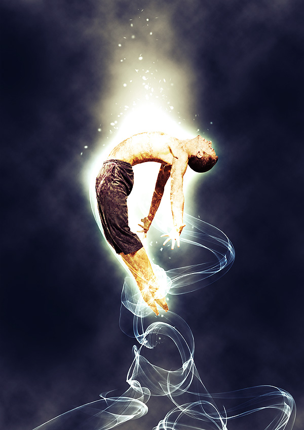
Here is the final result:

 Author : Sebastiano Guerriero
Sebastiano Guerriero is a 23-year-old Italian Graphic Designer whos spent the last two years studying graphics by himself. Hes the author of WeGraphics, a blog that publishes graphic design tutorials, articles about Graphic Design, and graphic design freebies. You can follow him on Twitter (his username is @wegraphics).
Source : Design Instruct
Subscribe to:
Posts (Atom)


- Follow Us on Twitter!
- "Join Us on Facebook!
- RSS
Contact