Showing posts with label your. Show all posts
Showing posts with label your. Show all posts
Wednesday, May 13, 2015
and,
content,
create,
have,
how,
in,
own,
panels,
pse,
templates,
them,
theme,
to,
using,
your
0
comments
How to create your own theme templates using PSE and have them in your content panels
You can create your own custom themes for the different creations like Greeting card, Photo book, CD/DVD jacket etc and have them placed in your content panel of Photoshop Elements Editor.
Here are the steps with which I created my own theme "Mothers Day" for Mothers day and had it placed in my content panel.
1. Create a blank file from File>New>Blank File. Select default size of the file.
2. Now paint it with the color you like. I painted pink and used gradient tool to give non monotonous effect of the background.
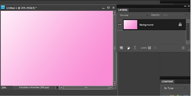
3. Save this as a jpeg on your hard drive. This step is workaround for PSE8 where there is no way of creating a smart object from a leyer as we had in PSE7. Once you have saved the jpeg, click on close widget of the file you were previously working with. It will ask you to save the untitled file. Say No. This will bring back the file you were working till step 2.
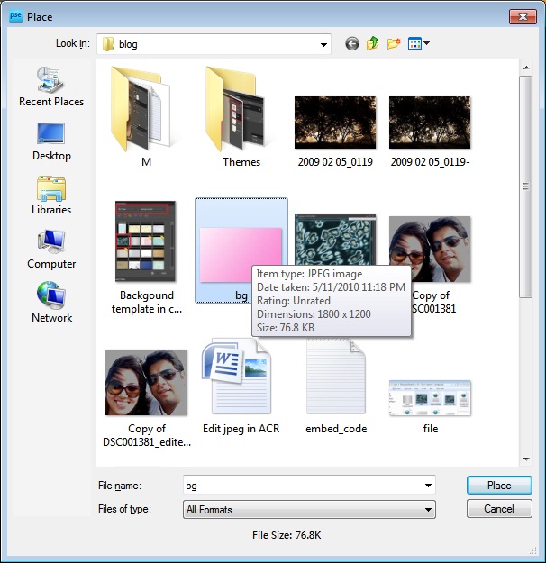
4. Now select the background layer from layers pallette and File>Place and select the jpeg saved at step 3. Click on the green checkmark shown shown over the image.
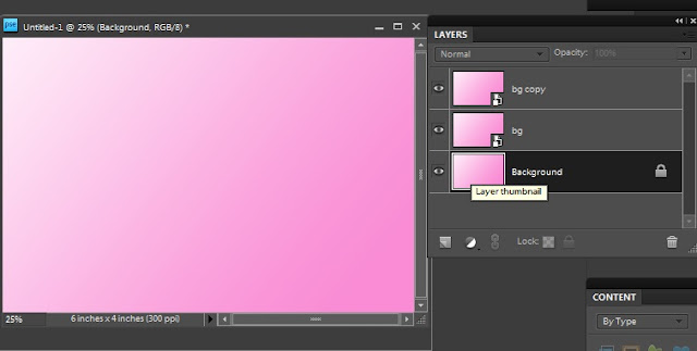
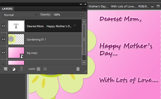
As soon as you do this, you would notice that there is a layer created as a smart object with a tiny icon on the layer thumbnail as shown below. And this layer is exactly as your background layer.
So by now, you would have understood why we saved the background as a separate jpeg in step3. The reason is, in PSE8, we can create smart objects using File>Place. In PSE 7, we do not need the step 3 as we can directly create the background layer as a smart object. This is a workaround in PSE8.
5. Now you can create a duplicate of this smart object layer by pressing Control+J and delete the original background layer.
6. From Window meniu, select Content. This will result in Content pane appear in right hand panel.
7. Select "By Type" from Category and "Frames" in sub category.
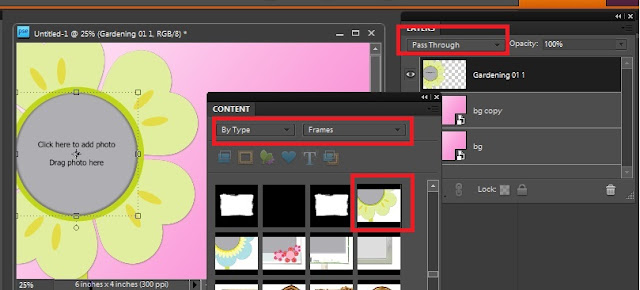
8. Drag a frame from the frames shown in the content bin to the image. Once you do this, you will notice that the blending mode for the frame dropped is "Pass through".
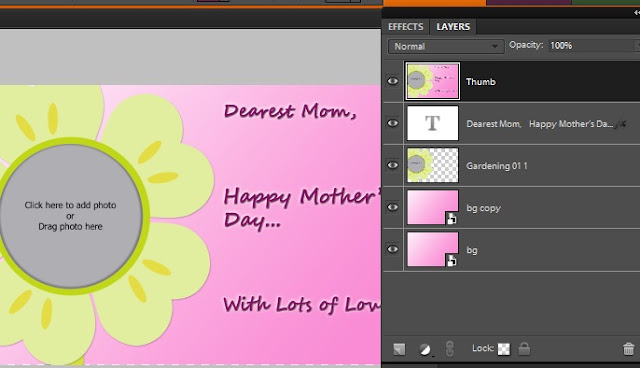
9. Add text layer and put some text to your theme. I am creating a Mothers day greeting card template in this example. So I added the text as shown below.
11. Save this file as a psd. I saved it as "Mothers day.psd"
12. Create a template file with name "<filename>.metadata.xml". I created "Mothers day.metadata.xml"
13. Copy the following into your xml file :
**************************************************************************
Also note that you can edit the categories and sub categories as per your needs. For example my above theme will appear under category Event and sub category Celebration. Similarly in category Color and sub category Pink.
You can customize these as per your needs.
14. Now place your jpeg and your metadata xml file at location :
On XP : C:Documents and SettingsAll UsersApplication DataAdobePhotoshop Elements8.0Photo Creations hemes
On Win 7 : C:ProgramDataAdobePhotoshop Elements8.0Photo Creations hemes
Please make sure that your Editor is closed and you relaunch it to see the background created in your content pane.
If you still do not find it in the content pane in Background category, close Editor and rename the file : "C:Documents and SettingsAll UsersApplication DataAdobePhotoshop Elements8.0Localeen_USMediaDatabase.db3" followed by application relaunch. The launch may take sometime as application creates thumbnails for your background at the location where you have created your jpeg.
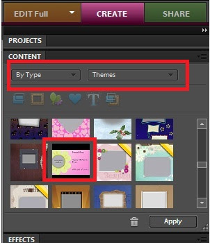
After relaunch, here is where I see my Mothers day theme in Content Panel from Create Pane>Photo Book or Greeting Card :
I hope you find this tutorial useful!
Read more »
Here are the steps with which I created my own theme "Mothers Day" for Mothers day and had it placed in my content panel.
1. Create a blank file from File>New>Blank File. Select default size of the file.
2. Now paint it with the color you like. I painted pink and used gradient tool to give non monotonous effect of the background.
3. Save this as a jpeg on your hard drive. This step is workaround for PSE8 where there is no way of creating a smart object from a leyer as we had in PSE7. Once you have saved the jpeg, click on close widget of the file you were previously working with. It will ask you to save the untitled file. Say No. This will bring back the file you were working till step 2.
4. Now select the background layer from layers pallette and File>Place and select the jpeg saved at step 3. Click on the green checkmark shown shown over the image.
As soon as you do this, you would notice that there is a layer created as a smart object with a tiny icon on the layer thumbnail as shown below. And this layer is exactly as your background layer.
So by now, you would have understood why we saved the background as a separate jpeg in step3. The reason is, in PSE8, we can create smart objects using File>Place. In PSE 7, we do not need the step 3 as we can directly create the background layer as a smart object. This is a workaround in PSE8.
5. Now you can create a duplicate of this smart object layer by pressing Control+J and delete the original background layer.
6. From Window meniu, select Content. This will result in Content pane appear in right hand panel.
7. Select "By Type" from Category and "Frames" in sub category.
8. Drag a frame from the frames shown in the content bin to the image. Once you do this, you will notice that the blending mode for the frame dropped is "Pass through".
9. Add text layer and put some text to your theme. I am creating a Mothers day greeting card template in this example. So I added the text as shown below.
10. Now select all the layers in the palette and right click>Duplicate. This will create duplicate of all layers. Right click again and Merge. name this layer as thumb.
12. Create a template file with name "<filename>.metadata.xml". I created "Mothers day.metadata.xml"
13. Copy the following into your xml file :
**************************************************************************
<?xml version="1.0" encoding="UTF-8"?><PSEContent xmlns="http://ns.adobe.com/PSEContent/2.0/"><name value="$$$/content/themes/Mothers Day=Mothers Day" /><type value="theme" /><creation value="1x1" /><creation value="2x3" /><creation value="3x4" /><creation value="cddvdlabel" /><creation value="cdjacket" /><creation value="dvdjacket" /><creation value="photobook" /><creation value="1x1photobook" /><creation value="3x4photobook" /><category value="$$$/content/category/Event=Event"><subcategory value="$$$/content/category/Event/Celebration=Celebration" /></category><category value="$$$/content/category/Color=Color"><subcategory value="$$$/content/category/Color/Pink=Pink" /></category><category value="$$$/content/category/Style=Style"><subcategory value="$$$/content/category/Style/Cute=Cute" /></category><category value="$$$/content/category/Object=Object" /><category value="$$$/content/category/Mood=Mood"><subcategory value="$$$/content/category/Mood/Fun=Fun" /></category><keyword value="$$$/content/keyword/Toys=Toys" /></PSEContent>
**************************************************************************
Replace the text in the tag with your filename : <name value="$$$/content/themes/<filename>=<filename>" />Also note that you can edit the categories and sub categories as per your needs. For example my above theme will appear under category Event and sub category Celebration. Similarly in category Color and sub category Pink.
You can customize these as per your needs.
14. Now place your jpeg and your metadata xml file at location :
On XP : C:Documents and SettingsAll UsersApplication DataAdobePhotoshop Elements8.0Photo Creations hemes
On Win 7 : C:ProgramDataAdobePhotoshop Elements8.0Photo Creations hemes
Please make sure that your Editor is closed and you relaunch it to see the background created in your content pane.
If you still do not find it in the content pane in Background category, close Editor and rename the file : "C:Documents and SettingsAll UsersApplication DataAdobePhotoshop Elements8.0Localeen_USMediaDatabase.db3" followed by application relaunch. The launch may take sometime as application creates thumbnails for your background at the location where you have created your jpeg.
After relaunch, here is where I see my Mothers day theme in Content Panel from Create Pane>Photo Book or Greeting Card :
I hope you find this tutorial useful!

Thursday, April 30, 2015
cs6,
document,
illustrator,
modifying,
tutorial,
with,
your
0
comments
Modifying your document with illustrator Cs6 Tutorial
This video teach you Modifying your document with illustrator cs6 tutorial
And Im take this one is just could want to them to move them to an arbitrary location. So lets start things off by centering the one, and you do that by going up to the Control panel at the top of the screen, go over here to the right-hand side, and youll see word Align, go ahead and click on it. And then well go and change is Align to Option from Align to Selection to Align to Artboard. And now Ill click on each one of these Middle Align Icons both Horizontal Align Center, and then Vertical Align Center. and then Vertical Align Center. So I am going to press Shift Down arrow--lets say two times--in order to nudge the number downward. Now Ill go up to the Edit menu, and Ill choose the Cut Command or press Ctrl+X, or
| Command+X on the Mac. In illustrator cs6 you To go ahead and move that one to the clipboard, and now Ill go up to the Edit menu and choose one of the coolest commands inside the software paste on all artboards which has a gigantic keyboard shortcut Ctrl+Shift+ Alt+V, or Command+Shift+Opt+V. And then well go ahead and paste that number onto every single page. And all you have to do is switch to the Type tool, which I can get by pressing the T key. But I should say here you may notice that on your toolbox the T is further down. Thats because youre working with a Single Column toolbox, and you can switch between them by clicking on this whole Double Arrow Icon. I have to work with a Double Column toolbox because my screens not tall enough to accommodate all of the tools otherwise. Now I am going to switch to the Type tool, and then its just a matter of selecting each one of these numbers and changing it to a different number. So Im selecting all the ones and changing them, of course, to 2 through 8. And now Ill just switch back to my Default tool which Illustrator CS6 with this tutorial calls the Selection tool
|
adobe,
artwork,
cs6,
illustrator,
navigating,
tutorial,
your
0
comments
Adobe Illustrator CS6 Tutorial Navigating your artwork
Illustrator CS6 Tutorial Video
This chapter is all about getting around in Illustrator cs6., magnifying your artwork, panning
to another location, and managing your workspace.
I spend nine movies on this topic, which is a lot, for the simple reason that theres a lot to know.
 I want you to be able to move around inside Illustrator cs6. without even thinking, because
 thats how everything about the program is going to make sense.
Better still, you will be able to focus less on the mechanics of the software and more
on the task of creating great artwork.
Allow me to help you feel at home in Illustrator cs6..
Tuesday, March 31, 2015
21,
creatives,
fonts,
fresh,
spice,
to,
up,
your
0
comments
21 Fresh Fonts To Spice Up Your Creatives

Museo Cyrillic

Nexa free font

Sreda free font

Casper Typeface

Fengardo Neue

BALLEGE Typeface

Uppertype

Tikal Sans

Obey Typeface

Gluk Fonts

CHE’s Bone – Free Font

Oranienbaum free font

Mood Type

Pontus

Albatross – Free font

Stiff Staff font

BD Bardust

Civita

Foobar Pro

Zarif Typeface

Yeseva

 About The Writer
Hello! My name is Tommy. Im a blogger, I love graphics design and now i went to Architechture Technical Senior High School. | Facebook |
Monday, March 30, 2015
add,
brilliant,
effects,
light,
photoshop,
to,
with,
work,
your
0
comments
Add Brilliant Light Effects To Your Work With Photoshop
Tutorial Resources
- Blanched Paper Textures from WeGraphics
- Dancer from Shutterstock
- light_effects_custombrushes (ZIP, 26.1 MB)
Step 1: Set up the background
Let’s start the tutorial by creating a new document (Ctrl/Cmd + N) in Photoshop. Since I like printing my work, I will typically choose a large standard document size (like A4) and set the Resolution at 300 pixels/inch.

Once the new Photoshop document has been created, fill (Edit > Fill) the default Background layer with a dark blue (#052b4c).
I start my work from the background. If you do the same, I suggest that you don’t give too much importance to your starting colors because we can change them later on once we have completed our foreground work. The most important thing at the beginning is to achieve a concept—something interesting to represent. The beauty of Photoshop is that it allows you to change colors and other aspects of your work at any moment. The best moment to work with colors is when you have more elements to play with, near the end.
Let us start by creating a new layer (Crtl/Cmd + Shift + N). Next, set white (#ffffff) as your Foreground color and then select a large, soft brush tip with Hardness at 0% for our Brush Tool (B).
Simply click once at the center of the canvas to apply your brush stroke.
Step 2: Create a simple ellipse light effect
Since the scene is focused at the center of the canvas, we are going to create a light effect that will enhance all elements that will be placed there. Press Ctrl/Cmd + T to activate the Free Transform command and contract the light source so that it becomes an ellipse.Then, remove the edges of the brush stroke using the Eraser Tool (E) (or use a layer mask, if you want).

Step 3: Create some clouds
We will now make some clouds. Make sure to have white (#ffffff) as foreground color and black (#000000) as your background color; you can press the D key to reset your foreground/background color to white/black and then press X to switch foreground and background colors.Create a new layer and then go to Filter > Render > Clouds.

Activate the Free Transform command (Ctrl/Cmd+T) and enlarge the clouds layer by pulling on one of the corner transform controls.

Switch the layer’s blending mode to Screen to remove black parts of the clouds layer and also reduce the layer’s Opacity to around 30%.

To make the clouds more realistic, use the Eraser Tool (E) to remove some parts to make it look randomized. As always, use a large, soft brush with a Hardness set at 0%.
Just to recap our simple five-step clouds creation process:
- Create a new layer and apply the clouds filter
- Enlarge the layer
- Switch the layer blending mode to screen
- Reduce opacity
- Remove unwanted parts

Repeat the same process to create other clouds. Try experimenting with different layer dimensions and opacity. This is what I ended up with:

Step 4: Select and prepare your subject
Choose a nice subject for your work. I chose this nice image of a dancer, but you can pick any image that you like or have lying around.Since we will create light effects to play with, I suggest you pick a dynamic moving subject such as a person jumping, an animal running, or a rock star jamming.
Once you’ve chosen your subject, copy and paste (Ctrl/Cmd + V) it into the canvas.

At this point, we have to modify the dancer. In particular, the aim is to increase the image contrast and to give the subject a grungier look. We can achieve both these results with a texture.
Firsst, you must download the free sample of my Bleached Paper Texture set, open it in Photoshop, and paste it into our document. Also, you can check out the Design Instruct Freebie section for other interesting textures to use.
Resize the texture with Free Transform (Ctrl/Cmd + T) so that it’s of the same size as our canvas.

Step 5: Apply a clipping mask on the texture layer
We want to apply our texture only to the subject. For this purpose, we can create a clipping mask. To do so, press Alt/Option and then click between the subject’s layer and the texture layer in the Layers Panel. A little arrow should appear and the texture layer’s name will move a bit to the right inside the Layers Panel indicating that you have added a clipping mask.The clipping mask means that all the things we do in the texture layer will affect only the area delimited by dancer’s silhouette.

Switch the texture layer’s blending mode to Overlay and reduce the Opacity to 70%.
Step 6: Change the texture’s color
You can see how the texture details nicely interact with the human body. If you zoom in (press Z to activate the Zoom Tool, and then click on the canvas), you will notice that the grunge texture looks like veins. I want to play around with this idea/concept.Let’s change the texture’s color. Press Ctrl/Cmd + U to open the Hue/Saturation dialog window. Check the Colorize option and move the hue slider to the area between purple and red.

Now create a mask on top of the texture layer by pressing the Add Layer Mask button at the bottom of the Layers Panel.
Next, grab a soft, black brush for our Brush Tool (B) and remove textures from some parts of the body. The image below will show you suggested parts to paint on:

Step 7: Add a vivid light effect
It’s time to add a more brilliant and prominent light effect. Right-click on the subject’s layer in the Layers Panel and then choose Blending Options from the contextual menu.Add an Outer Glow layer style. Increase the Size of the outer glow to around 200px and set Blend Mode to Color Dodge.

The light effect you see at the top is the result of the combination between the ellipse light effect we created at the beginning and the Outer Glow layer style.
If you want to change the orientation of this effect, simply move the elliptical lighting effect layer around.
Step 8: Create an abstract Photoshop brush
Here comes the fun part. There are plenty of ways to create light effects. In this tutorial, I’ll show you one of the simplest methods. We will make abstract fractals for our custom brushes and then we will use these brushes to add lights into our work.In order to create nice abstract fractal effect, we will use the flame tool, which is a free online tool made by Peter Blaskovic. This tool is amazing!

Create you own flames and save them to your computer. Use default colors and once finished, just press Save. Save your flame as a JPG image.
Open one of the flames you just created in Photoshop. We are going to create a cool brush set with these.

Desaturate the image by going to Image > Adjustments > Desaturate (Shift + Ctrl/Cmd + U).
Then invert the image by going to Image > Adjustments > Invert (Ctrl/Cmd + I). We invert the images because while you create Photoshop brushes, you have to consider that the white parts will be transparent and the blacker parts will represent the brush stroke. The parts that are in grayscale will therefore be the only ones saved as brushes.
Here is the result:

To save the brush, go to Edit > Define Brush Preset.
We have thus created the first brush of the set! Go ahead and create other brushes following the same process.

Step 9: Apply the custom abstract Photoshop brush
Create a new layer group (Ctrl/Cmd + G) and title it "light effect". Set the group’s blending mode to Color Dodge. Create a new layer (Ctrl/Cmd + Shift + N) inside the "light effect" group, set your Foreground color to white (#ffffff), and then click on the canvas to apply our custom abstract brush stroke.Here is your light effect! Really simple, don’t you agree? I promised it would only take 10 minutes!
If you want a stronger light effect, duplicate the layer (Ctrl/Cmd + J) and experiment with the layer’s blending mode.

You can now use all the brushes of the brush set you created. Try to combine them in harmony with the body of the subject.
Also try this: Create a new layer, apply an abstract brush stroke, then rotate it with the Free Transform command (Ctrl/Cmd + T). You can also flip the layer (Edit > Transform > Flip Horizontal or Edit > Transform > Flip Vertical). This can add variety to your abstract light effects.
Remember to create each brush stroke on a different layer so that you can move them separately to achieve a satisfactory composition.
Here is the result after I played around with all the brushes of my own set.

Step 10: Add more light effects
Still inside our "light effect" layer group, create a new layer (Ctrl/Cmd + J). This time we will use soft brushes to enhance some parts of the body. For example, take a look at the left hand of the dancer—it’s covered by some light beams. We can start there. Add more light where you think it’s necessary.
Step 11: Make energy particles
We will now create energy particles to detail our light effects. Create another layer inside the same group. Select the 16px Soft Mechanical tip.
Next, we will modify the Brushes options. If it’s not opened, toggle the Brushes Panel (Window > Brushes).
Check the Spacing option and increase its value to 400%.

Then, check the Shape Dynamic and set its options to the following values:

Finally, check Scattering and use the following suggested settings:

All that remains now is to paint over the canvas to create our energy particles. I suggest adding the energy particles on their own layers to compartmentalize our work. To increase the brightness and prominence of the energy particles, you can add an Outer Glow layer style to them.

Step 12: Final adjustments
Our work is almost complete. As I wrote at beginning of the tutorial, Photoshop allows us to play with colors at any moment.In another tutorial I wrote here on Design Instruct, I showed you the power of adjustment layers in Photoshop and how they can dramatically change our work. We will now follow a similar process to complete the work.
Hue/Saturation adjustment layer
Let’s start by desaturating our image a bit. This is something I often do because I’ll apply a Gradient Map later (with its blending mode set at Overlay) that will increase color contrast.Go to Layer > New Adjustment Layer > Hue/Saturation and reduce Saturation to -40.
Note that you can also add adjustment layers by clicking on the Create new fill or layer adjustment button located at the bottom of the Layers Panel.

Curves adjustment layer
Increase the image’s contrast using a Curves adjustment layer. Go to Layer > New Adjustment Layer > Curves. Create a curve as shown in the image below:
Gradient Map adjustment layer
Finally, add a Gradient Map adjustment layer. Set the color gradient so that it goes from purple (#6f156c) to yellow (#f9e600).
Afterwards, set the adjustment layer’s blending mode to Overlay and reduce its Opacity to 50%.
That’s it. We’re done!
Tutorial Summary
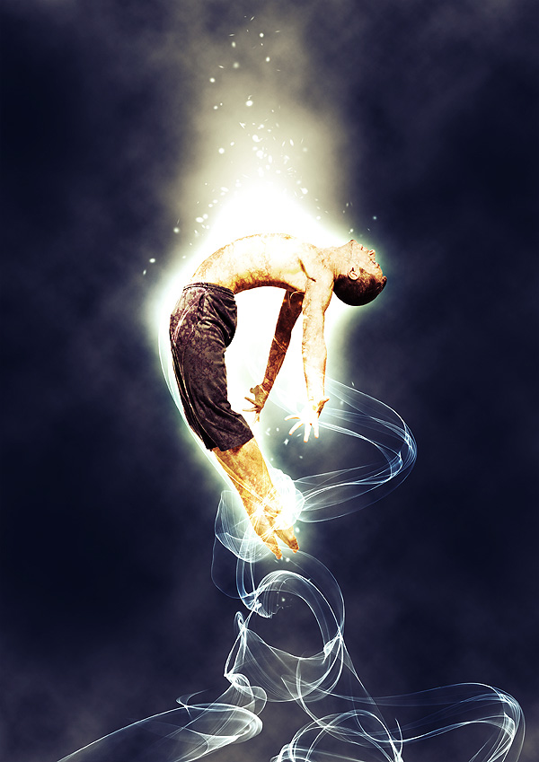
I showed you a variety of light effect techniques in this tutorial. We applied a simple light effect glow using a soft, white brush. Then we stepped it up a notch by adding an Outer Glow layer style on our subject. We created custom abstract light brushes as well as energy particles to enhance the look of our light effects. We applied a clipping mask to our subject for artistic purposes. To finish off our composition, we added some adjustment layers.I hope that you enjoyed this tutorial and learned a few tricks for adding light effects on your own work.
Here is the final result:

 Author : Sebastiano Guerriero
Sebastiano Guerriero is a 23-year-old Italian Graphic Designer whos spent the last two years studying graphics by himself. Hes the author of WeGraphics, a blog that publishes graphic design tutorials, articles about Graphic Design, and graphic design freebies. You can follow him on Twitter (his username is @wegraphics).
Source : Design Instruct
Subscribe to:
Posts (Atom)


- Follow Us on Twitter!
- "Join Us on Facebook!
- RSS
Contact