Showing posts with label design. Show all posts
Showing posts with label design. Show all posts
Friday, May 1, 2015
cs6,
design,
drop,
illustrator,
shadow,
tutorial,
vector,
with
0
comments
Design Vector Drop Shadow with Illustrator CS6 Tutorial
In today’s quick tip tutorial, I’m going to show you how to use one of the great new features of Adobe Illustrator CS6, gradient on stroke, to create a 100% vector Drop Shadow and Inner Glow.
So let’s get to it straight away.

So you’ve drawn a random object, in this case I’ve used the Star Tool and you want a drop shadow on it. To get this go to Effect > Stylize > Drop Shadow and you’ll get the blow dialogue box to modify your drop shadow as you wish.
 However if you were to apply this effect and then Object > Expand it and drill down into the group it produces, you’d notice that it contains a raster element. This is the object labeled "Image" which you can see below.
 In fact if you hide the "Image" you’ll just be left with the original shape. So what actually happens?
 What actually happens when you apply the effect is Adobe Illustrator duplicates the shape and then changes the fill color to say black in this case. It then rasterizes the object, blurs it and offsets it. Then the shape is combined with the original to produce Live Effect Drop Shadow. This means you can go back into the options of the Drop Shadow via the Appearance panel to modify anything from the drop shadow fill color, blur and so on. The same is true when you create an Inner Glow effect.
 You can apply a similar process to create an inner glow effect, just by using "Align Stroke Inside".

There are a couple things you need to keep in mind. You can’t "Align Stroke Outside" with a gradient. To get around this you’ll need to ensure your Drop Shadow color, in this case black, is the most central Gradient Slider and at 100% Opacity. Other than that, you’ll find you can increase the Drop Shadow "blur" by playing with the Stroke Weight and even the Gradient Sliders along the top.
 Let’s just look at this a little more closer and Object > Expand our Gradient on Stroke. When you do this, you’ll notice the Gradient on Stroke is just a Gradient Mesh! So not a raster element as the Live Effect Drop Shadow uses. This makes it a vector Drop Shadow.
 To prove furthermore it’s a Gradient Mesh and one you can actually edit, I’ve used the Direct Selection Tool (A) to select all the points in the corner of our mesh and changed the color to blue.

 Use the duplicate of the original shape to then create a Clipping Mask (Command + 7) and there you’ll have your Inner Glow.

Read more »
Introduction Design Vector Drop Shadow with Illustrator CS6 Tutorial
In today’s quick tip tutorial, I’m going to show you how to use one of the great new features of Adobe Illustrator CS6, gradient on stroke, to create a 100% vector Drop Shadow and Inner Glow.So let’s get to it straight away.
Taking Apart the Drop Shadow
Before we get into how to achieve this drop shadow, we need to understand what actually happens when we use a Drop Shadow effect in Adobe Illustrator at present and why it isn’t completely vector.So you’ve drawn a random object, in this case I’ve used the Star Tool and you want a drop shadow on it. To get this go to Effect > Stylize > Drop Shadow and you’ll get the blow dialogue box to modify your drop shadow as you wish.
100% Vector Drop Shadow – CS5 Style
If you’re a regular reader of VectorTuts+, you may have seen a similar tutorial title a couple of years back. In fact I did a video quick tip tutorial on how to create a 100% vector drop shadow in Adobe Illustrator CS5. This is done by making use of "Align Stroke Outside" in the Appearance panel.100% Vector Drop Shadow – CS6 Style
So how can we achieve a Drop Shadow in CS6? Simple, by duplicating your shape and giving it say a black fill and then a black transparent linear gradient stroke set to "Apply gradient across stroke".There are a couple things you need to keep in mind. You can’t "Align Stroke Outside" with a gradient. To get around this you’ll need to ensure your Drop Shadow color, in this case black, is the most central Gradient Slider and at 100% Opacity. Other than that, you’ll find you can increase the Drop Shadow "blur" by playing with the Stroke Weight and even the Gradient Sliders along the top.
100% Vector Inner Glow – CS6 Style
If only you could use "Align Stroke Inside" with Gradient on Stroke, because creating an Inner Glow would be a lot easier. However as you can see from the below, the option is greyed/nulled out. So to create an Inner Glow first duplicate your original shape. Then put your fill on as normal and then "Apply gradient across stroke" with the previously used transparent linear gradient. Give the stroke only a Blending Mode and Opacity.Conclusion
Why would you want to do this? Well if you’re a vector freak like me, the thought of having any raster elements in your work makes your skin crawl and you’d like to go that extra mile to ensure every part of your work is vector. Maybe I’ve just confessed to some bizarre vector OCD. Anyway other than that, it’s just a bit of an exercise for those who like to exercise their scalable brains. I hope you’ve enjoyed this tip!
The future lies ahea d of us, but beh ind us the re is also a grea t accumulation of history—a resource for imagination and crea tivity. I think we call “creative” tha t dynamism of intellectual conception that flows back and forth betwee n the future and the past.
Graphic Design Theory PDF give you improve skill design
Graphic Design Theory PDF is an introduction to graphic design theory. Each selection, written in its own time and place across a century of design evolution, explores the aesthetic and social purposes of design practice. All of these writers were—or are—visual producers active in the field, engaged with the realities of creating graphic communication. Why did they pause from making their work and building their careers to write about what they do? Why should a young designer today stop and read what they wrote?

Design is a social activity. Rarely working alone or in private, designers respond to clients, audiences, publishers, institutions, and collaborators. While our work is exposed and highly visible, as individuals we often remain anonymous, our contribution to the texture of daily life existing below the threshold of public recognition. In addition to adding to the common beat of social experience, designers have produced their own subculture, a global discourse that connects us across time and space as part of a shared endeavor, with our own heroes and our own narratives of discovery and revolution. Few members of the general public are aware, for example, of the intense waves of feeling triggered among designers by the typeface Helvetica, generation after generation, yet nearly anyone living in a literate, urbanized part of the world has seen this typeface or characters inspired by it. Design is visible everywhere, yet it is also invisible—unnoticed and unacknowledged.
Creating design theory is about building one’s own community, constructing a social network that questions and illuminates everyday practice—making it visible. Many of the writers in this book are best known for their visual work; others are known primarily as critics or educators. But in each case, a living, active connection to practice informs these writers’ ideas. Each text assembled here was created in order to inspire practice, moving designers to act and experiment with incisive principles in mind. El Lissitzky, whose posters, books, and exhibitions are among the most influential works of twentieth-century design, had a huge impact on his peers through his work as a publisher, writer, lecturer, and curator. In the mid-twentieth century, Josef Müller-Brockmann and Paul Rand connected design methodologies to the world of business, drawing on their own professional experiences. Wolfgang Weingart, Lorraine Wild, and Katherine McCoy have inspired generations of designers through their teaching as well as through their visual work. Kenya Hara has helped build a global consumer brand (muji) while stimulating invention and inquiry through his work as a writer and curator.
A different kind of design theory reader would have drawn ideas from outside the field—from cognitive psychology, for example, or from literar criticism, structural linguistics, or political philosophy. Designers have much to learn from those discourses as well, but this book is about learning from ourselves. Why theory? Designers read about design in order to stimulate growth and change in their own work. Critical writing also inspires new lines of questioning and opens up new theoretical directions. Such ideas draw people together around common questions. Designers entering the field today must master an astonishing range of technologies and prepare themselves for a career whose terms and demands will constantly change. There is more for a designer to “do” now than ever before. There is also more to read, more to think about, and many more opportunities to actively engage the discourse. Graphic Design Theory PDF lays the groundwork for plunging into that discourse and getting ready to take part.
Get Graphic Design Theory PDF
Must login with gmail account and get this book. Or sent email to imkits@gmail.com and autoresponder to you link download. ( I want to link download never dead so I share by this method)
Related Rearch
Read more »
Graphic Design Theory PDF give you improve skill design
Graphic Design Theory PDF is an introduction to graphic design theory. Each selection, written in its own time and place across a century of design evolution, explores the aesthetic and social purposes of design practice. All of these writers were—or are—visual producers active in the field, engaged with the realities of creating graphic communication. Why did they pause from making their work and building their careers to write about what they do? Why should a young designer today stop and read what they wrote?
-->
Theory is all about the question “why?” The process of becoming a designer is focused largely on “how”: how to use software, how to solve problems, how to organize information, how to get clients, how to work with printers, and so on. With so much to do, stopping to think about why we pursue these endeavors requires a momentary halt in the frenetic flight plan of professional development. Design programs around the world have recognized the need for such critical reflection, and countless designers and students are hungry for it. Graphic Design Theory PDF, carefully curated by emerging scholar and designer Helen Armstrong, is designed as a reader for history and theory courses as well as an approachable volume for general reading. Armstrong developed the book as graduate research in the Graphic Design mfa program at Maryland Institute College of Art, which has produced a series of collaboratively authored books. Hers is the first book from our program edited independently by a graduate student. Presented within its pages are passionate, intelligent texts created by people who helped build their field. These writers used their practical understanding of living processes and problems to raise philosophical, aesthetic, and political questions about design, and they used those questions, in turn, to inspire their own visual work as well as the work of people around them.Design is a social activity. Rarely working alone or in private, designers respond to clients, audiences, publishers, institutions, and collaborators. While our work is exposed and highly visible, as individuals we often remain anonymous, our contribution to the texture of daily life existing below the threshold of public recognition. In addition to adding to the common beat of social experience, designers have produced their own subculture, a global discourse that connects us across time and space as part of a shared endeavor, with our own heroes and our own narratives of discovery and revolution. Few members of the general public are aware, for example, of the intense waves of feeling triggered among designers by the typeface Helvetica, generation after generation, yet nearly anyone living in a literate, urbanized part of the world has seen this typeface or characters inspired by it. Design is visible everywhere, yet it is also invisible—unnoticed and unacknowledged.
Creating design theory is about building one’s own community, constructing a social network that questions and illuminates everyday practice—making it visible. Many of the writers in this book are best known for their visual work; others are known primarily as critics or educators. But in each case, a living, active connection to practice informs these writers’ ideas. Each text assembled here was created in order to inspire practice, moving designers to act and experiment with incisive principles in mind. El Lissitzky, whose posters, books, and exhibitions are among the most influential works of twentieth-century design, had a huge impact on his peers through his work as a publisher, writer, lecturer, and curator. In the mid-twentieth century, Josef Müller-Brockmann and Paul Rand connected design methodologies to the world of business, drawing on their own professional experiences. Wolfgang Weingart, Lorraine Wild, and Katherine McCoy have inspired generations of designers through their teaching as well as through their visual work. Kenya Hara has helped build a global consumer brand (muji) while stimulating invention and inquiry through his work as a writer and curator.
A different kind of design theory reader would have drawn ideas from outside the field—from cognitive psychology, for example, or from literar criticism, structural linguistics, or political philosophy. Designers have much to learn from those discourses as well, but this book is about learning from ourselves. Why theory? Designers read about design in order to stimulate growth and change in their own work. Critical writing also inspires new lines of questioning and opens up new theoretical directions. Such ideas draw people together around common questions. Designers entering the field today must master an astonishing range of technologies and prepare themselves for a career whose terms and demands will constantly change. There is more for a designer to “do” now than ever before. There is also more to read, more to think about, and many more opportunities to actively engage the discourse. Graphic Design Theory PDF lays the groundwork for plunging into that discourse and getting ready to take part.
Get Graphic Design Theory PDF
Must login with gmail account and get this book. Or sent email to imkits@gmail.com and autoresponder to you link download. ( I want to link download never dead so I share by this method)
Related Rearch
Icon Design in Illustrator cs6 are nifty little designs that add flavor to your web pages while helping to direct users to different areas of interest. While most websites dont require a ton of icons, they do usually require several and creating these seemingly simple designs can be much more complicated than you think.

-Planning the concept for a cohesive icon set
-Creating and refining icons in Adobe Illustrator
-Working with multiple artboards
-Advanced icon drawing techniques
-Working with perspectives
-Finalizing and polishing finished icons
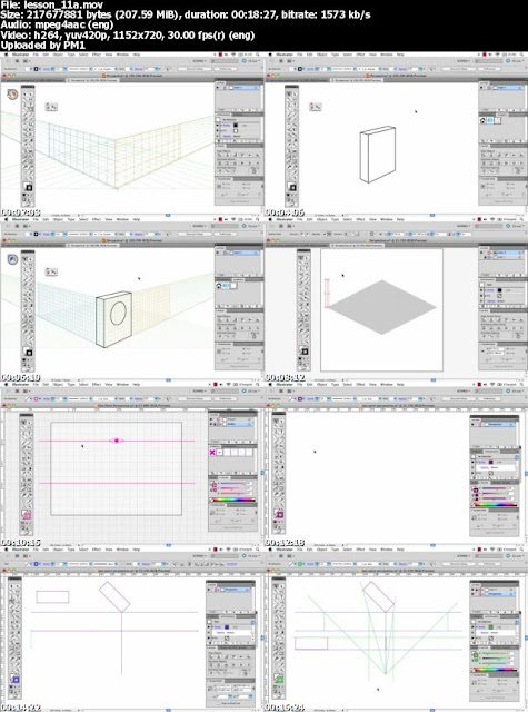
Download Icon Design in Illustrator cs6 :
Tuts.Icon.Design.2012.part1.rar
Tuts.Icon.Design.2012.part2.rar
Tuts.Icon.Design.2012.part3.rar
Tuts.Icon.Design.2012.part4.rar
Tuts.Icon.Design.2012.part5.rar
Why Use Icons Design in Illustrator cs6
Icons Design in cs6 are used in the design of your web pages to add a visual element to your content. While paragraph after paragraph of text will eventually get boring and a reader will lose interest, by adding icons to break up and accent the text you can keep your readers attention longer.
They are also used in places like the header of a page, the table of contents, in product lists, and in the place of common bullet points. Used in these place, icons add charm to your text and highlight what you are selling or saying.
Icons Design can go a long way in making a website look and feel professional from the very first glance. They show your readers that you care about even the small details of your business. When designed correctly, they add to your website, not distract from it, and they should be made to go with the flow and feel of your site and other company graphics to add to brand recognition.
Read more »
-Planning the concept for a cohesive icon set
-Creating and refining icons in Adobe Illustrator
-Working with multiple artboards
-Advanced icon drawing techniques
-Working with perspectives
-Finalizing and polishing finished icons
Download Icon Design in Illustrator cs6 :
Tuts.Icon.Design.2012.part1.rar
Tuts.Icon.Design.2012.part2.rar
Tuts.Icon.Design.2012.part3.rar
Tuts.Icon.Design.2012.part4.rar
Tuts.Icon.Design.2012.part5.rar
Why Use Icons Design in Illustrator cs6
Icons Design in cs6 are used in the design of your web pages to add a visual element to your content. While paragraph after paragraph of text will eventually get boring and a reader will lose interest, by adding icons to break up and accent the text you can keep your readers attention longer.
They are also used in places like the header of a page, the table of contents, in product lists, and in the place of common bullet points. Used in these place, icons add charm to your text and highlight what you are selling or saying.
Icons Design can go a long way in making a website look and feel professional from the very first glance. They show your readers that you care about even the small details of your business. When designed correctly, they add to your website, not distract from it, and they should be made to go with the flow and feel of your site and other company graphics to add to brand recognition.
Wednesday, April 1, 2015
app,
design,
freebie,
transparent,
web
0
comments
Transparent Web App Design Freebie
Lonavla - Transparent Web App Design - Freebie

Download
Tuesday, March 31, 2015
app,
concept,
design,
free,
ios7,
psd
0
comments
ios7 app design concept Free psd
IOS7 App Design
(Free PSD)


ios7 conceptual app design -
Free zip file contains 2 psd files.
Get location screen and sliding menu screen.
Font used - Levenim MT (Free font)
Download Here
Monday, March 30, 2015
80’s,
design,
photoshop,
style,
using
0
comments
80’s Style Design Using Photoshop

Part 1: Creating The Main Text
Taking a canvas size of 1900 X 1200. Of course you could pick any size according to your preference, but make sure the resolution is decent enough.
Fill the background layer BLACK.

With the Text Tool type whatever you want the text to be. I chose “Leave, but don’t leave me”, from a Pink Floyd song. “But don’t leave me” is coming later. Right now we’ll work on “Leave”. The font I have used is Futura Heavy.

- Right-click on the text layer, go to Blending Options to create Layer styles.
- On the Layer style box, go to Gradient Overlay, tick it.
- On the Gradient Overlay, we open the Gradient editor and make the New Custom Gradient as above. I have chosen shades of black, white and grey so that we can easily modify the colors later.

Then apply Stroke, and in the fill type, set it to Gradient, and choose the simple Black to White Gradient preset.

Next, make a new layer above the text layer, name it Gradient 1 (or anything you please). Fill it with a gradient. I used real bright colors, in honor of the 80’s.

The ‘Gradient 1′ layer is set to Soft Light mode, with an opacity of 72% (you can experiment with the modes, and opacity).

The above image shows you are current progress. We are beginning to have the 80’s looks to it.
Part 2: The Background

Next we are going to add a nice texture to the image. I have used a paper texture. You can find it here.
Select all (Ctrl/Cmd+A), copy the texture (Ctrl/Cmd+C) and paste it (Ctrl/Cmd+V) on your work. The Blend Mode is ‘Vivid Light’, and you can see we already have a great effect going.

Now it’s time to create a new brush to get a cloud effect; open up the Brush Engine, and use the following settings:


It’s a very useful brush, and can be used to make clouds in other work as well.
Now make a new layer “Clouds”, and paint with the brush you just created. Add a bit of Inner Shadow, to add more depth to the clouds.

Now change the order of layers, bring the ‘Clouds’ layer just above the Background. Also, the opacity of the ‘Clouds’ layer is Changed to 56%.
 
Now Ctrl/Cmd+Click the ‘Leave’ (Text) Layer, which selects the region of the text, and then go to the ‘Gradient 1′ layer and add a layer mask. This masks of the gradient from the rest of the image and leaves it on the Text.

Then we create a New Layer, Name it ‘Clouds 1′, Above the ‘Clouds’ layer. Make sure your foreground and background colors are Black & White, Go to Filter -> Render -> Clouds.

Keep the overlay mode as Vivid Light. Then in the Blending mode, add a Gradient Overlay, and use the following 2 colors for the gradient: #00fff0 and #e303bb.

Next we will add some stars to the background.
We now make a new layer above the ‘Cloud 1′ layer and fill it with Black. Then we go to Filter -> Noise -> Add Noise. Use Gaussian, Monochromatic, 10 % amount. There are various ways of making a star filled sky, this is the one I chose.
 
Next, choose Image -> Adjustment -> Levels and use the following values for Inputs: 65, 1.00, 99.

I have renamed the layer to Stars, and the blending mode is set as Screen.
Next we’ll add bigger glowing stars. Make the following brush using the brush engine:

Paint with varying brush sizes. Use the bracket keys ([ and ])to change the size quickly. Then add a Layer mask, and paint with black, using the same brush. This gets rid of some extra stars.

Now with a brush of 0% hardness and size of around 300, paint along the edges and get rid of some more stars, also add some Gaussian Blur if required.

Part 3: The 80’s Twinkle
It’s very simple to create the twinkle used in so many 80’s posters. 
- Take a soft brush, and just click once with it on a new layer, to create a soft circle.
- Duplicate the layer, and go to Filter -> Blur -> Motion Blur, Angle 0 degree, Distance around 46 pixels.
- Keep duplicating and adding motion blur 3 more times.
- Then merge all these layers (5 of them). Go to Free Transform, and stretch it, it widen the glowing object.
- Finally, duplicate the merged layer, Rotate by 90 degrees.
Now we can use the ‘Twinkle’ layer where needed.

Duplicate the ‘Twinkle’ layer over the Text layer (rotated, transformed etc.) and place them on the text. This makes it shiny and 80’s!
Part 4: The shapes
Create a new layer for the shapes.Using the polygon lasso tool, and create a selection in the shape shown above. Select the Gradient tool, and use a Gradient of color White (foreground color) and transparent. We fill the selection with this gradient.

Next, Duplicate the shape and shift it a bit. (Press Alt/Option and drag the shape). Merge the layers, and duplicate them. Then we flip them horizontally and create and new shape.

Orient the shapes in different directions and places, as shown below:


Then apply a Gradient Overlay, using Blending options on the few layers, with Hard Light as the Gradient Overlay Blend mode.

So, this is how it looks so far (below). We are almost done now. You can leave it right here, or make a few more adjustments.

I add the new Text layer, “But Don’t Leave Me”, and apply a stroke via the Blending options.

If you think the colors are too bright, you can add a Hue/Saturation mask on the top of the layer stack, and lower the saturation to somewhere around -15.

The final image:

Hope you had a lot of fun going through this tutorial. A big thanks to the guys at GoMedia, for making this possible. Cheers!
 Author : Rahul Jha
Source : gomediazine
Subscribe to:
Posts (Atom)


- Follow Us on Twitter!
- "Join Us on Facebook!
- RSS
Contact