Showing posts with label icon. Show all posts
Showing posts with label icon. Show all posts
Friday, May 1, 2015
adobe,
bridge,
cs2,
cs6,
icon,
illustrator,
tutorial
0
comments
Adobe Bridge CS2 Icon Illustrator CS6 Tutorial
Adobe Bridge CS2 Icon
This tutorial will show you how to replicate the Adobe Bridge icon in Illustrator CS6 using the same techniques as the Photoshop Splash Page tutorial. You will be surprised how easy it is to create such as complicated icon with gradient & blending mode.Download Source File
Required: Illustrator CS2+
1. Place Images
First, place in the original Adobe Bridge icon image in Layer 1 for reference. Double click on Layer 1 and change the following Layer Options: check Lock and Dim Images to 50%.
2. Start Tracing
Make a new layer. Hold down Ctrl key and click on the Visibility icon of Layer 2 to view that layer in Outline Mode. Now use the Pen tool and start tracing the basic shapes of the sea shell.

3. Gradient
Select the top layer and apply a 2 colors radial gradient (color 1 = m5, color 2 = c26, m86, y44). Use the Gradient Tool (G) and drag from the lower center to top corner. This will re-position the gradient.
4. Multiply Blending Mode
Now in the Transparency palette, select Multiply Blending Mode. Notice this will create the see through effect.
5. Back Layer
Select the back sea shell layer, fill it with another radial gradient (color 1 = c21, color 2 = c26, m86, y44). Again, you need to use the Gradient Tool to position the gradient. Then, select Multiply Blending Mode.
6. Top Layer
Select the top layer and fill it with different color gradient (color 1 = m5, color 2 = c33, m95, y62). Again, select Multiply Blending Mode.
7. Eyedropper
Select the rest of the unfilled paths, use the Eyedropper tool and click on the top layer to copy the gradient fill. To get the best result, you might need to use the Gradient Tool to adjust the gradient position of each shape.
8. Icon Base
Make a rectangle box and then apply 25pt round corner (Effect > Stylize > Round Corners).
9. Drop Shadow
Now go to Effect > Stylize > Drop Shadow and apply the following setting:
10. Gradient
Use the Gradient Tool and apply a 3 colors gradient as shown (color 1 = k0, color 2 = k16, color 3 = k13).
11. Add New Stroke
To make an inner glow effect, we need to add a new stroke. in the Appearance palette (top right corner dropdown menu), select Add New Stroke.
Align Stroke Inside
In the Appearance palette, selct the new added stroke, fill it with 4pt white stroke color. Then open the Stroke palette, and click on Align Stroke to Inside.
12. White Background
Notice when you place the sea shell on top of the icon base, the sea shell is see-through because the blending mode has been set to multiply? We can get rid of that by adding a white background to the sea shell. First copy the entire sea shell to clipboard, then merge the current sea shell by Alt-click on Add to shape area (Pathfinder palette).

Final
The image on the left is my version and the image on the right is the original version.

iTune Icon Illustrator CS6 Tutorial
The challenge of this tutorial is to use various Blending modes and blending techniques to replicate the iTune icon. This tutorial is a good exercise to master your Blend techniques.Download Source File
Required: Illustrator 9+
1. Basic Shapes
Start making the basic shapes of the iTune icon. If you need help on how to trace from an image, visit my Tracing Photo tutorial.
2. Music Note
Make a glossy orb by using my Glossy Button technique. First, make 3 shapes from light color to dark color. Go to Object > Blend > Blend Options, select Specified Steps = 128. Then select all 3 shapes and press Ctrl + Alt + B or go to Object > Blend > Make.
Reflection
Make an oval shape and fill with black-white gradient. Make sure the black color is full black (C,M,Y,K=100). Drag it on top of the orb and select Screen Blending Mode.
Highlights
Make a tall vertical rectangle and an elongate circle; then Blend it. Duplicate it by Alt-drag to the right.


3. CD
Use the Gradient tool and fill the CD shapes with white-grey gradient.
Rainbow Gradient
Make some multi-color line strokes as shown below. Make sure the first and last stroke is white because it will be transparent. Use the Blend Tool (W), click on the edge of each stroke starting from left to right.
Mask
Use the CD shape and mask the rainbow gradient by Ctrl+7 or Object > Clipping Mask > Make. Then select Multiply Blending Mode and adjust the Opacity to 26%.

4. Music Note Refection
Make 3 oval paths, make sure the outer path is white color(this will make a glow effect). Select all 3 paths, go to Object > Blend > Make (Ctl+Alt+B).

5. Drop Shadow
The last step is to apply a Drop Shadow effect to the CD. Select the outer CD path, go to Effect > Stylize > Drop Shadow and apply the following setting:
Final
Here is the final iTune icon!
Wednesday, April 29, 2015
cs6,
design,
icon,
illustrator,
in
0
comments
Icon Design in Illustrator cs6
Icon Design in Illustrator cs6 are nifty little designs that add flavor to your web pages while helping to direct users to different areas of interest. While most websites dont require a ton of icons, they do usually require several and creating these seemingly simple designs can be much more complicated than you think.

-Planning the concept for a cohesive icon set
-Creating and refining icons in Adobe Illustrator
-Working with multiple artboards
-Advanced icon drawing techniques
-Working with perspectives
-Finalizing and polishing finished icons
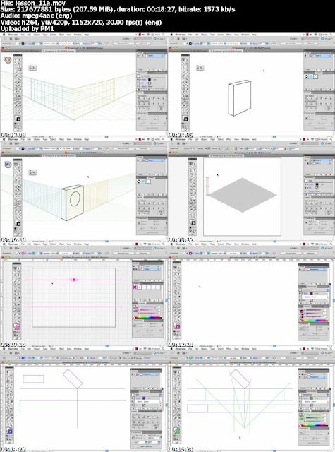
Download Icon Design in Illustrator cs6 :
Tuts.Icon.Design.2012.part1.rar
Tuts.Icon.Design.2012.part2.rar
Tuts.Icon.Design.2012.part3.rar
Tuts.Icon.Design.2012.part4.rar
Tuts.Icon.Design.2012.part5.rar
Why Use Icons Design in Illustrator cs6
Icons Design in cs6 are used in the design of your web pages to add a visual element to your content. While paragraph after paragraph of text will eventually get boring and a reader will lose interest, by adding icons to break up and accent the text you can keep your readers attention longer.
They are also used in places like the header of a page, the table of contents, in product lists, and in the place of common bullet points. Used in these place, icons add charm to your text and highlight what you are selling or saying.
Icons Design can go a long way in making a website look and feel professional from the very first glance. They show your readers that you care about even the small details of your business. When designed correctly, they add to your website, not distract from it, and they should be made to go with the flow and feel of your site and other company graphics to add to brand recognition.
Read more »
-Planning the concept for a cohesive icon set
-Creating and refining icons in Adobe Illustrator
-Working with multiple artboards
-Advanced icon drawing techniques
-Working with perspectives
-Finalizing and polishing finished icons
Download Icon Design in Illustrator cs6 :
Tuts.Icon.Design.2012.part1.rar
Tuts.Icon.Design.2012.part2.rar
Tuts.Icon.Design.2012.part3.rar
Tuts.Icon.Design.2012.part4.rar
Tuts.Icon.Design.2012.part5.rar
Why Use Icons Design in Illustrator cs6
Icons Design in cs6 are used in the design of your web pages to add a visual element to your content. While paragraph after paragraph of text will eventually get boring and a reader will lose interest, by adding icons to break up and accent the text you can keep your readers attention longer.
They are also used in places like the header of a page, the table of contents, in product lists, and in the place of common bullet points. Used in these place, icons add charm to your text and highlight what you are selling or saying.
Icons Design can go a long way in making a website look and feel professional from the very first glance. They show your readers that you care about even the small details of your business. When designed correctly, they add to your website, not distract from it, and they should be made to go with the flow and feel of your site and other company graphics to add to brand recognition.
History, theory, tips and tutorials an insight into the word on icon design
Introduction Icon For designer

Get This Book at link above
A Picture Tells a Thousand Words
With roots stretching as far back as the 1970s, the humble icon has come a long way. Evolving from black and white representations of office items into beautifully rendered illustrations of objects, symbols, characters and the same office items from the very beginning, icons have become a visual language that is understood the world over.
Where a picture will tell a thousand words, a computer icon informs, educates and reassures its audience. Because icons are used for such specific purposes, creating a successful icon design is more of a science than an art.
I came to icon design almost by accident. My first year out from University, I was hired to work in-house for a software company who needed an icons and UI illustrator. With two degrees in Multimedia and Communication Design and a portfolio of digital illustration, I stood out as a good candidate for the job.
I had never given icon design much thought beyond the occasional replacement set, but knowing that this was a rare opportunity, I decided to jump in the deep end (with both feet!). I took the offer and a week later I was up to my eyeballs in specifications, requests and a back catalogue of previous designs. I was spending most of my time in review meetings with the development team, product management and even marketing. I quickly learned that when asked, everyone has an opinion, right or wrong.
So here I was, stuck in the middle of the technical requirements of the development team and the aesthetic guides from marketing. To top it off, I was spending hours rendering images and all I had to show at the end of the day was a handful of pixels! It was really frustrating to move from print design and illustration to screen.As time progressed, I settled into the role of “icon lady” and started to see the craft and beauty in small images.
I also developed a system of project management that greatly improved my workflow (less meetings = more productivity).
During the course of Icon designer book, I will share my experiences in the field of icon design, look at rendering styles and ways to achieve them, and the many uses for icons today. This book won’t teach you how to emulate others. It won’t focus heavily on one OS over another; nor will it turn you into a master overnight. Instead it will help you create designs that will stand up to the test of time and help you better understand the constraints (and the joys) of pixel perfect rendering.
Get this book at here
Read more »
Introduction Icon For designer
Get This Book at link above
A Picture Tells a Thousand Words
With roots stretching as far back as the 1970s, the humble icon has come a long way. Evolving from black and white representations of office items into beautifully rendered illustrations of objects, symbols, characters and the same office items from the very beginning, icons have become a visual language that is understood the world over.
-->
Where a picture will tell a thousand words, a computer icon informs, educates and reassures its audience. Because icons are used for such specific purposes, creating a successful icon design is more of a science than an art.
I came to icon design almost by accident. My first year out from University, I was hired to work in-house for a software company who needed an icons and UI illustrator. With two degrees in Multimedia and Communication Design and a portfolio of digital illustration, I stood out as a good candidate for the job.
I had never given icon design much thought beyond the occasional replacement set, but knowing that this was a rare opportunity, I decided to jump in the deep end (with both feet!). I took the offer and a week later I was up to my eyeballs in specifications, requests and a back catalogue of previous designs. I was spending most of my time in review meetings with the development team, product management and even marketing. I quickly learned that when asked, everyone has an opinion, right or wrong.
So here I was, stuck in the middle of the technical requirements of the development team and the aesthetic guides from marketing. To top it off, I was spending hours rendering images and all I had to show at the end of the day was a handful of pixels! It was really frustrating to move from print design and illustration to screen.As time progressed, I settled into the role of “icon lady” and started to see the craft and beauty in small images.
I also developed a system of project management that greatly improved my workflow (less meetings = more productivity).
During the course of Icon designer book, I will share my experiences in the field of icon design, look at rendering styles and ways to achieve them, and the many uses for icons today. This book won’t teach you how to emulate others. It won’t focus heavily on one OS over another; nor will it turn you into a master overnight. Instead it will help you create designs that will stand up to the test of time and help you better understand the constraints (and the joys) of pixel perfect rendering.
Get this book at here
Make a Button in two steps
Final view

Step 1:
Create new file and fill background with black color (Shft+f5 ---> color ---> Select Black color---> OK).

select Elliptical Marquee Tool and Draw a circle. Press and hold Shift key while Drawing circle. because it will results to accurate..

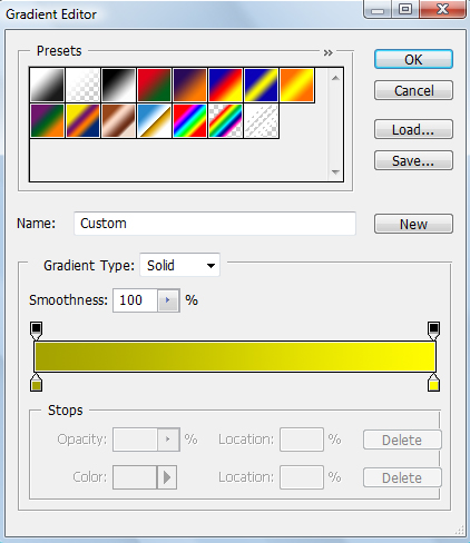

Create new file and fill background with black color (Shft+f5 ---> color ---> Select Black color---> OK).
Select Gradient fill Tool and select the two color combination, here Ive choose "FFFC00" and "A5A300" colors.
Hit OK. And drag the cursor from top-left corner to right-bottom.
Step 2:
Again select Elliptical Marquee Tool and Draw a circle smaller than previously drawn. Press and hold Shift key while Drawing circle. because it will results to accurate..
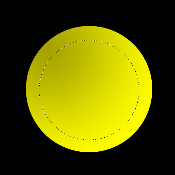
Again select Gradient Fill tool and Drag cursor from Right-Bottom corner to Left-Upper corner..
Done..!!
Wednesday, March 18, 2015
blog,
calendar,
design,
how,
icon,
in,
photoshop,
to
0
comments
How to design Blog Calendar Icon in Photoshop
In this Photoshop tutorial you will learn how to design Blog Calendar Icon. We will be using some tools like Rectangle Tool, Marquee Selection Tool, Horizontal Type tool etc. We will also learn some Layer Styles techniques like, Gradient Overlay, Inner Glow, Drop Shadow, Inner Shadow etc. Nice tutorial for those who are new to Photoshop and wanted to learn Icon Design technique. Lets start.


 Result:


 Result:


 Result:


 Result:


Step 1:
Let’s start out by creating a new file. I used a 200×200 pixels canvas set at 72dpi, and I filled my background with #D0E8EA color shade. In a new layer, draw a gray rectangle with #A7A7A7 color shade and 96 x 63 px dimensions.
Step 2:
Under Layer add a Gradient Overlay blending option to your gray rectangle layer.
Step 3:
In a new layer, draw a white rectangle with 92 x 45 px dimensions. Then cut the bottom left corner as shown below.
Step 4:
Under Layer Style (Layer > Layer Style) add a Gradient Overlay blending option to your white rectangle layer.
Step 5:
In a new layer, draw a light gray right triangle on the cut out corner of the white rectangle. Then in another layer, draw a red rectangle with #FF0000 color shade and 92 x 17 px dimensions.
Step 6:
Under Layer Style (Layer > Layer Style) add an Inner Glow blending option to the red rectangle layer.
Step 7:
In a new layer, draw a small gray rectangle with #D2D2D2 color shade and 6 x 12 px dimensions as shown below.
Step 8:
Under Layer Style (Layer > Layer Style) add a Drop Shadow, Inner Shadow, and Gradient Overlay blending options to the small gray rectangle layer.
Step 9:
Duplicate the small gray rectangle design and place it as shown below. Now select the Horizontal Type Tool then set the font family to Arial, regular, 12 pt, none and white color shade. In a new text layer type the month on the middle of the small gray rectangle designs.
Step 10:
In a new text layer add the day using font Arial, bold, 20 pt, smooth, and #6D6D6D color shade. Then in another text layer add the month below the day with smaller fonts.
Results:
So here is our Final Clean Blog Calendar Icon Design which we just made in Photoshop, hopefully you like working on it and learn something by following this tutorial.
Subscribe to:
Posts (Atom)


- Follow Us on Twitter!
- "Join Us on Facebook!
- RSS
Contact