Showing posts with label making. Show all posts
Showing posts with label making. Show all posts
Tuesday, May 19, 2015
better,
for,
how,
in,
making,
pse,
quick,
selection,
selections,
the,
to,
tool,
train
0
comments
How to train the quick selection tool for making better selections in PSE
Quick selection is a great tool for selecting objects in any image. It intelligently selects the object distinctly from the background by detecting the brightness, contrast and tonal changes along the objects and their backgrounds. It takes just a little mouse drag with in an object to select an background.
For example : for the image below I just dragged my mouse from point A to point B for selecting the whole apple instead of moving my mouse along the edges of the whole apple which we would require for other selection tools.
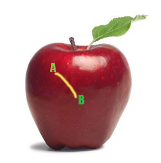
This is how my object was selected moving my mouse from point A to B (Please note I increased the brush size to 35 px from options bar after selecting the quick selection tool for making this selection) :
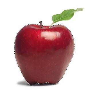
However in the above image, there is good contrast between the object to be selected and its background. So we did not need to train our quick selection tool. But for getting better results in minimum time when there is not much great color difference or contrast between our object and background, it is recommended that you train your quick selection tool.
So in an image like below, where there is not that great color contrast between yellow flower and its background, we would train our tool.
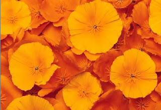
So if I move my quick selection tool from point A to B to select the yellow flower, here is what
I get as selected :
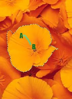
However I did not need this extra highlighted(green) part in my selection(as shown below) which was selected when I moved my mouse from point A to point B. But since there is a low contrast between the orange and the yellow here, this area too got selected.
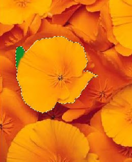
So instead of selecting my flower in one go as shown above, I follow the steps below to get my needed selection :
1. Select a very small part of the yellow flower as shown after selecting Quick selection tool.
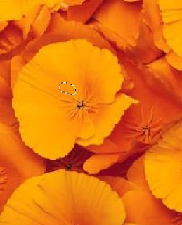
2. Now I will press Alt key and keeping it pressed, I click and drag my mouse over the area I did not want in the selection. So I brush my mouse over the green highlighted region shown in the second last image.
I also notice that as soon as I click Alt key my mouse cursor changes from "+" to "-" as it tell what area not to select.
Once I am done with that I leave the Alt key back and again move my mouse from point A to B as I did earlier and here is how I get my desired selection :
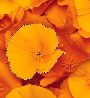
So here I have trained my quick selection tool not to select what areas of contrast. So if I had the similar background around the whole flower, then I would just drag my mouse once along the boundaries of the flower to tell my tool about the low contrast areas which I do not want to select.
Also keep in mind that if you have a large and random objects to be selected then you should keep subtracting the wrong selections you make as you sweep and not to defer the subtraction task in the end. This trains my tool at every step of selection and tell it what "not" to selection as it goes ahead.
I hope you find this tutorial helpful!
Read more »
For example : for the image below I just dragged my mouse from point A to point B for selecting the whole apple instead of moving my mouse along the edges of the whole apple which we would require for other selection tools.
This is how my object was selected moving my mouse from point A to B (Please note I increased the brush size to 35 px from options bar after selecting the quick selection tool for making this selection) :
However in the above image, there is good contrast between the object to be selected and its background. So we did not need to train our quick selection tool. But for getting better results in minimum time when there is not much great color difference or contrast between our object and background, it is recommended that you train your quick selection tool.
So in an image like below, where there is not that great color contrast between yellow flower and its background, we would train our tool.
So if I move my quick selection tool from point A to B to select the yellow flower, here is what
I get as selected :
However I did not need this extra highlighted(green) part in my selection(as shown below) which was selected when I moved my mouse from point A to point B. But since there is a low contrast between the orange and the yellow here, this area too got selected.
So instead of selecting my flower in one go as shown above, I follow the steps below to get my needed selection :
1. Select a very small part of the yellow flower as shown after selecting Quick selection tool.
2. Now I will press Alt key and keeping it pressed, I click and drag my mouse over the area I did not want in the selection. So I brush my mouse over the green highlighted region shown in the second last image.
I also notice that as soon as I click Alt key my mouse cursor changes from "+" to "-" as it tell what area not to select.
Once I am done with that I leave the Alt key back and again move my mouse from point A to B as I did earlier and here is how I get my desired selection :
So here I have trained my quick selection tool not to select what areas of contrast. So if I had the similar background around the whole flower, then I would just drag my mouse once along the boundaries of the flower to tell my tool about the low contrast areas which I do not want to select.
Also keep in mind that if you have a large and random objects to be selected then you should keep subtracting the wrong selections you make as you sweep and not to defer the subtraction task in the end. This trains my tool at every step of selection and tell it what "not" to selection as it goes ahead.
I hope you find this tutorial helpful!

Make a Button in two steps
Final view
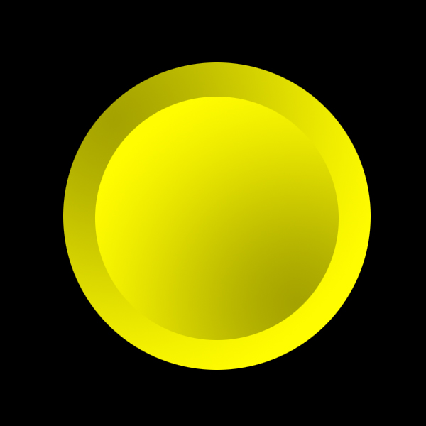
Step 1:
Create new file and fill background with black color (Shft+f5 ---> color ---> Select Black color---> OK).
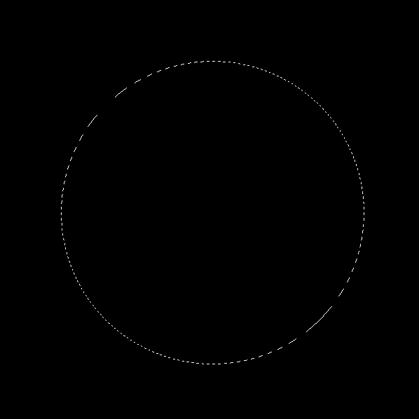
select Elliptical Marquee Tool and Draw a circle. Press and hold Shift key while Drawing circle. because it will results to accurate..
Create new file and fill background with black color (Shft+f5 ---> color ---> Select Black color---> OK).
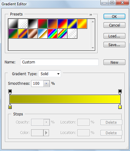
Select Gradient fill Tool and select the two color combination, here Ive choose "FFFC00" and "A5A300" colors.
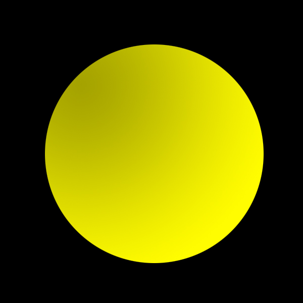
Hit OK. And drag the cursor from top-left corner to right-bottom.
Step 2:
Again select Elliptical Marquee Tool and Draw a circle smaller than previously drawn. Press and hold Shift key while Drawing circle. because it will results to accurate..
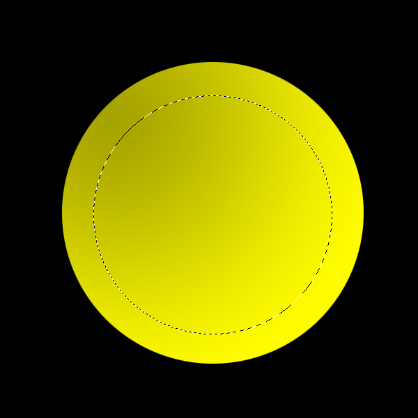
Again select Gradient Fill tool and Drag cursor from Right-Bottom corner to Left-Upper corner..
Done..!!
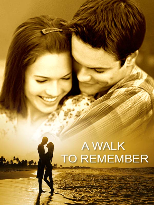
Making Movie Album Cover
Final view
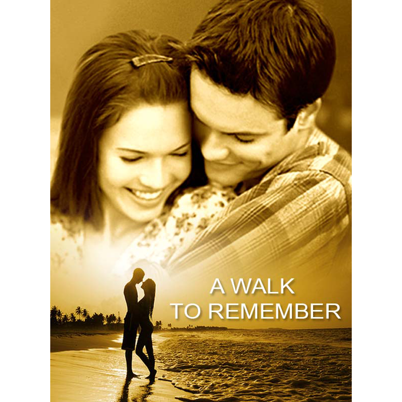
Step 1:
Create New File.
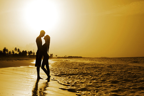
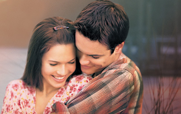
Get the two images for cover.
Step 2:
Take both the images on newly created file by copy-paste. (Layer 1 and Layer 2)
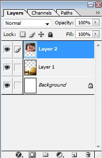
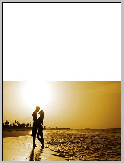
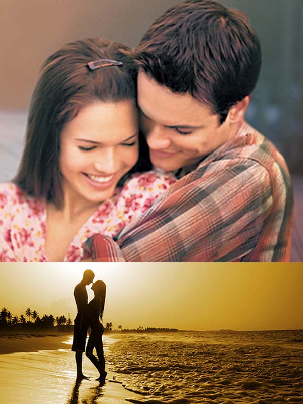
Transform the images to the middle By pressing Ctrl+T.
Step 3:
Now Select layer 2 and make it black-white (Image ---> adjustment ---> Gradient Map --> Select Black-White ---> OK).
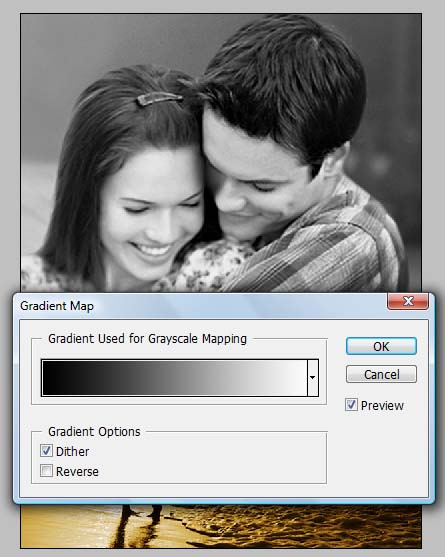
Step 4:
Now Now press Ctrl+B (color balance).
and adjust the Layer 2s color to orange so that it matches nearly to Layer 1 Image color.
and adjust the Layer 2s color to orange so that it matches nearly to Layer 1 Image color.
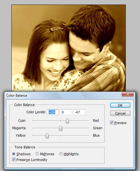
Step 5:
Select the masked layer and go to the Gradient fill tool Select the Black-transparent color combination and click ok.
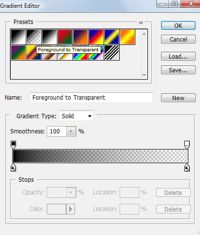
Drag the mouse over top of Layer 1.

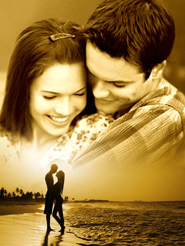
Step 5:
Make New layer (Ctrl + Shft + N). fill layer with orange color. add mask to it and set layer to "color mode"
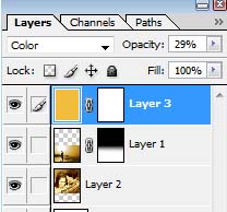
Add Title/Text.
Making Login Form
Color Combination is the main thing in web-Design, Making Forms , web-pages.. Use proper and effective color combinations for web design for better looking.. Here we can see how to Design a Login page for your website..
Final view
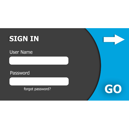
Step 1:
Create new file and fill the background with #3E3E3E color.
Create new file and fill the background with #3E3E3E color.

Step 2:
Make a new layer (Ctrl+Shft+N)
Select circular select tool and create circle on the Layer.
Select circular select tool and create circle on the Layer.
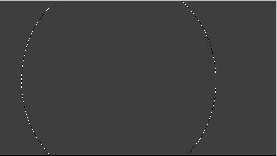
Right click on circle ---> Select Inverse.
And fill the Selected area withe color #02A4E0(Shft+f5 ---> color).
And fill the Selected area withe color #02A4E0(Shft+f5 ---> color).

Select eraser tool and erase the left side area.

Step 3:
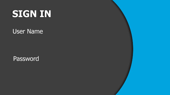
Now Go to Blending Options ---> Drop Shadow.
Change the angle to 0 degree.
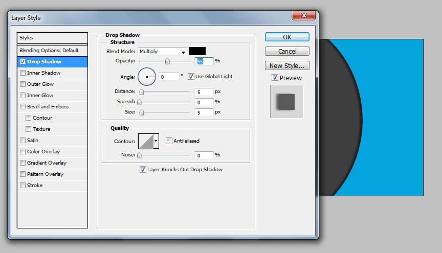
Change the angle to 0 degree.
Now select Horizontal text tool and Type the Sign In text at left corner with weight Bold..

Now with regular font weight type "User name" and "Password" Text.
Step 4:
Make New Layer (Ctrl+Shft+N).
Select Shape tool ---> Select Rounded corner rectangle .
And drag mouse below User name and Password field with white color.
Make New Layer (Ctrl+Shft+N).
Select Shape tool ---> Select Rounded corner rectangle .
And drag mouse below User name and Password field with white color.

Step 5:
Select Horizontal type text tool, Select larger font ant Type GO/Sign In/ Login.
Drop shadow to this button/text with increase in size.
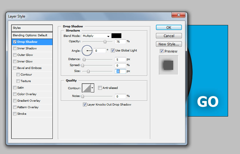

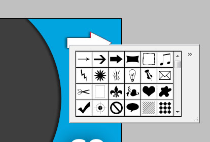
Select Shape tool and Select arrow from shapes, drag mouse on right corner.
Now select text tool and type forgot password below input Password field.
Drop shadow to this button/text with increase in size.
Drop shadow to arrow from Blending options ---> Drop Shadow.
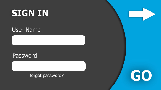
Done..!!
Making Shiny Text
Final view

Step 1:
Create New File.
Paint Give the Gradient to background using gradient fill tool (blue combination).

Step 2:
Select Horizontal Type text Tool and Type the Text with white color.

Step 3:
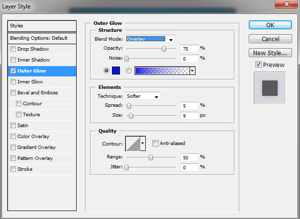
Now go to Blending options ---> Outer Glow and select Blue color for outer glow.

Step 4:
Now make a new layer (Ctrl+Shft+N).
select a shape tool from tool box,select polygon. Check smooth corners, star and indent to 99% or 100%.
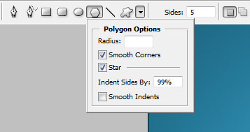
Select white color and Drag mouse on the image/layer, it will make a star.
press Ctrl+T and transform these stars at the corners of the text.
Making Happy Birthday Frame/Memory frame
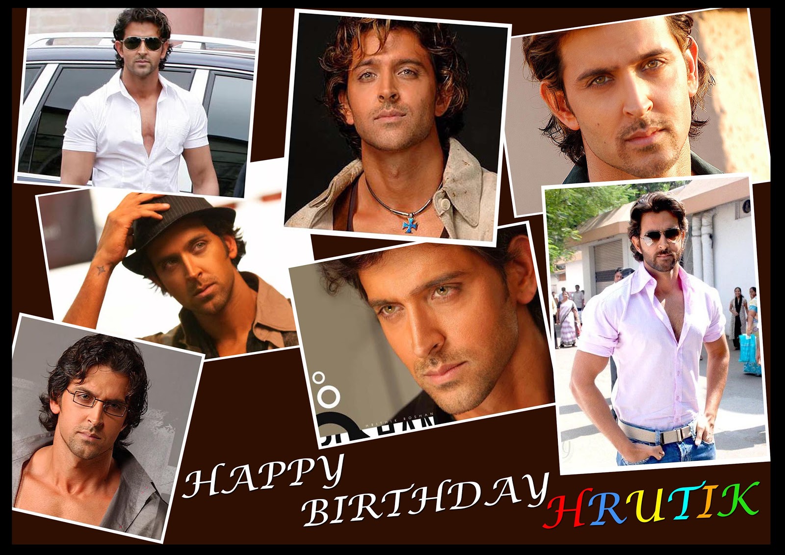
Final view
Step 1:
Create new image, fill background with dark color using fill color (shft+f5).

Save this PSD/JPG file as "frame".
Step 2:
Now select some photos to put in the frame..
Take one of them to edit.

Take one of them to edit.
Now make a duplicate layer of it by right clicking on the layer. your new layer will be "background copy"
Now select the "background" layer and fill it with white color.(shft+f5).
select "background copy" layer and press ctrl+t to transform it.
NOTE- While transforming Layer, press and hold shift because the dimentions of layes changes in proportion.
make a relative small size of "background copy" layer and place it at middle..

Now select the "background" layer and fill it with white color.(shft+f5).
select "background copy" layer and press ctrl+t to transform it.
NOTE- While transforming Layer, press and hold shift because the dimentions of layes changes in proportion.
make a relative small size of "background copy" layer and place it at middle..
Save this jpg.
Step 3:
Follow this process for remaining photos and save all the photos.
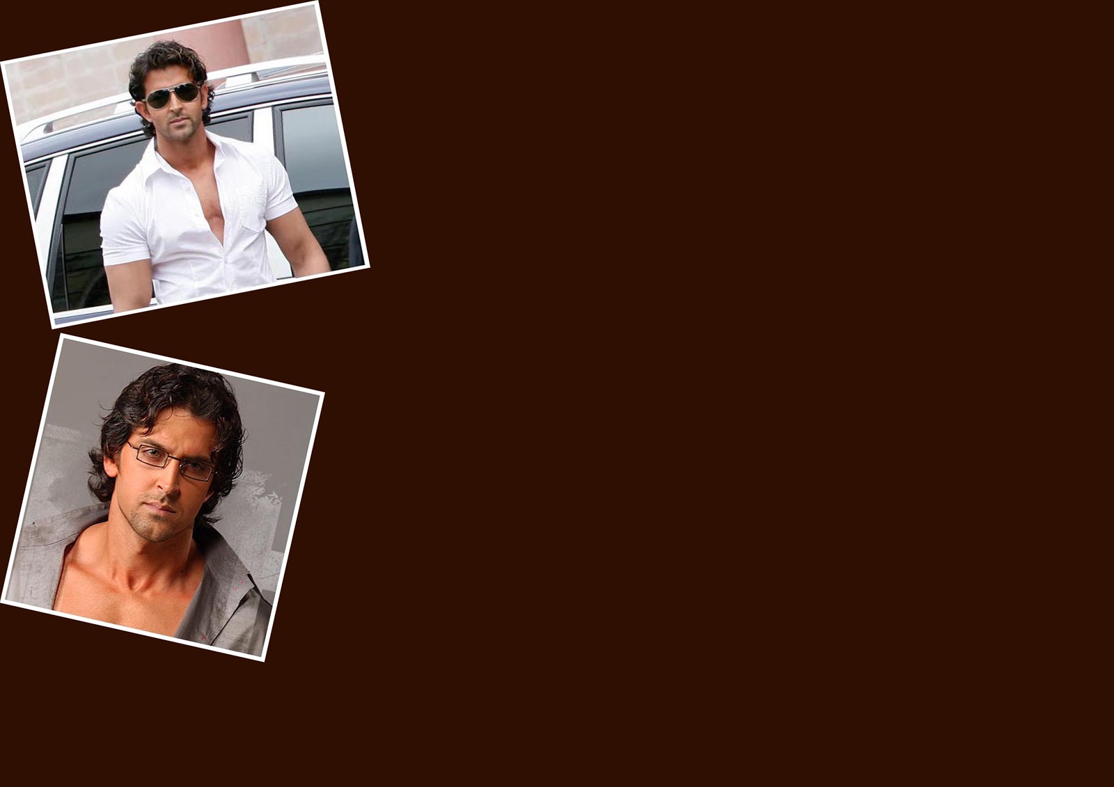
Now open the "frame" file and add photos on this dark background one by one .
Transform the layers/photos by pressing ctrl+t as you like.
Now open the "frame" file and add photos on this dark background one by one .
Transform the layers/photos by pressing ctrl+t as you like.
Step 4:
put all the photos on the dark background.
add birthday text by horizontal type text tool.
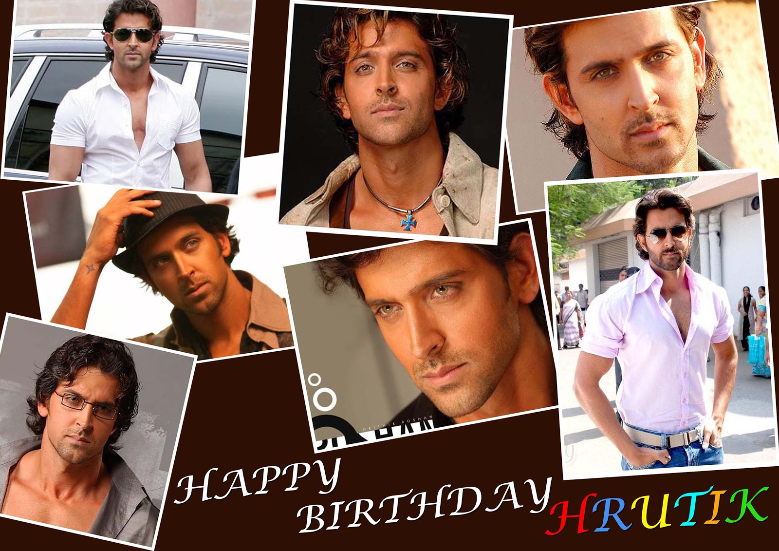
add birthday text by horizontal type text tool.
Step 5:
Now merge all layers (ctrl+E).
and make duplicate layer by right clicking on the layer.
fill the background layer with black and transform the background copy later(small size yhan original) and place it at middle se that itll look like a frame.
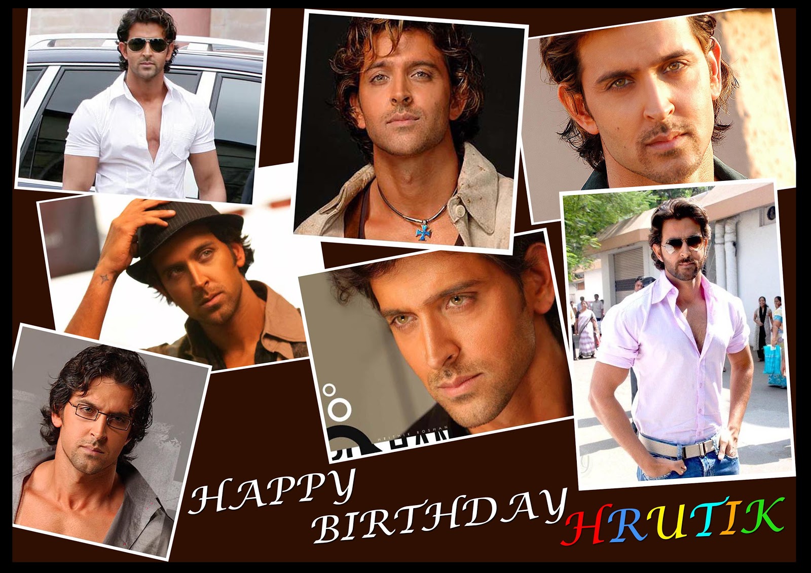
and make duplicate layer by right clicking on the layer.
fill the background layer with black and transform the background copy later(small size yhan original) and place it at middle se that itll look like a frame.
Done..!!
Subscribe to:
Posts (Atom)


- Follow Us on Twitter!
- "Join Us on Facebook!
- RSS
Contact