Showing posts with label scene. Show all posts
Showing posts with label scene. Show all posts
Thursday, June 18, 2015
a,
an,
and,
background,
content,
create,
fill,
from,
hole,
how,
object,
pse9,
remove,
scene,
the,
to,
using
0
comments
How to remove an object from a scene and create background content to fill the hole using PSE9
Is there a tool in PSE which can help you remove an object or a person from foreground of an image by filling it with the background content?
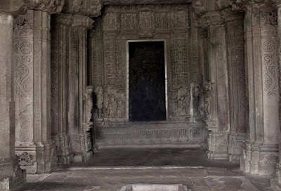
So in my source image above, I wanted to remove the girl from the temple and have just the building.
It may be achievable with clone tool, however it would really be a big time task.
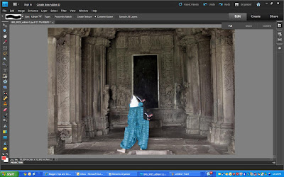
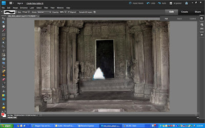
Yes, there is one which was introduced in PSE 9. So here are my initial and final images to show what this tutorial will help you achieve through this tutorial:
 |
| Initial image |
 |
| Final image |
So in my source image above, I wanted to remove the girl from the temple and have just the building.
It may be achievable with clone tool, however it would really be a big time task.
For non-complex images, it may just take seconds to fix that photo using content aware spot healing by doing just a couple of dabs
.
However, I choose an image which is complex as we need to remove a person whose background is not consistent throughout. It has the dark area inside the gate, the gate boundaries, the sculptured wall, the ground with variations in textures and colors. And spot healing from previous versions of PSE might not work since it does not have that intelligence to create content from background and fill it with it.
.
However, I choose an image which is complex as we need to remove a person whose background is not consistent throughout. It has the dark area inside the gate, the gate boundaries, the sculptured wall, the ground with variations in textures and colors. And spot healing from previous versions of PSE might not work since it does not have that intelligence to create content from background and fill it with it.
1. Open the image in Editor.
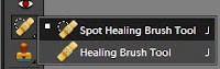
2. Select Spot healing tool from the left tool bar.
 |
| The spot healing brush properties in top properties bar |
3. Now keeping "Content-Aware" option selected in Properties panel, a keeping brugh size of the area not very big(which can be incremented and decremented using ],[ keys), start brushing(dabbing) over the object you want to remove.
So here are some tips which I have learnt on using this tool again and again :
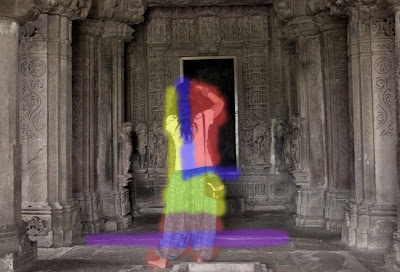
1. In the image above, for areas marked in red, I could use a bigger brush size without worrying much as the background behind the red mark is not very complex and is consistent, and I am not worried much as there are change in colors, no linear planes changing etc. So I can do this part quickly.
2. The areas marked in yellow are bit complicated as they have carvings on the wall. So would be good to start dabbing the brush with small size from the area near to the yellow area boundary in a linear manner. So if you see the carvings on the wall, they are horizontally linear. So it would be good if I start from the left near the boundary of the yellow area towards right horizonally.
3. The areas marked in blue(In L shape) is the area which should be taken care alittle meticulously since it has the frame of the door which has straight lines which need to be content created. So for this I reduced the brush size so that it did not cover the breadth of the frame and started from left such that the brush area includes the area of the existing frame(white frame area). However, this decision making may vary from image to image which would come to you as you try this tool a few times. For non-complex images, it may just take seconds to fix that photo using content aware spot healing and you may not have to do any such decision making. But for complex images, you might need a little thinking to get the best results.
4. For the area in purple, I used clone tool as it was quicker for that scenario. Spot healing content aware brushcould also have been used.
Here is my final result :
Hope this tutorial helps!!!
So here are some tips which I have learnt on using this tool again and again :
1. In the image above, for areas marked in red, I could use a bigger brush size without worrying much as the background behind the red mark is not very complex and is consistent, and I am not worried much as there are change in colors, no linear planes changing etc. So I can do this part quickly.
3. The areas marked in blue(In L shape) is the area which should be taken care alittle meticulously since it has the frame of the door which has straight lines which need to be content created. So for this I reduced the brush size so that it did not cover the breadth of the frame and started from left such that the brush area includes the area of the existing frame(white frame area). However, this decision making may vary from image to image which would come to you as you try this tool a few times. For non-complex images, it may just take seconds to fix that photo using content aware spot healing and you may not have to do any such decision making. But for complex images, you might need a little thinking to get the best results.
4. For the area in purple, I used clone tool as it was quicker for that scenario. Spot healing content aware brushcould also have been used.
Here is my final result :
Hope this tutorial helps!!!

Tuesday, March 31, 2015
desert,
in,
photoshop,
scene,
surreal
0
comments
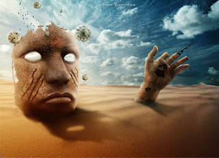
Surreal Desert Scene in Photoshop
Materials Needed:
- Desert 1
- Desert 2
- Iron mask
- Clock
- Bronze Hand
- Gearing Brushes
- Galaxy Brushes
- Bird Brushes
- Sky
- Tree texture
- Celtic Rune Charm Pack
Step 1: Create a new document and add the sky

Step 2: Add a small galaxy on the sky

Step 3: Add the first desert stock photo

Note: You can also use the Eraser Tool (E) and a soft brush to erase some parts of the sky from this photo.
Step 4: Duplicate the "desert 1" layer

Step 5: Add the second desert stock photo

Note: Arrange the image from this step in a way that makes visible the hills of the other two desert photos beneath it.
Step 6: Add the iron mask

Step 7: Add a Gradient Overlay layer style to the iron mask

Step 8: Mask the bottom area of the iron mask

Step 9: Add a Levels adjustment layer

Step 10: Create a shadow for the iron mask

Step 11: Add a sign on the iron mask’s forehead

Step 12: Add two scars to the iron mask

Step 13: Create some lights coming out of the iron mask’s eyes

Step 14: Add a bronze hand

Step 15: Make some color adjustments to the hand

Step 16

Step 17: Add a texture to the hand

Step 18: Use the iron mask as a texture for the hand

Step 19: Create a clock needle

Step 20: Color the hand in orange

Step 21: Create some gears

Step 22: Adjust the lights and the shadows of the iron mask

Note: when you have the Dodge Tool or the Burn Tool selected you can use the Alt key to quickly shift between them.
Step 23: Create a shadow for your hand

Step 24: Add some clocks

Repeat this step to add more clocks to your image. Change the size of each clock and rotate them. Take a look at the following image for reference. Select all your clock layers and merge them together (Ctrl+E). Name this layer "clocks."
Step 25: Add a shadow to the clocks

Step 26

Step 27: Add some birds

Step 28: Final color adjustments

Step 29

Step 30

Step 31

Final Result
I hope you enjoyed this tutorial and that you learned something new. What we have obtained is a photo-manipulation with some ruins in the desert; the clocks, the gears and the clock needle make everything to gravitate around the time theme.
Author : Ciursa Ionut
 About The Writer
Hello! My name is Tommy. Im a blogger, I love graphics design and now i went to Architechture Technical Senior High School. | Facebook |
 Resources Used In This Tutorial
- Snake Charmer
- Rocks
- Taj Mahal
- Cobra
- Small Snake
- Smoke
- Moss Texture
- Gem
Step 1
Start by creating a new document (1000X1000px).Paste in the Taj Mahal image from the resources section for this tutorial.

We want to improve the colors and contrast of our backdrop im
age, so apply a levels and color balance adjustment layer. Be sure to apply a clipping mask to all adjustment layers in this tutorial, unless otherwise specified, as we only want our adjustments to effect the underlying layer.
Levels Adjustment Layer Settings:
12 / 0.94 / 255
Color Balance Adjustment Layer Settings:
Highlights: +1 / +2 / -5
Midtones: +4 / +8 / -16
Shadows: -11 / +2 / -1

Step 2
If you look at our backdrop photo, the distance is very sharp, but the bottom area of the photo gets slightly out of focus as it gets closer to us.I’ve highlighted this area in red below:

To fix this, select your backdrop photo and both adjustment layers (hold shift to select more than one layer). Hit option+g to place these three layers within a layer group.
Duplicate this layer group.
Then, with your duplicate group folder selected, go to filter>convert for smart filters. This way you can non-destructively apply filters to an entire layer group, which contains multiple layers.
With your smart filters in place, go to filter>sharpen>unsharp mask. This will allow us to precisely sharpen our backdrop image.
Unsharp Mask Filter Settings:
Amount: 240%
Radius: 0.7 pixels
Threshold: 0 levels
You can see below that this has sharpened our entire image. However, we only really wanted to sharpen the bottom corners of our image, in order to focus them. The rest of our image is now too sharp:

To fix this, apply a layer mask to your duplicate backdrop smart object. Use a large, soft black paintbrush to mask off all of this sharpened layer apart from the bottom corners (which we want to sharpen).
I’ve shown where this mask is applied using a red area below:

And here is the result. Now the entire backdrop is nice and sharp, including the bottom corners, which were previously out of focus:

Step 3
Download the ‘snake’ image from the resources section for this tutorial.Cut it out from it’s background (this should be easy as it has a plain white background). Paste the snake into the bottom right of your canvas, keeping it really large, as we want this to be a giant sized snake!

Apply a levels and color balance adjustment layer in order to blend the snake better with our backdrop:
Levels Adjustment Layer Settings:
20 / 1.00 / 230
Color Balance Adjustment Layer Settings:
Highlights: +13 / +1 / -29
Midtones: +25 / +5 / -23
Shadows: +8 / -5 / -12

You can see the result of this below:

We want to extend the snakes tail to the left corner of our canvas, so simply copy/paste part of the snake’s body and position this in the bottom corner. Use the same adjustment layers to blend this area.
Don’t worry if there’s a gap in the middle, we’ll be covering this up!

Step 4
Download the ‘rocks’ image from the resources section for this tutorial.Paste the rocks roughly into the bottom-center of your canvas, after extracting them from their background:

Apply a color balance and levels adjustment layer to your rocks layer:
Color Balance Adjustment Layer Settings:
Highlights: -4 / +5 / -4
Midtones: +9 / +6 / -12
Shadows: +1 / +4 / -12
Levels Adjustment Layer Settings:
45 / 1.05 / 236

You can see the result of this below:

Step 5
Paste in your ‘moss’ image from the resources for this tutorial.
Duplicate this ‘moss’ layer, hiding the original. You can see keep this original layer though as we’ll be making many more duplicates.
Select your visible duplicate moss layer and resize it to fit over one of the lower rocks. Then go to edit>transform>warp. Warp your moss to fit more to the shape of the rock, thus making it less flat:

Apply a layer mask to your moss layer, and then use one of the roughly, grungy default brushes that come with photoshop (ensuring it’s set to: black) and mask off the edges of your moss area. You want to smoothly blend your moss into the rock surface.
To help blend it further, reduce the opacity of your moss layer to around 90%.

Now apply a color balance adjustment layer:
Color Balance Adjustment Layer Settings:
Highlights: +22 / -13 / -8
Midtones: +19 / +32 / -26
Shadows: -1 / +6 / -12

This is the effect:

Step 6
Repeat the technique of applying moss, applying it to the rest of your rock surfaces:
Step 7
Create a new layer called ‘bottom shadow’ and use a large, soft black paintbrush to paint in a shadow along the bottom of your canvas.
Reduce this layer’s opacity to 10%:

Step 8
Paste in your snake charmer image, positioning him so that he’ll be sat roughly on top of the rocks in your main composition:
We want to get rid of his background, so use your preferred extraction method. Personally, I love being non-destructive, so I used a layer mask to mask off his background.

Now apply a color balance adjustment layer to blend your man better with the rest of your piece:
Color Balance Adjustment Layer Settings:
Highlight: -13 / 0 / -8
Midtones: +4 / +13 / -15
Shadows: 0 / 0 / 0

And here’s the result:

Step 9
Create a new layer called ‘shadow under man’.Use a soft black paintbrush at around 10% opacity to paint in shadow between the man and the rock. Make it look more natural, as if the man is sitting on the rock and casting a natural shadow:

Step 10
Download the ‘small snake’ image from the resources for this tutorial.Extract it from it’s background and then paste/position it to appear to be coming out of the end of the man’s pipe:

Set this layer’s blend mode to screen:

Now apply a hue/saturation and levels adjustment layer:
Hue/Saturation Adjustment Layer Settings:
Hue: 0
Saturation: -100
Lightness: +23
Levels Adjustment Layer Settings:
53 / 0.77 / 198

You can see the result of this below:

Step 11
Our snake is looking a little too solid to pass as smoke right now, so grab your smudge tool, set to around 25% opacity and smudge areas of your snake to blend outwards like smoke.This should create a much softer looking effect:

To add a little additional smoke, download the ‘smoke’ image from the resources for this tutorial.
Position it over your snake image:

Change this layer’s blend mode to ‘screen’ to hide the black background for the smoke and just let the smoke show through:

Step 12
Download your ‘jewel’ image from the resources for this tutorial and extract it from it’s background.
Go to edit>transform and use the distort tool to resize the jewel to rest on the front of the man’s turban. Make it much thinner than the original to give the impression of it being part of the man’s profile.
Then apply a hue/saturation adjustment layer to this jewel layer:
Hue/Saturation Adjustment Layer Settings:
Hue: +95
Saturation: 0
Lightness: +2

Step 13
Create a new layer called ‘lens flare’.Fill your canvas with black and then change it’s layer blend mode to ‘screen’. This will hide the black fill, but allow you to apply a lens flare effect non-destructively.
Go to filter>convert for smart filters. Then go to filter>render>lens flare. Apply a 50-300mm Zoom lens fare at 100% Brightness, trying to position your main flare over the end of the man’s pipe:
The image below shows this lens flare layer at ‘normal’ blend mode:

This shows the ‘lens flare’ mode at ‘screen’ blend mode:

Step 14
Create a new layer called ‘dodge/burn’. To dodge/burn your image non-destructively go to edit>fill>50% gray. Change your layer’s blend mode to ‘overlay’ to hide your 50% gray fill, and then use a soft, low opacity (around 10%) black paintbrush to burn your image, and a soft, low opacity white paintbrush to dodge your image.You want to try and create a more unified light source. In this image we can see that the main light source is coming from the right of your canvas. So try to add highlights to the right edges of your objects, and shadow the left edges.
The images below show your dodge/burn layer at ‘normal’ blend mode and then ‘overlay’ blend mode:


Step 15
To accentuate the highlights cast on your rocks by the sun, create a new layer called ‘rock highlight edge’.Keep this new layer active, but in your layer’s palette option+click on your original rocks layer. This will create an active selection around the shape of your rocks.
This will allow you to paint just inside the edge of your rocks without leaking out onto the background.
Use a soft white paintbrush to paint in a highlight along the right edge of your rocks:

To make this highlight effect more subtle change this layer’s blend mode to ‘overlay’ and reduce it’s opacity to 30%.

Step 16
The left edge of our rocks is looking too light considering the lighting of the overall piece.To fix this, create a new layer called ‘rock shadows’.
Use a soft black paintbrush (around 20% opacity) to paint shadows over this area of rock:

Step 17
Apply a final couple of adjustment layers, but this time DO NOT create clipping masks for them as you want your adjustments to effect your entire composition.Gradient Overlay Adjustment Layer:
Gradient: Default purple to orange gradient
Blend Mode: Normal
Opacity: 10%
Levels Adjustment Layer Settings:
9 / 1.00 / 238

Here is the result of these adjustments:

Step 18
Finally, to finish we want to sharpen our image just a little to make it clearer.Go to layers>flatten image. Select your entire flattened canvas and then hit ‘copy’.
In your history panel undo this flattening, as of course we want to retain our original layers.
Then paste your copied flat image in as a new top layer.
Go to filter>convert for smart filters. Then go to filter>sharpen>unsharp mask. Apply these settings:
Unsharp Mask Settings:
Amount: 35%
Radius: 0.5 pixels
Threshold: 0 levels

And We’re Done!
You can view the final outcome below. I hope that you enjoyed this tutorial and would love to hear your feedback on the techniques and outcome.  Author : Tom
Tom is the founder of PSDFAN. He loves writing tutorials, learning more about design and interacting with the community. On a more interesting note he can also play guitar hero drunk with his teeth.
Subscribe to:
Posts (Atom)


- Follow Us on Twitter!
- "Join Us on Facebook!
- RSS
Contact