Showing posts with label on. Show all posts
Showing posts with label on. Show all posts
Saturday, June 13, 2015
–,
corel,
on,
road,
text,
the,
tutorial,
x3
0
comments
Text on the Road – Corel X3 Tutorial
Text on the Road – Corel X3 Tutorial
In this tutorial we will show you how to place text on a street in Corel Draw X3.
Start a new drawing.
Then import a street photo:


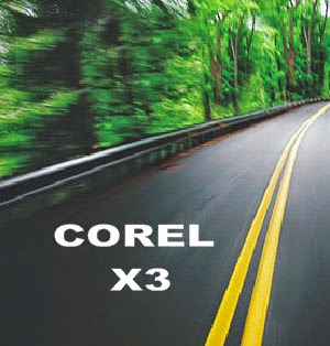
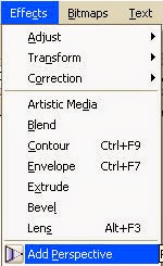
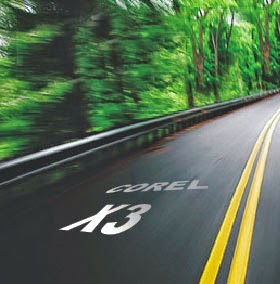
Then import a street photo:
Now type the text you want to add to the road:
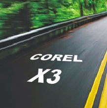
Then place it over the picture:
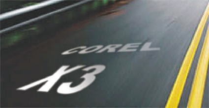
As soon as you finish, add some perspective:
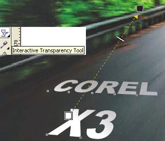
Then, add the Interactive Transparency tool to the text:
Look how cool it is looking now:
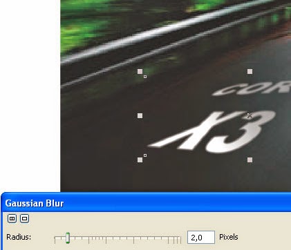
As this is an image in motion, we need to add the same motion to our text.
So lets add some Gaussian Blur:
So lets add some Gaussian Blur:
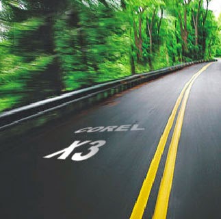
This is the result:
You can do it ...
Download the original source files from this tutorial in Zip format Here

Saturday, May 23, 2015
a,
bring,
eyes,
focus,
how,
in,
more,
on,
potrait,
pse,
to,
using
1 comments
How to bring more focus on eyes in a potrait using PSE
1. Select Background layer in layers palette
2. Select the complete eye area ( including the white part ) using any selection tool (i used quick selection tool). Right click over the selected portion and say Layer via Copy. Name this layer in layers palette as Eyes by double clicking the layer in the palette.
3. Now select the background layer again and make a selection for the eye ball regions only. And right click and select Layer via Copy and name this layer as Eye ball.
4. Now Conrol+Click on the layer Eyes to show the eyes selected in the image. Click on Background layer and Select Inverse from right click on image area followed by Layer via Copy. Name this new layer as Blur. This constitutes the whole image except the eye region.
5. Now select the layer Blur and Filter>Blur>Gaussian Blur. Modify the blur to something like 2.5 or lesser. This is done to rest of the image leaving eyes so that eyes are prominent in the image. Click Ok. You can later on modify the opacity of the layer making it more transparent if you want to decrease the blur effect. You can do that by selecting this layer in the layer palette and moving the opacity slider on right top of layers palette.
6. Now select the layer Eyes. Go to Enhance>Adjust Sharpness. Now make changes to the amount and radius. Click Ok. You can vary the sliders as per your needs and preview it side by side in image area or preview area in the dialog. Do not oversharpen as it makes the eyes look artificial.
7. Now select only the layer Eye ball and select Enhance >Unsharp mask.
I changed the amount to near 50% and radius to near 16. This details out the pattern inside the eye ball and brings more focus to the eye region.
8. You can now also increase the saturation of this layer by Enhance>Adjust color>Adjust Hue/Saturation. You can select the Grrens from the combo box if you obly want to saturate the Green of the eyes using the Saturation slider.
Click Ok.
Here are the initial and the final images :


(Click to have larger views to see differences)
Thursday, April 30, 2015
adobe,
cs6,
demand,
illustrator,
on,
pdf,
tutorial
1 comments
Adobe Illustrator CS6 Tutorial on Demand PDF
Adobe Illustrator CS6 on Demand PDF has been created by the professional trainers and writers at Perspection, Inc. to the standards you’ve come to expect from Que publishing. Together, we are pleased to present this training book.
Perspection, Inc. is a software training company committed to providing information and training to help people use software more effectively in order to communicate, make decisions, and solve problems. Perspection writes and produces software training books, and develops multimedia and web-based training. Since 1991, we have written more than 120 computer books, with several bestsellers to our credit, and sold over 5 million books.
This book incorporates Perspection’s training expertise to ensure that you’ll receive the maximum return on your time. You’ll focus on the tasks and skills that increase productivity while working at your own pace and convenience. We invite you to visit the Perspection web site at: www.perspection.com
The task of creating any book requires the talents of many hard-working people pulling together to meet impossible deadlines and untold stresses. We’d like to thank the outstanding team responsible for making this book possible: the writer, Steve Johnson; the technical editor, Toni Bennett; the production editors, James
Teyler and Beth Teyler; proofreader, Beth Teyler; and the indexer, Sharon Shock. We’d also like to thank JP Johnson for his contribution of Illustrator artwork. At Que publishing, we’d like to thank Greg Wiegand and Laura Norman for the opportunity to undertake this project, Cindy Teeters for administrative support, and Sandra Schroeder for your production expertise and support
.
Steve Johnson has written more than 70 books on a variety of computer software, including Adobe Photoshop CS5, Adobe Dreamweaver CS5, Adobe InDesign CS5, Adobe Illustrator CS5, Adobe Flash Professional CS5, Microsoft Windows 7, Microsoft Office 2010 and 2007, Microsoft Office 2008 for the Macintosh, and Apple Mac OS X Lion. In 1991, after working for Apple Computer and Microsoft, Steve founded Perspection, Inc., which writes and produces software training. When he is not staying up late writing, he enjoys coaching baseball, playing golf, gardening, and spending time with his wife, Holly, and three children, JP, Brett, and Hannah. Steve and his family live in Northern California, but can also be found visiting family all over the western United States.
Creative artists from Hollywood, brochure designers, as well as casual users turn to Illustrator for its proven ability to create top-of-the-line vector artwork and complex graphic designs. Illustrators ability to manipulate illustrations for use in books, brochures, multimedia presentations, or on the web, has made Illustrator the undisputed leader in the graphics industry. When it comes to vector illustration, Illustrator is
literally the best software the computer industry has to offer. With Illustrator, you can create anything from simple icons to multilayered illustrations, as well as manipulate text. And Illustrators ability to work with other programs allows you to import Excel data for graph building, export Illustrator files directly to Adobe InDesign and QuarkXPress, as well as open layered Illustrator files in Photoshop, making it a snap to move back and forth between programs as you design.
Link Down load share by google Drive. (must login gmail and get) .
https://docs.google.com/open?id=0B_8GkjDl4WIfX3ppa013Zk8zX0E
Read more »
Perspection, Inc. is a software training company committed to providing information and training to help people use software more effectively in order to communicate, make decisions, and solve problems. Perspection writes and produces software training books, and develops multimedia and web-based training. Since 1991, we have written more than 120 computer books, with several bestsellers to our credit, and sold over 5 million books.
This book incorporates Perspection’s training expertise to ensure that you’ll receive the maximum return on your time. You’ll focus on the tasks and skills that increase productivity while working at your own pace and convenience. We invite you to visit the Perspection web site at: www.perspection.com
The task of creating any book requires the talents of many hard-working people pulling together to meet impossible deadlines and untold stresses. We’d like to thank the outstanding team responsible for making this book possible: the writer, Steve Johnson; the technical editor, Toni Bennett; the production editors, James
Teyler and Beth Teyler; proofreader, Beth Teyler; and the indexer, Sharon Shock. We’d also like to thank JP Johnson for his contribution of Illustrator artwork. At Que publishing, we’d like to thank Greg Wiegand and Laura Norman for the opportunity to undertake this project, Cindy Teeters for administrative support, and Sandra Schroeder for your production expertise and support
.
About the Author of Adobe Illustrator CS6 on Demand
Steve Johnson has written more than 70 books on a variety of computer software, including Adobe Photoshop CS5, Adobe Dreamweaver CS5, Adobe InDesign CS5, Adobe Illustrator CS5, Adobe Flash Professional CS5, Microsoft Windows 7, Microsoft Office 2010 and 2007, Microsoft Office 2008 for the Macintosh, and Apple Mac OS X Lion. In 1991, after working for Apple Computer and Microsoft, Steve founded Perspection, Inc., which writes and produces software training. When he is not staying up late writing, he enjoys coaching baseball, playing golf, gardening, and spending time with his wife, Holly, and three children, JP, Brett, and Hannah. Steve and his family live in Northern California, but can also be found visiting family all over the western United States.
Introduction Adobe Illustrator CS6 Tutorial on Demand PDF
Adobe Illustrator CS6 is a graphics design and drawing program that runs seamlessly on both Windows and Macintosh platforms. Adobe Illustrator CS6 is a stand-alone program, but it’s also part of Adobes Creative Suite of professional programs that work together to help you create designs in print, on the web, or on mobile devices. Many of the Creative Suite 6 programs also include additional Adobe programs and services—Bridge, Camera Raw plug-in, Media Encoder, Extension Manager, and ExtendScript Toolkit—to help you manage and work with files Adobe Illustrator CS6 Tutorial on Demand PDF.Creative artists from Hollywood, brochure designers, as well as casual users turn to Illustrator for its proven ability to create top-of-the-line vector artwork and complex graphic designs. Illustrators ability to manipulate illustrations for use in books, brochures, multimedia presentations, or on the web, has made Illustrator the undisputed leader in the graphics industry. When it comes to vector illustration, Illustrator is
literally the best software the computer industry has to offer. With Illustrator, you can create anything from simple icons to multilayered illustrations, as well as manipulate text. And Illustrators ability to work with other programs allows you to import Excel data for graph building, export Illustrator files directly to Adobe InDesign and QuarkXPress, as well as open layered Illustrator files in Photoshop, making it a snap to move back and forth between programs as you design.
Link Down load share by google Drive. (must login gmail and get) .
https://docs.google.com/open?id=0B_8GkjDl4WIfX3ppa013Zk8zX0E
Cake Based on Phoenix Illustration

Wednesday, April 29, 2015
cs6,
gradients,
illustrator,
on,
strokes,
tutorial
0
comments
Illustrator CS6 Tutorial Gradients on Strokes
We had to wait 25 years, but the day has finally arrived. Adding a gradient to a stroke in Illustrator CS6 now is as simple as selecting an object, and choosing a gradient from the Stroke menu.
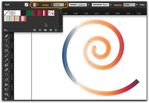
Fantastic with new version of Illustrator CS6 ! But what are the possibilities?
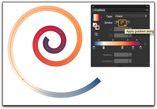
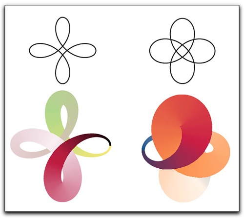
First of all, we now have three direction options in the Stroke panel: gradient within stroke, along stroke and across stroke in Illustrator CS6 Tutorial . All three options are accessible via the Gradient panel. The image above shows the default gradient within the stroke.The image below shows the gradient along the stroke.

Read more »
Fantastic with new version of Illustrator CS6 ! But what are the possibilities?
First of all, we now have three direction options in the Stroke panel: gradient within stroke, along stroke and across stroke in Illustrator CS6 Tutorial . All three options are accessible via the Gradient panel. The image above shows the default gradient within the stroke.The image below shows the gradient along the stroke.
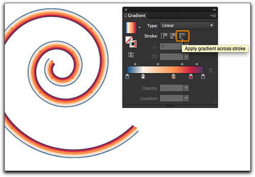
And this image shows the gradient across the stroke very effective in this verson Illustrator CS6 Tutorial
Now let’s add some variable widths to our spiral: with Illustrator CS6 Tutorial
And let the fun begin! with Illustrator CS6 Tutorial : Gradients on Strokes
Add Gradient On Images
For changing color combination of a original photo, Add a gradient on the photo.. You may choose different colors for filling gradient, but choose those colors which will results to better effect to the photo..
Final view
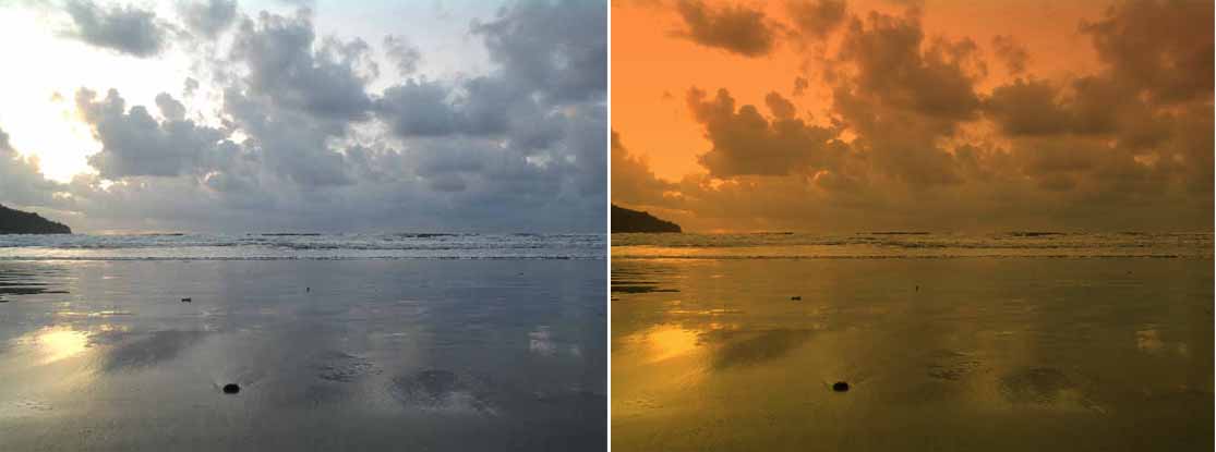
Step 1: take the image in photoshop to edit.
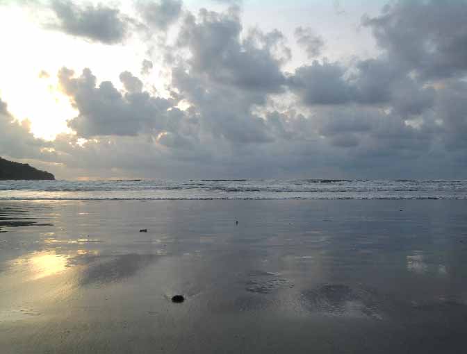
(If necessory,adjust the level of the image by pressing crl+L)
create a new layer Layers--->New Layer (ctrl+shft+N).
Name the layer new.
Step 2:
Now select the Gradient tool from tool box and go to options of gradient tool. (fig)
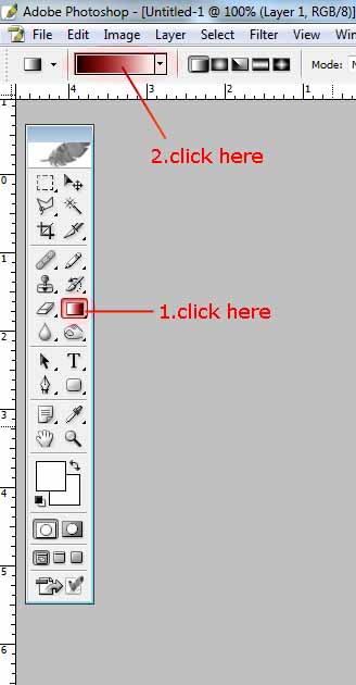
select the colors which will effect better on the image
(orange and yellow) when your done with selecting color, click ok..
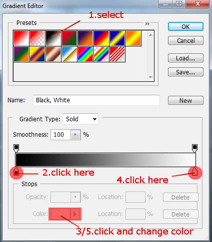
Now drag cursor on image from top to bottom, the gradient is filled..

Step 3:
Now go to the layer properties and set it to Multiply.. you can also change the opacity of the layer..
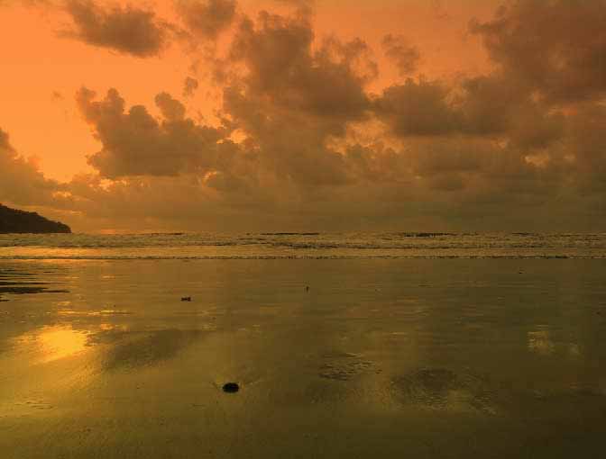
Done..!!
Adding real Tattoo on face
Final view
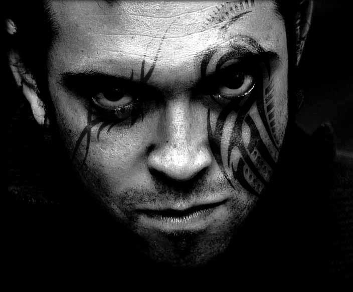
Step 1:
take the image in photoshop to edit and make it black-white.
(I took one of the image from Google)
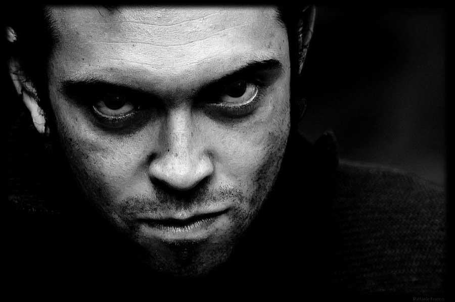
Step 2:
Crop the image so that object is in the middle.
Adjust the images brightness using curves (Ctrl + M) and Level(Ctrl + L).
Burn the shadows of the image by burn tool. (Keep Range=Shadows and Exposure=15-20).
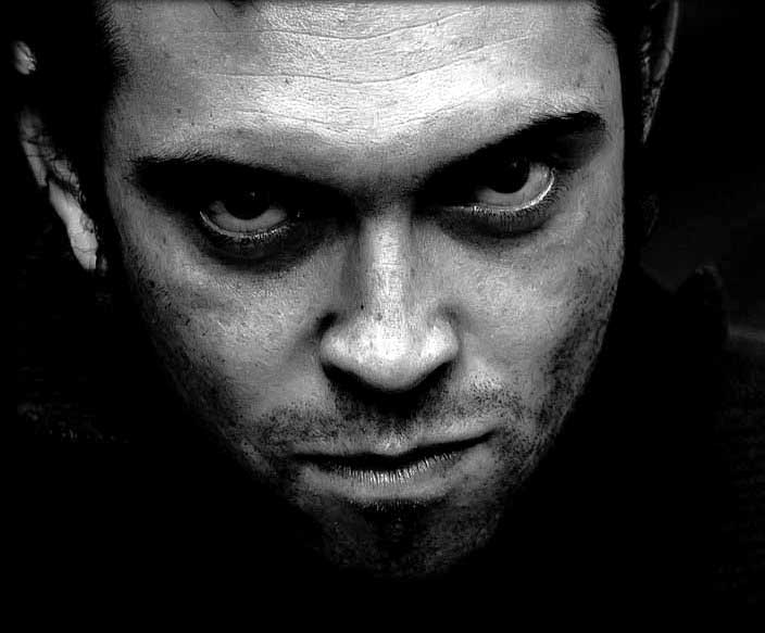
Step 3:
Create new blank layer (ctrl+shft+n), name it layer1.
Now select Brush tool and the tattoo brush of your choice. Click on the layer, where you want a tattoo.
(f you dont have Tattoo brush set, the download the set and copy it in to Adobe --> ps--> presets --> brushes).
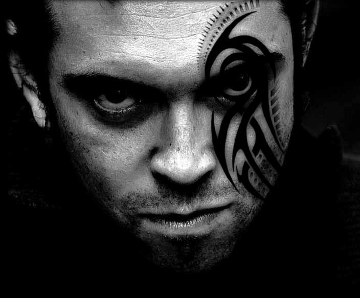
Now make a duplicate layer of the layer1 by right clicking on the layer (Ctrl+J).
the name of the layer is layer1 copy.
Step 4:
Set the property of the layer1 to overly 88%,
Set the property of the layer1 copy to soft light 70%.
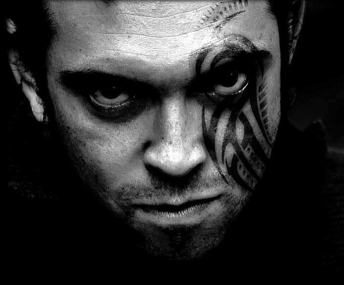
Step 5:
Same like this you can add more tattoos..
create new layer(ctrl+shft+n) name it layer2
select the another brush and set the position of tattoo.
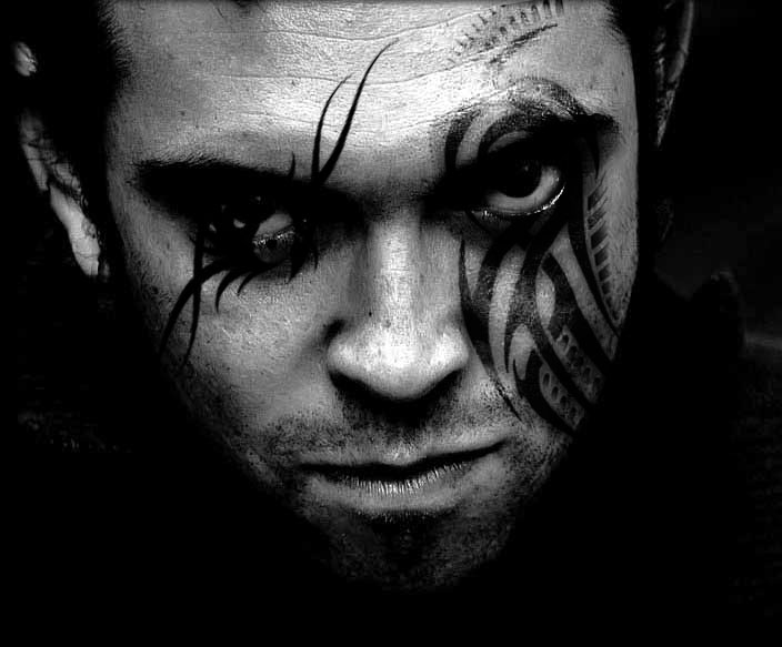
Step 6:
Make a duplicate layer of it.. name will be layer2 copy.
set layer2 property to overly 88%, and layer2 copy property to soft light 70%;
You will get the final real tattoo.
Done..!!
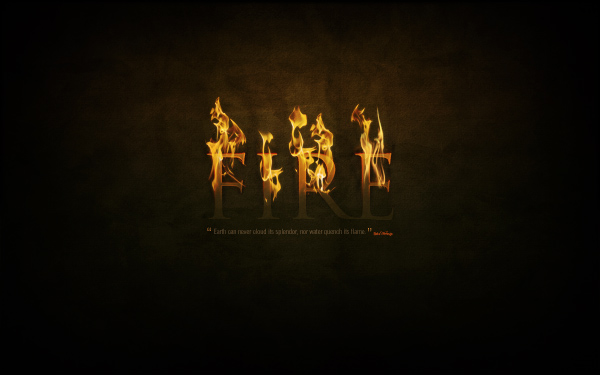
Part 1— The Background
So create a new document in Photoshop at 1920px wide x 1200px high, and with the Gradient Tool (G), draw in a radial gradient of browns (#5c3d09 to #1f1409) so you get something like what is shown below.Notice that the gradient is not centered vertically but sits toward the top. In this image we want the top of the text to be on fire, so the top part of the image sh
ould be a bit more lit up.

Step 2
As in the grass text tutorial, once again we’re going to have a textured background. But rather than starting from scratch, I just copied the background from the previous tutorial, merged all the layers and desaturated to get what you see below.If you need to make this from scratch, first visit Bittbox to get the original paper textures and then follow the previous tutorial’s steps.

Step 3
Now we set the layer to Overlay and to blend the texture into the background and voila!
Step 4
Just to add a bit more texture though, let’s run the Texturizer filter. To do this, create a new layer and fill it with a brown/beige color—#66500f. Then go to Filter > Texture > Texturizer and use the Canvas texture with 80% Scaling and Relief set to 4.
Step 5
Once you have your texturized layer, set that to Overlay. This adds some extra fine detail to our texture which is good because we’re working on such a big canvas.
Step 6
Next we’re going to apply a layer to slightly desaturate the bottom half of the image. This is so that the top looks like it has a warmer glow where the flames are, while the bottom looks a little colder.So create a new layer and fill it with the color #4b4f3b. Then add a layer mask with a gradient to mask out the top and fade down (so you get the effect shown).
Now set the layer to Color and 45% Opacity.

Part 2—Text + Glow = Awesomeness
OK, we now have a nice background! So let’s add some text. I’ve used the font Trajan because it’s a really dramatic looking font. Here I’ve placed the text in the color #cb9328, then set it to Linear Dodge (Add) with an Opacity of 8%.What we’re going to be doing with our text is making it look like the top half of the text is coming out of the background and is red hot with flames flickering off. This means we’re going to run a lot of effects and apply layer masks to them so that only the top half shows while the bottom half reverts to faded out text like we have currently.

Step 8
So first create a new layer group to put all the text layers in—because there will be a lot of them.Then duplicate the text layer and set the color of the duplicate text to #5e3f1c.

Step 9
Now set the newest text layer to Overlay and 70% Opacity. It should look kind of reddish (as shown below).
Step 10
Now duplicate the text again and set the latest duplicate to a yellowish color—#cb9328. Then set this to Linear Dodge (Add) and Opacity 30%.Next we add a layer mask and draw a gradient so the latest text layer fades out as shown below, and beneath you can see the reddish colored combination of the bottom two text layers.


Step 11
Next we duplicate the text layer yet again, but put this layer right on the bottom. Set the color to black—#000000. Then go to Filter > Blur > Gaussian Blur and it will ask you to rasterize the text, click yes to that, and then set the Radius to about 4px.Then Ctrl-click any of the other text layers and go back to the black layer and hit delete so you are just left with a sort of shadow. Then duplicate this layer and merge it with the first so the effect is heavier. You should have something that looks like the screenshot below.

Step 12
Once again, add a layer mask so the shadow quickly fades out as shown. This makes it look like the text is coming out of the page.
Step 13
Now duplicate our black layer again and using the Smudge Tool (R) and a largish soft brush you want to just smudge the shadow around so it looks like burn marks.
Step 14
Here’s how our text is looking now. I actually created two sets of "burn" marks, and then four sets of the shadow layer each blurred a little more than the last and each faded back.
Step 15
Now it’s time to make the top part of our text glow. So first of all, duplicate the text layer again and place this layer at the very top and set it to a yellow color—#dc9a08.Then run a Filter > Blur > Gaussian Blur over it with Radius of 8px. Then grab a large soft eraser brush and just erase away parts at the bottom so it’s kind of uneven.

Step 16
Set our first glow layer to Soft Light. You might want to repeat the process, erasing even more so the top part is even glowier.
Step 17
Now duplicate the text layer yet again and place this at the very top. This one should be again the same yellow (#dc9a08).Then go to Layer > Rasterize > Type and turn the text into a flat graphic. Then Ctrl-click the layer and go to Select > Modify > Contract and use a value of 1px. Then press Delete to delete everything except that 1px outline.

Step 18Now set the 1px layer to Overlay, and you should have something like the image below.

Step 19
Now to our 1px glow add a layer mask to fade it out down the bottom as we’ve been doing with the other layers.Then duplicate the layer, and run a Filter > Blur > Gaussian Blur set to 1px. Then duplicate this layer again and blur it by 2px. Then duplicate the layer again and blur it by 4px.
Then Ctrl-click any of the text layers, press Ctrl+Shift+I to inverse the selection and go through each of the glow layers and press Delete to remove any of the blur that has strayed out of the boundary of the text.
The idea is that we want the edges of the text to look red-hot with it fading in to an overall hot glow on the text.

Step 20
Next we duplicate all four of the glow layers and merge them together. This should result in a layer on top which is the original bright yellow.Grab the Smudge Tool and run over the text, smudging it up to look like heat waves coming off the text, as shown.

Step 21
Now set this latest layer to Overlay and you should have something looking like this!
Step 22
Now we’ve pretty much finished our text. I went through and duplicated some of the glow layers to make it look even more fiery. Feel free to experiment with getting a real red-hot glow look by doing so.
Step 23
Next, in keeping with the last wallpaper, I’ve gone and added a quote underneath my main text. This provides a nice embellishment to the page. Try to use colors that fit in with the background and text layer so it doesn’t stand out too much, because we really want this to be a secondary element to the main text. I’ve used Swiss Light Condensed as my font and laid it out just like in the previous Grass Text tutorial.
Part 3—The Flames
Finally, with all our preparation done, it’s time to add the actual flames! For this, we need some images of fire set against a plain black background. A good photo is hard to find, and try as I did, I couldn’t find a really great free photo. So in the end I used this photo from Fotolia which you can purchase using the link below. There was also an OK photo from Flickr which I’ve also linked to and which I ended up using later for the "E". So you might want to grab that too.AcheroN—Fotolia.com
Peasap—Flickr.com
Now the technique for copying the flames over is actually really simple. I actually only learned this technique recently when reading one of Nik Ainley‘s tutorials for DigitalArts magazine called Create Amazing Photomontages where he did it with water.
What you need to do is:
- Open up the flame image in Photoshop
- Go to the Channels tab and find the channel with the highest contrast, which for images of fire should be the Red Channel, and click on it
- This will make your image appear black and white, and because we’re on the highest contrast layer, it will seem really bright white. Now Ctrl-click this channel and it will select all the pixels in that channel.
- Click back to the RGB channel and copy the selected pixels
- You can now paste the flames into your main canvas!


Step 25
OK, so here we’ve pasted the flames on to our main canvas. (For clarity I’ve also temporarily switched off the text layers). As you can see, we’ve got the fire without the black background and it’s partially transparent, which means it’ll look super on top of our text.
Step 26
Now the next thing to do is to cut up our one bit of fire into a few pieces. Just duplicate the layer and switch off one as a backup first. Then using the Pen Tool, cut up the fire so you work with the contours of the flame so it looks natural. Here you can see I’ve produced four pieces of flame from the one image. You can also try flipping bits around to make them seem more random.Set the layers to Screen mode so that any remaining black parts are totally gone, and it’s even more transparent.

Step 27
Now because my text is just four letters, I need four separate pieces of fire. For the fourth one (on top of the E) I actually grabbed that Flickr photo and repeated the same process as earlier to create another flame. Also the fire on the letter I has been squashed a little as well to make it look more random.
Step 28
Applying the fire is really as easy as moving the flames over the text. You want to try to match the flames to the shape of the letter so it looks like they are dancing off the letters.
Step 29
OK here I’ve placed all four bits of flame over the top. It’s not bad, but you can see that the I and the R have the same flame and also all the flames aren’t very tall.
Step 30
So here I’ve gone through each flame and using the Transform Tool stretched them vertically. Also I used a bit of judicious erasing to make the flame on the I look a little more unique.
Step 31
Now to make them look even more lit up, duplicate each flame layer, run a Filters > Blur > Gaussian Blur with a Radius of 3px and set the layer to 15% Opacity so it provides a bit of glow around the edges of the flames.
Step 32
So we’re pretty much there! This is how the composition looks.
Step 33
Finally we’ll add a last highlight. So create a new layer above all the others and draw in a white to black radial gradient as shown. Set this layer to Overlay and 40% Opacity.
Finished!
And there we have it, a text on fire effect! In the next tutorial in the series, we’ll be producing the Air image, however it’ll be in two weeks, not one—as I’m taking a few days off work!If you’re interested in creating flames from scratch in Photoshop, you might also like to check out this classic tutorial that coincidentally uses the exact same typeface! It’s a Photoshop 6 tutorial, and I can still remember reading it like a half decade ago, but it’s still very relevant, even if the screenshots feature a super retro Mac interface.

 Author : Collis
Hello! I started Psdtuts+ because years ago reading Photoshop tutorials was how I got into design. You can find me on Twitter or on my blog theNetsetter.
Source : Dramatic Text on Fire Effect in Photoshop
Subscribe to:
Posts (Atom)


- Follow Us on Twitter!
- "Join Us on Facebook!
- RSS
Contact