Showing posts with label of. Show all posts
Showing posts with label of. Show all posts
Friday, June 19, 2015
9,
a,
for,
free,
getting,
glare,
how,
of,
person,
portrait,
pse,
spectacled,
to,
use
0
comments
How to use PSE 9 for getting glare free portrait of a spectacled person
A very common problem while taking portraits of a spectacled person is the glare in the lens that results in hiding the eyes. The best way is to take two pictures of the same person one with spectacles and one without spectacles and then correcting the glare in PSE 9 as shown below.
So here was the portraits that were shot, one with spectacles and one without spectacles.


We will be using layers masks of PSE 9 to correct the glare. The same can though be achieved using PSE 8 magnetic lasso tool as well. However I prefer layer masks in PSE 9 as they give me flexibility of using opacity and transparency of the pen and eraser tools to give more realistic results.
1. Open both the images in PSE 9.
2. Select the image without spectacles in workspace and using rectangular marquee select the area around the eyes as shown below.
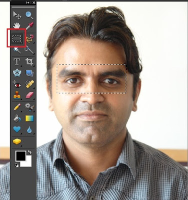
Right click the selection made and select Layer via Copy . A new layer gets created in the Layer palette as shown:

3. Once done, select Move tool from tool bar and drag it over the other image(with spectacles) in the project bin. The dragged layer now gets created in the spectacle image as well as shown.

4. Now we would reposition this portion of the layer above background layer such that the forehead lines and the nose line overlap over each other. Doing this I realized that one image had the head tilted while the other had the head straight up. So we will first transform it using Control+T and would rotate it a bit so that both the layers can be inlined properly.

In the above image I have rotated the upper layer a bit so that the nose line of the person match.
5. Now we would create a copy of the background layer by selecting it and dragging it over the new layer icon in the layer palette or just press Control+J selecting the background layer.
Once done, move the background copy layer on the top by dragging it above the layer on the top. Now the layer with eyes we dragged from other image goes below the spectacles and we see following in the layers palette and the editing workspace :

6. Select the background copy layer and go to Layer> Layer Mask>Reveal All.
This will create a white mask next to the background copy layer as shown in the Layer palette.
Select the brush tool from tools bar and make the foreground color as black in the color swatch.
Now reduce the opacity of the brush from the top bar to somewhere around 50%. Brush over the area of the eyes inside the spectacles.
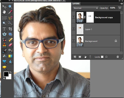
If any extra areas are brushed, that can be reverted using the eraser tool or by just making the foreground color white and rubbing it over the extra areas painted.
If we do not reduce the opacity while brushing then the mask is totally removed over the areas inside spectacles which looks as if there are no glasses in the spectacles. So in order to give realistic look of the lenses, the eyes are brushed with reduced opacity and keeping unbrushed areas near the edges to leave some glare there.
Here is my final output :
Here are the initial and edited images :
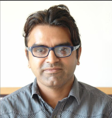
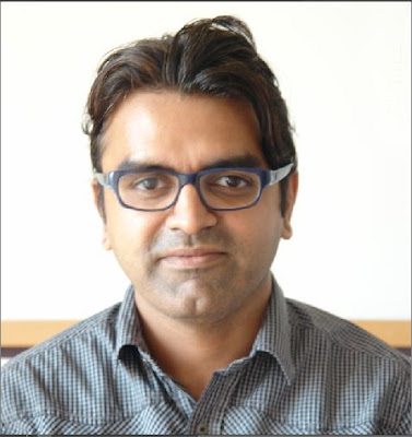
If any extra areas are brushed, that can be reverted using the eraser tool or by just making the foreground color white and rubbing it over the extra areas painted.
If we do not reduce the opacity while brushing then the mask is totally removed over the areas inside spectacles which looks as if there are no glasses in the spectacles. So in order to give realistic look of the lenses, the eyes are brushed with reduced opacity and keeping unbrushed areas near the edges to leave some glare there.
Here is my final output :
Here are the initial and edited images :

Sunday, May 24, 2015
11,
edit,
how,
iptc,
metadata,
multiple,
of,
organizer,
photos,
pse,
to,
using
0
comments
How to edit IPTC metadata of multiple photos using PSE 11 Organizer
PSE Editor provides a way to edit IPTC metadata of an image at a time. However, Organizer did not have a way to edit IPTC metadata till Elements 11 version. With PSE 11, Organizer provides a way to edit IPTC metadata of multiple photos at a time as well.
Here is how you can achieve that:
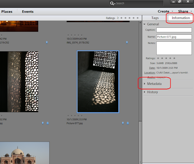
1. For a single image, select a file in Image grid in Organizer. Click on Information tab in right panel as shown, followed by expanding metadata panel as shown in the image below:
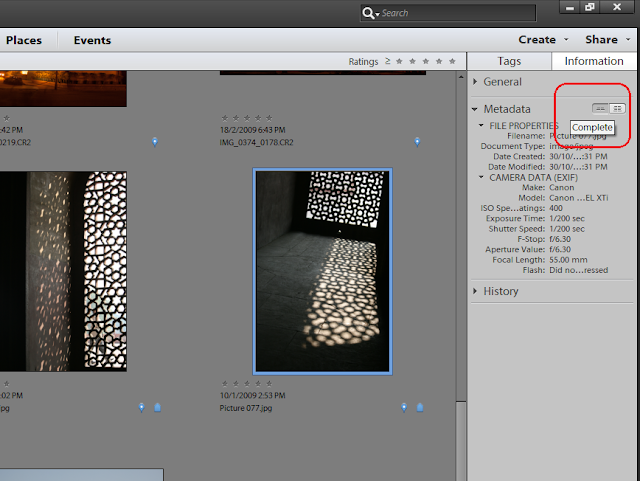
2. Click on the icon shown on right to view Complete metadata of the image selected.
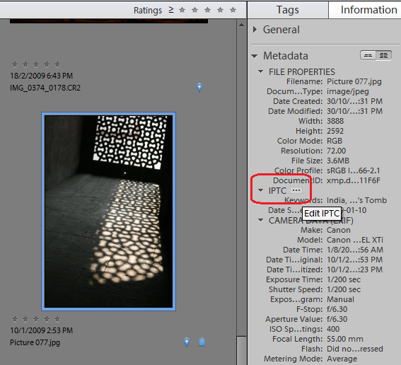
3. Under IPTC header, select the button that shows 3 dots "..."
This launches the following dialog showing IPTC metadata fields. Fill in the metadata and Click Save.
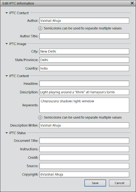
The saved metadata should now appear in metadata panel under IPTC header. To edit this metadata, go to the same dialog with the same steps as above and you can then append or overwrite the existing metadata.
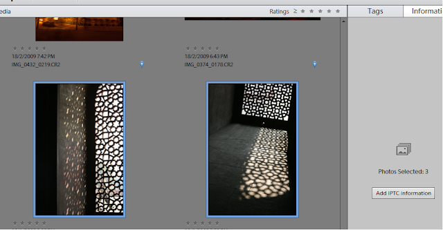
To edit metadata of multiple files, you just need to select multiple files in the image grid and select "Add IPTC information: button in Information panel :
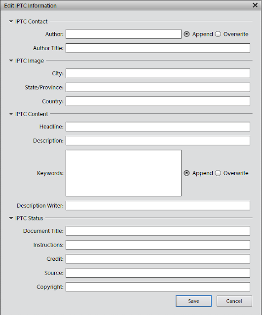
The dialog you see for multiple files is a bit different as it provides a radio button option for Author and Keywords fields to overwrite or append existing values as shown. You can use these options as desired.
Click Save and here you go!
Here is how you can achieve that:
1. For a single image, select a file in Image grid in Organizer. Click on Information tab in right panel as shown, followed by expanding metadata panel as shown in the image below:
2. Click on the icon shown on right to view Complete metadata of the image selected.
3. Under IPTC header, select the button that shows 3 dots "..."
This launches the following dialog showing IPTC metadata fields. Fill in the metadata and Click Save.
The saved metadata should now appear in metadata panel under IPTC header. To edit this metadata, go to the same dialog with the same steps as above and you can then append or overwrite the existing metadata.
To edit metadata of multiple files, you just need to select multiple files in the image grid and select "Add IPTC information: button in Information panel :
The dialog you see for multiple files is a bit different as it provides a radio button option for Author and Keywords fields to overwrite or append existing values as shown. You can use these options as desired.
Click Save and here you go!
Friday, May 22, 2015
awesomeness,
elements,
folders,
in,
of,
organizer,
photoshop,
watch
0
comments
Awesomeness of Watch Folders in Photoshop Elements Organizer
Watch Folders : This functionality is a little hidden in Elements Organizer (File>Watch Folders) and not many know about it usefulness. It is one quick way to get media into your Organizer catalog without bothering about manually importing into it.
To use it, just make the parent folder (of all your photo folders) as the watch folder and it auto imports the media into your Organizer catalog. As soon as any new picture is added to your watch folder in windows explore or to any child of your watch folder, it would be auto-imported to your Organizer catalog.
For example, mostly all my pictures are dumped to one of following three folders (shown in screenshot). So i have made all three as my watch folders. Hence I never need to import any media to my Organizer catalog.
Awesomeness is added if you say exchange photos or receive photos through dropbox. You can add dropbox as your watch folder. Hence all media comes to your Organizer catalog automatically.

I find this feature very useful as it saves a lot of my time. The dropbox idea was shared by one of the Elements user(Thanks Mellissa) and I really found it useful. So just thought to share this tip with everyone!
Thursday, April 30, 2015
and,
artboards,
changing,
cs6,
illustrator,
in,
of,
shape,
size,
the
0
comments
Changing the size and shape of artboards in Illustrator CS6
Changing the size and shape of artboards in Illustrator CS6
 In this movie, I will show you how to change the change the shape and size of your artboards.
Now the first thing I would like you to do, just to make sure that you and I are on the same page, is to go up to the View menu, and make sure that the Smart Guides command is turned on.
If you see a check mark everythings good, if not go ahead and choose the command, you also have the keyboard shortcut of Ctrl+U and Command+U on a Mac.
What Smart Guides do is they allow you to align objects inside of your illustrationsas well as artboards on the fly.
Next step, of course, is to switch to Artboard tool, you can get by pressing Shift+O, or you can just click on it here inside the toolbox.
But before I do that, I want you to notice something.
At this point, you can see that page 1 is active because it has a black outline, whereas page 2 or Artboard 2 if you prefer is not selected nor or any of the others, because they have gray outlines.
If you click on lets say Artboard 4, you can see that it gets the black outline because
its now active and the others are inactive.
Youll also see a number 4 down here in the bottom left corner of the window.
Illustrator goes ahead and numbers Artboards automatically, in the order you create them.
You can override that however that I will show you in a later movie.
Now I will go ahead and switch to the Artboard tool and notice that Artboard 4 is highlighted.
So I just want you to see that artboard thats selected in a standard mode also become selected here inside Artboard mode.
I am going to go ahead and switch back to Artboard 1 by clicking on it and notice that
you have these handles that are surrounding the Artboard.
If you drag one of the handles then you will resize Artboard on the fly and see those green lines, those are the Smart Guides.
So I have got one Smart Guide on the far right side of artboard and another down there at
the bottom thats showing me that I have a center intersection.
So I know that Im exactly aligned to the right side of pages 2 and 6 as well as the
Now, I am going to drag this bottom handle down until I get alignment with the bottom
of those artboards, and I now have this large artboard that includes 1, 2, 5, and 6 and
has independent artboards inside of it for 2, 5, and 6, which can be a very useful way
to work if you want to have one larger artboard that includes all the artwork inside of a
document, for example, as well as independent artboards for each item.
Its a great way to organize and control the output of your artboard.
You also have some options that are available to you up here in the Options bar.
Notice that I have these orientation icon, so I can switch from Portrait to Landscape
just by clicking on it.
You can also select from preset artboard sizes, such as the popular page sizes letter here
Illustrator CS6in States and A4 in Europe and elsewhere.
Ill go ahead and select A4 for now.
You also have numerical control over the size and location of your artboard.
Lets say, I want to go ahead and switch mine back to 6x8 inches.
I would go ahead and highlight Width value, and you can do that, by the way just by clicking
on the letter next to it.
So Ill click on the W, and Ill change it to 6 in, and then press the tab key, and Ill
change the Height value which is now active to 8 in order to reset the size of that page.
Notice however, that Illustrator went ahead and resized the artboard with respect to its
center, and thats because the center reference point is selected up here in the Options bar.
If I want to position the artboard with respect to its upper left corner, I go ahead and click
on the upper left point inside of that reference matrix, and now Ill change the X value to 0,
and then Ill tab to the Y value and change it to 0 as well, and that gos ahead and restores
the original location of the page. In order to accept the work just press the Escape key
in order to return to the Black Arrow tool.
Read more »
Illustrator CS6 Tutorial Video,
I have gone ahead and restored the saved version of 8-page newsletter.ai found inside the 02_artboards folder.Now the first thing I would like you to do, just to make sure that you and I are on the same page, is to go up to the View menu, and make sure that the Smart Guides command is turned on.
If you see a check mark everythings good, if not go ahead and choose the command, you also have the keyboard shortcut of Ctrl+U and Command+U on a Mac.
What Smart Guides do is they allow you to align objects inside of your illustrationsas well as artboards on the fly.
Next step, of course, is to switch to Artboard tool, you can get by pressing Shift+O, or you can just click on it here inside the toolbox.
But before I do that, I want you to notice something.
At this point, you can see that page 1 is active because it has a black outline, whereas page 2 or Artboard 2 if you prefer is not selected nor or any of the others, because they have gray outlines.
If you click on lets say Artboard 4, you can see that it gets the black outline because
its now active and the others are inactive.
Youll also see a number 4 down here in the bottom left corner of the window.
Illustrator goes ahead and numbers Artboards automatically, in the order you create them.
You can override that however that I will show you in a later movie.
Now I will go ahead and switch to the Artboard tool and notice that Artboard 4 is highlighted.
So I just want you to see that artboard thats selected in a standard mode also become selected here inside Artboard mode.
I am going to go ahead and switch back to Artboard 1 by clicking on it and notice that
you have these handles that are surrounding the Artboard.
If you drag one of the handles then you will resize Artboard on the fly and see those green lines, those are the Smart Guides.
So I have got one Smart Guide on the far right side of artboard and another down there at
the bottom thats showing me that I have a center intersection.
So I know that Im exactly aligned to the right side of pages 2 and 6 as well as the
Illustrator CS6 Tutorial Video,
center of the bottom row of artboards.Now, I am going to drag this bottom handle down until I get alignment with the bottom
of those artboards, and I now have this large artboard that includes 1, 2, 5, and 6 and
has independent artboards inside of it for 2, 5, and 6, which can be a very useful way
to work if you want to have one larger artboard that includes all the artwork inside of a
document, for example, as well as independent artboards for each item.
Its a great way to organize and control the output of your artboard.
You also have some options that are available to you up here in the Options bar.
Notice that I have these orientation icon, so I can switch from Portrait to Landscape
just by clicking on it.
You can also select from preset artboard sizes, such as the popular page sizes letter here
Ill go ahead and select A4 for now.
You also have numerical control over the size and location of your artboard.
Lets say, I want to go ahead and switch mine back to 6x8 inches.
I would go ahead and highlight Width value, and you can do that, by the way just by clicking
on the letter next to it.
So Ill click on the W, and Ill change it to 6 in, and then press the tab key, and Ill
change the Height value which is now active to 8 in order to reset the size of that page.
Notice however, that Illustrator went ahead and resized the artboard with respect to its
center, and thats because the center reference point is selected up here in the Options bar.
If I want to position the artboard with respect to its upper left corner, I go ahead and click
on the upper left point inside of that reference matrix, and now Ill change the X value to 0,
and then Ill tab to the Y value and change it to 0 as well, and that gos ahead and restores
the original location of the page. In order to accept the work just press the Escape key
in order to return to the Black Arrow tool.
Wednesday, April 29, 2015
angle,
any,
at,
cs6,
illustrator,
in,
of,
pages,
size
0
comments
Pages of any size at any angle in Illustrator CS6

Friday, April 3, 2015
“a,
aquatic,
creation,
life,
of,
sounds”,
the
0
comments
The creation of “A Life Of Aquatic Sounds”

Step 1
In this step we will cover the beginning of our manipulation, simple document creation and placement of the base stock image as well as the hue change.To start off the piece, we will need to create a new document and grab our base stock. So, firstly create a new document at 1600×2400 pixels. Once created the document, we need to grab the image of the bottle with the glass. Even though our first stock is from Flickr, we are able to use it since it falls under the Creative Commons license.
Once you have your stock, go ahead and place it into your document as I have done below. This way the border is no longer visible.

We will change the hue of the liquid from red to blue. To do this press CTRL+U on your keyboard and set your screen up as mine is in the screenshot below:

Our image now looks like the this one:

Step 2
In step two, we will drop our background in, and use a few simple blending modes and techniques to simplify the isolation process so it takes no time at all.To start off we will need to grab our next stock, a mexican beach.

Once you have the stock, paste it into your document and free transform (CTRL+T) it. The main idea here is to cover the entire canvas with the image.
Then we need to apply the Gaussian blur filter (Filter>Blur>Gaussian blur). Enter a radius around 10px.

Our composition should now look like this one:

Next we need to move this layer below the bottle one. Once done that change, set the blending mode on the bottle layer to multiply and leave it at 100% opacity.

Now it looks much better! But, if you closely look at the bottom left hand corner, you can see that the floor is not 100% opaque! It’s showing pieces of the background, which is something we do not want.

To fix this we need to create a new layer. Place it between the blurred background and the bottle+glass layer. Grab the Brush tool and set it up as I have done in the screenshot below:

Set the foreground color to white and paint over the floor (on your new layer). You will see that where you paint, the bottle layer becomes opaque!
Go ahead and fill up the entire wooden floor.

We could leave the isolation as it is, or we can go ahead and create a new layer to clean up the insides of the glass and bottle.

I decided to clean up the isolation a step more. If you want to do the same, create another layer and set the opacity somewhere between 20-35%. Then use the brush tool as we made before and just fill up the bottle and glass.
Once done this (if you chose to) we can finish up this step by adding a little bit more contrast to the entire image. Duplicate your bottle layer (right click the layer and select “duplicate”) and then desaturate the image (CTRL+SHIFT+U on your keyboard).

Set the blending mode to overlay and reduce opacity to around 30% or contrast will be too strong.

Step 3
Now we can move on to coloring. In this step we will enrich our manipulation by creating a few color layers that will help to better blend the background and bottle layers.So to start off this step we need to create a new layer, a photo filter layer to be exact. To create a photo filter layer select the Layer tab>Adjustment layer>Photo filter layer. Then set up your filter as mine:

Switch the layer blend mode to “soft light” and reduce the opacity to 25-30%, I chose 28% but it’s up to you.
Here is how my image looks now:

We can continue on by creating another layer. On this layer use whatever brush you like and just doodle all over the canvas. Any brush will work fine for this, we will blur the layer so it doesn’t really matter the way you doodle.

Next apply a Gaussian blur (Filter>Blur>Gaussian Blur) with a radius of 200px. Once done this, simple change the blending mode to overlay and set the opacity to 50%.

Step 4
It’s time to start the real photo manipulation;-) Download this photo of a dune.
Once pasted your sand in, remove the background. You can use the technique you prefer. I used the pen tool.

Now we scale it down so it nicely fits the bottle. This layer – as all the layers to come – will be underneath the photo filter layer and above the bottle. If will be necessary, use the Smudge tool to modify the send dimensions so it will perfectly match the ones of the bottle. I had to do this because I sized the sand down to much, but looking back I think it helped the over all appeal. Finally duplicate the layer and set it to overlay.

Now select the sand (ctrl+click on the layer thumbnail). Next go back to your bottle (with the selection still active) and copy the selection of the bottle. Paste the selection into a new layer (ctrl+J), drag it above the sand layer and set it to overlay.

We can leave it as it is, but I think it’s not quite blue. So we will create a new photo filter layer just as before, but this time leave the opacity at 100% and set the blending mode to normal.

Just repeat this process on your glass using this second image of a desert dune

Step 5
We can start including other stocks images into the composition. To start off this step we will paste in a jumping man:
As with our previous stock, isolate the man using whatever method you prefer.

Now we can drop him into the bottle. Scale him down to a size you like, then you need to apply the same technique used with the sand in our previous step, so the man will look as if he’s inside the bottle.

Step 6
Let’s paste in a fish. To start off this step we need the image of a tropical fish. Isolate it from the background and paste it into the canvas. Re-apply the usual technique to put the fish inside the bottle.
Now we can put in a jelly fish!

We need to adjust the image: let’s start desaturating the jelly fish by pressing CTRL+SHIFT+U on your keyboard. Then press CTRL+L on your keyboard and set your level editor up as mine:

Once you have done this our image should look like the screenshot below, but if you still see floating particles, just increase levels values or erase these out with the Eraser Tool.

Press CTRL+U on your keyboard to open the hue/saturation window and use the following settings:

Here is the result of our efforts:

Now just set your layer on screen and place it wherever you prefer.

Now just continue adding more details! Simply paste in all the fishes and jellyfishes you like! You can find lots of free images surfing through sites like stock.xchng, DeviantArt or Morguefile.


Step 7
Step seven is an extension of the previous step. Take in mind that every element of the composition need to be modified in according with its colors and dimensions. If you use duplicated layers set on overlay to increase the contrast of fishes and other details, try experimenting with layers opacity until you obtain satisfactory results.Here is my outcome after added several details:

Step 8
It’s time to add the last details. Download the image of a gondolier.
Isolate and place him on the wave of the glass. Since he’s not in the water, we do not need to apply the effects used with prior images.

Next we can plaste in a star fish.

Extract the star fish and place it on top of the glass. Again since there is no water in that area, no effects need to be applied.

Ok guys, there’s no need to continue. At this point you know how to include other marine elements and how to modify them so that they look inside the bottle/glass. I added in some seagulls, a ladybug, a treasure and other nice things.

Finished!
Well that’s all for my tutorial! To finish off my piece I sized the image down, sharpened it and applied some slight color adjustments.I hope you enjoyed my tutorial and learned a thing or two! If you have any questions please don’t hesitate to ask!

Author : Soad2k
 About The Writer
Hello! My name is Tommy. Im a blogger, I love graphics design and now i went to Architechture Technical Senior High School. | Facebook |
Subscribe to:
Posts (Atom)


- Follow Us on Twitter!
- "Join Us on Facebook!
- RSS
Contact