Tuesday, March 31, 2015
beautiful,
divider,
for,
header,
websites
Beautiful Header Divider for websites
Beautiful Header Divider for websites
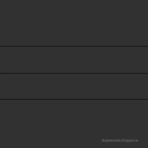
When you are going to design a website/ form design / UX / UI , you have to use dividers for better look of partitioning of website.. Using these dividers the visitor or user understands the partitioning of your website.. Here is the tutorial for better looking website header divider.
Final view

Step 1:
Create new file and fill background with dark gray color (Shft+f5 ---> color ---> Select Black color---> OK).

Make a new layer (Ctrl_Shft+N)
Select Rectangular Marquee Tool and Draw a line. Fill the line with darker gray color than background.

Step 2:
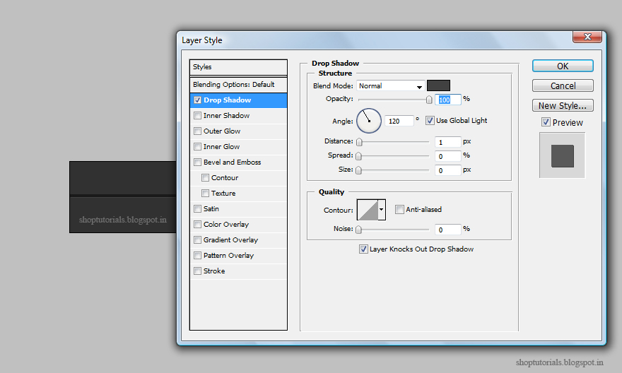
Now go to Blending Options (Fx) and select drop shadow property and make following changes.
Set
Blend mode = Normal
color = gray (Lighter than background [Important])
angle = 120 degree

Create new file and fill background with dark gray color (Shft+f5 ---> color ---> Select Black color---> OK).

Select Rectangular Marquee Tool and Draw a line. Fill the line with darker gray color than background.

Step 2:
Now go to Blending Options (Fx) and select drop shadow property and make following changes.
Set
Blend mode = Normal
color = gray (Lighter than background [Important])
angle = 120 degree
Opacity = 100%
Distance = 1
Speed and Size = 0
Distance = 1
Speed and Size = 0

Hit OK.


Done..!!
Subscribe to:
Post Comments (Atom)


0 comments:
Post a Comment