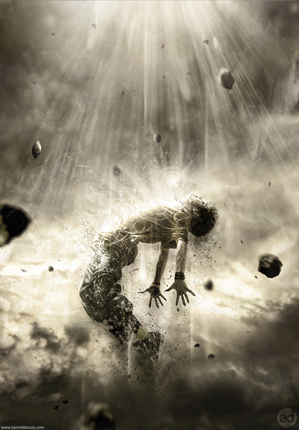
 Tutorial Assets
The following assets were used during the production of this tutorial.- Character
- Sky
- Meteors
- Light (Obsidian Dawn)
- Splatters
Step 1
Let’s start by creating a new document in Adobe Photoshop. Choose the size of document you prefer, but try to keep it in a vertical shape, with a transparent background.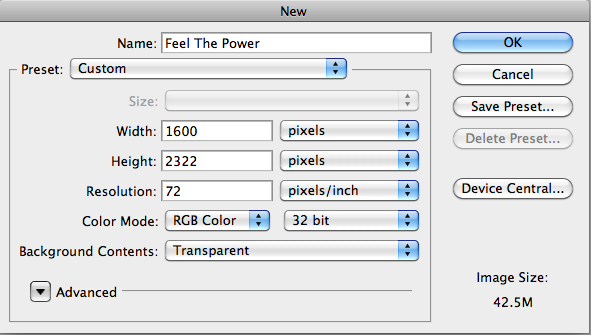
Step 2
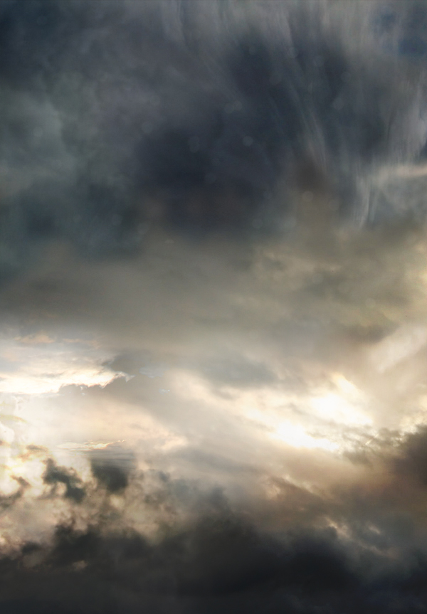
Then, find a good stock image of a cloudy sky that you can use as a background. You can also do like I did by interweaving several pictures of clouds to create the background you prefer. Make sure that the clouds are "dark" enough for a final atmosphere that will fit with the other elements you will be adding to your creation.
Step 3
The next step is very important since you will have to choose the character that will be the main focus of your whole piece. To do this, go to websites like SXC, Fotolia, iStock, etc.., and choose a model that projects a strong emotion. Be sure to pick a character that really inspires you, as it will be the main focus of your creation and it will play a major role in your final outcome. Once you’ve selected it, cut out the character carefully by using the pen tool (P) and place it in the middle, slightly shifted downwards.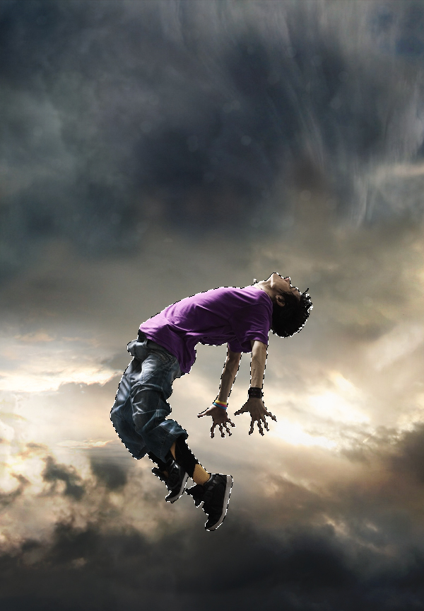
Step 4
Then, using the eraser tool (E) with the “Splatters” shape – which can be found in the tutorial assets – slightly erase the character’s legs.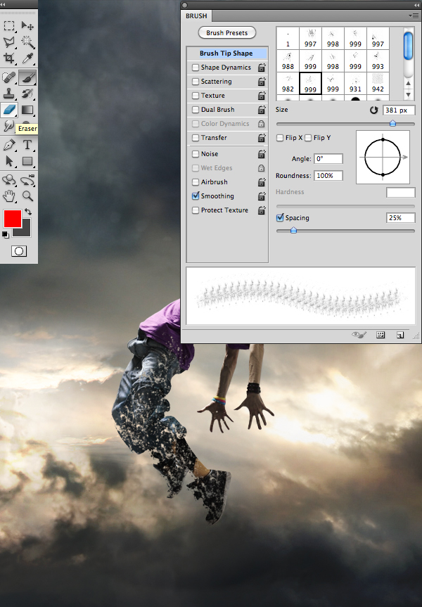
Step 5
Now, if you are like me and like to change your character’s colors, take the lasso tool (L) and surround the selected areas from your character that you would like to modify. Afterwards, create a layer of fill or adjustment by clicking on the black and white circle situated in the layers tab. In the said tab you will be able to select the method that suits you best. I personally recommend changing the colors with a Gradient Map layer and a Selective Color layer. A tip: avoid fluorescent colors and choose those that resemble your background’s colors.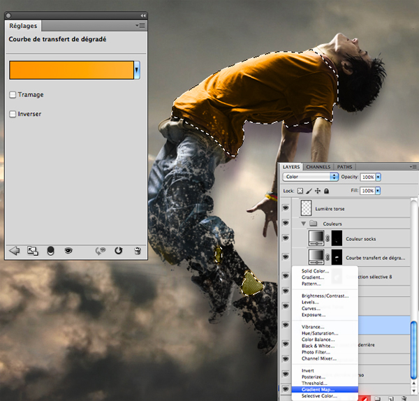
Step 6
Always with the “Splatters” shape, take your brush tool (B) and, on another layer, create shapes that go above, but also behind the model, as seen in the picture bellow. It is important to use the same colors and shades that you’ve used on your character to create the desired effect of disintegration.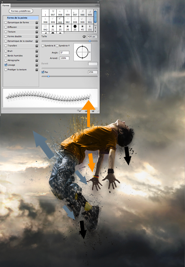
Step 7
There are numerous ways to give a darker aspect to your character and create the impression that he is possessed. Personally, I usually prefer to draw intense red veins on his arms, neck and face, as well as slightly darkening the eyes and mouth with a small black brush adjusted to “Soft Light”.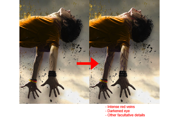
Step 8
Here, I decided to create a necklace that will later have a supernatural look, suggesting that the character is flying up due to the strength of the accessory. Everything is done with a small brush, by using a graphic tablet.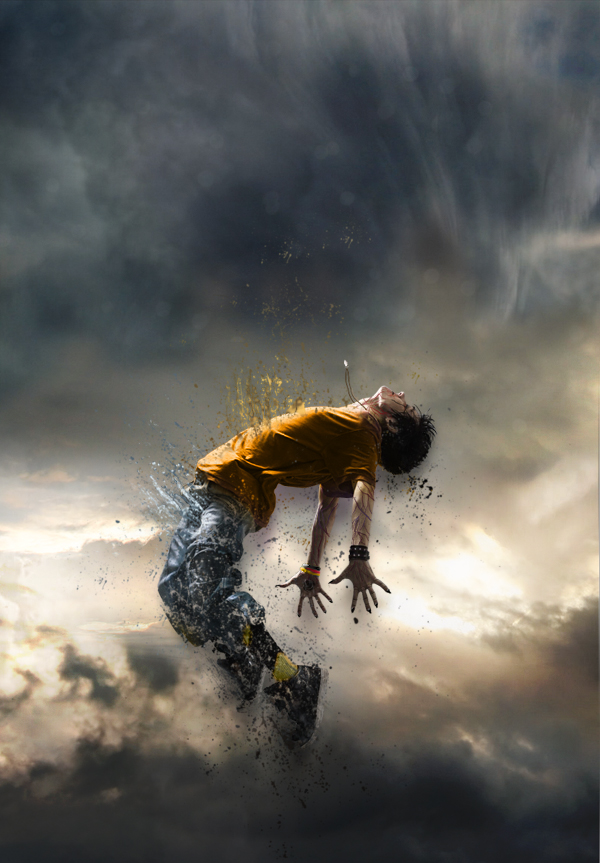
Step 9
Now this step will give the necklace a supernatural look. In order to achieve that, you will need to create "power waves" emitting from the necklace. On another layer, apply a white area on the necklace using a soft round brush, and then with a smaller soft round shape, erase the middle of that white area. When it’s done, “double click” on the layer to open the “Layer Style” box and enter the data as shown in the picture. Once you’ve done all that, duplicate the layer (Command/Ctrl + J) twice and make them bigger than the previous one. Remember, the more the wave is away from the necklace, the more it’s big and less opaque.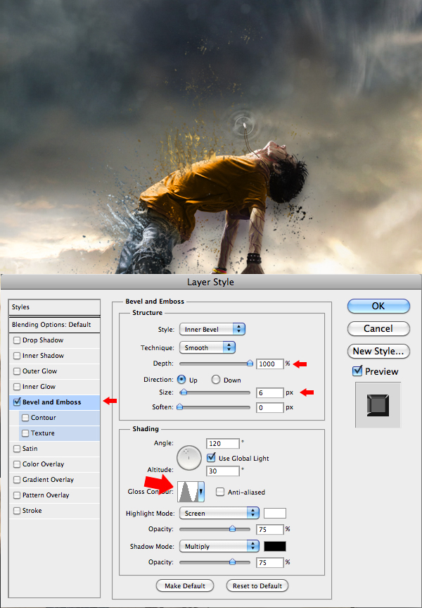
Step 10
To complete the work on the necklace, select the shapes titled “Light” available in the tutorial assets, select your brush (B), and on another layer create a white "light beam" effect coming out of the necklace.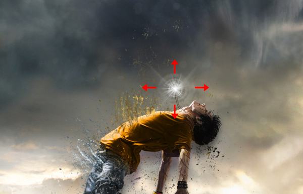
Step 11
With the same brush shapes, create a white "light beam" effect coming out of the model’s torso, as shown in the image. This effect will give out the impression that your character is liberating some sort of supernatural strengths while disintegrating.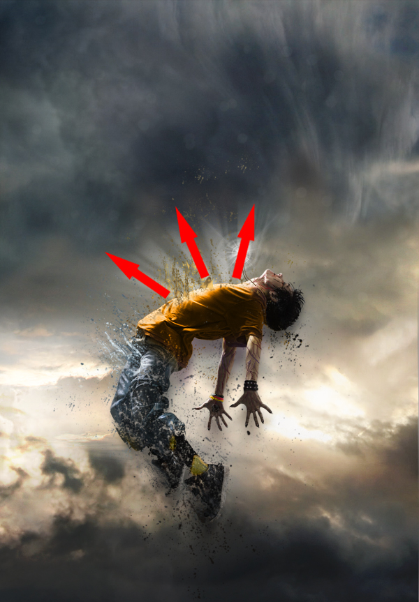
Step 12
Now that most of the work on the character is done, you will need to work a little bit more on the atmosphere. With the fill or adjustment layer, at the bottom of the layers tab, darken the colors and make them closer to those of your character. Again, there are several ways to do so, but I suggest the Gradient Map layer and the Selective Color layer.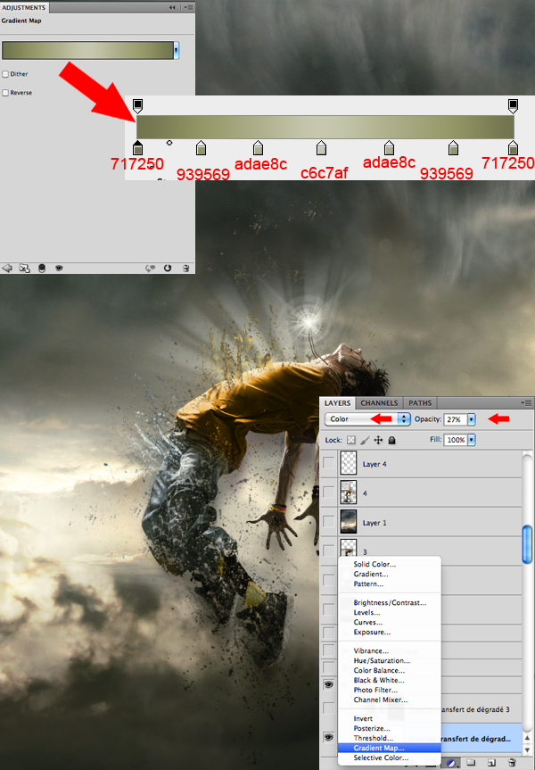
Step 13
Afterwards, put some action in the scenery by adding meteors coming down from the top. You will find a pack of meteorites in the tutorial assets. Insert them one by one, making sure that their sizes vary and that their colors stick with the atmosphere.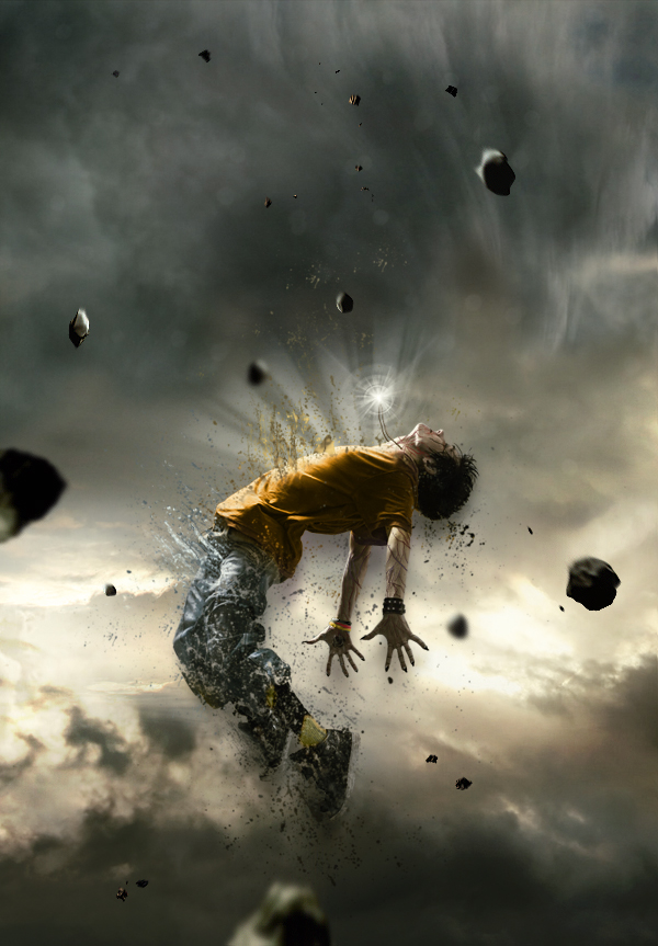
Step 14
This next step will consist in using the blur tool on the meteorites to make them look either close or far. Those that will be situated at the same distance as your character will remain untouched. Basically, the more a meteorite is far from the model, the greater the blur.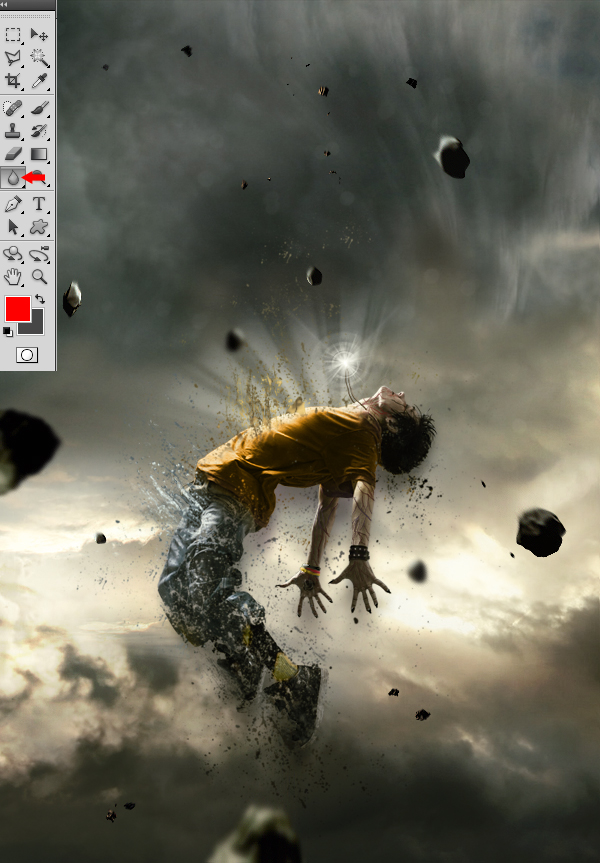
Step 15
Now, take the Smudge tool with strength of 5 to 10% and apply it on each of the meteorites, using little movements from bottom to top, to give them a speed effect.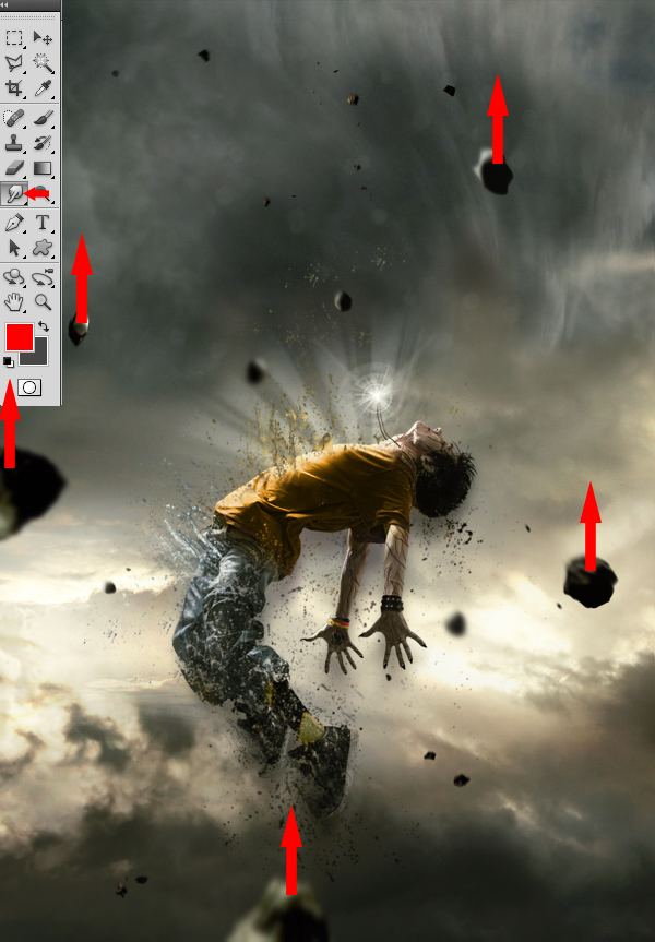
Step 16
To create a source of light coming from above of your character’s body, take a white brush tool (B) with the same “Light” shape used in Step 10 and 11. It is important that the rays coming from above are more intense than those coming from your character’s torso. You can also draw various small shapes that follow the same rays’ movements to make it look more magical.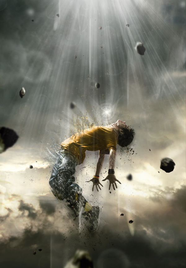
Step 17
Once you’ve completed the previous step, return to your character to improve it. With the presence of the new light source from above of your character’s body, you must increase the light reflected on its torso and face area by using a soft round white brush adjusted to “Overlay” mode.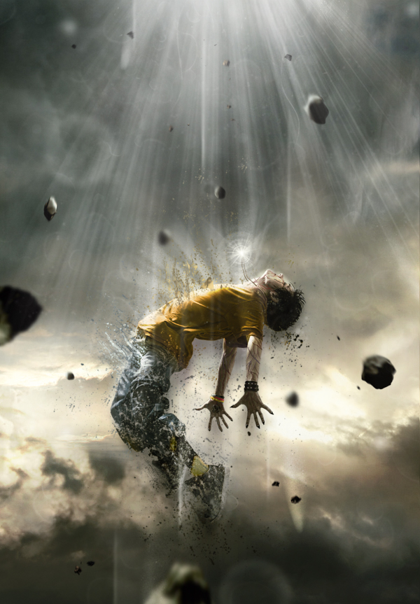
Step 18
Now, draw some light effects passing around your model’s body so he can be integrated better within the scenery and be surrounded by more power.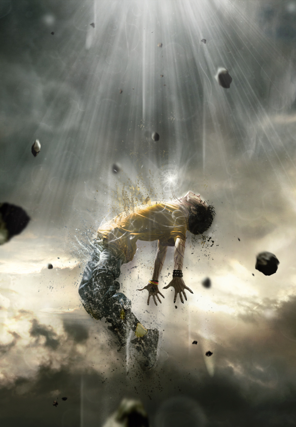
Step 19
You can always add more “Splatters” if you find that the model does not disintegrate the way you want it to.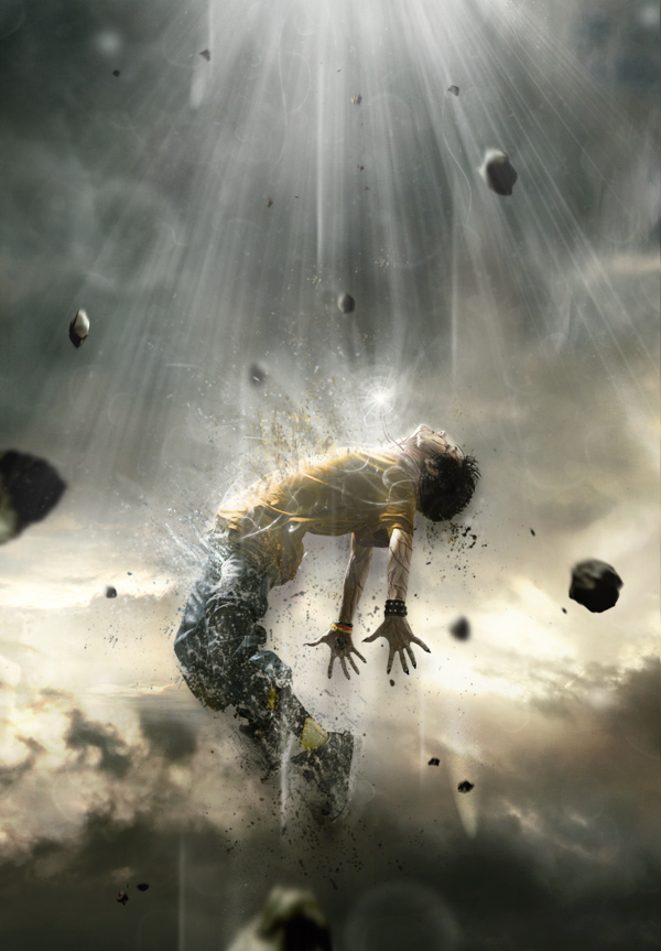
Step 20
To finalize everything, you can return to the colors, contrast and even intensify the bright areas with the same techniques you’ve used before. Basically, this step consists in putting your last personal touch to your piece! When you feel that your piece is finished, use a sharpness filter, to ensure a better overall quality, by duplicating your final image and by going to Filter > Sharpen > Sharpen.
Final Image

Author : Karim Fakhoury
Hello! My name is Tommy. Im a blogger, I love graphics design and now i went to Architechture Technical Senior High School. | Facebook |
Subscribe to:
Post Comments (Atom)


0 comments:
Post a Comment